Fulton County is a Republican stronghold. About 25% of voters here vote Democratic and 75% Republican.
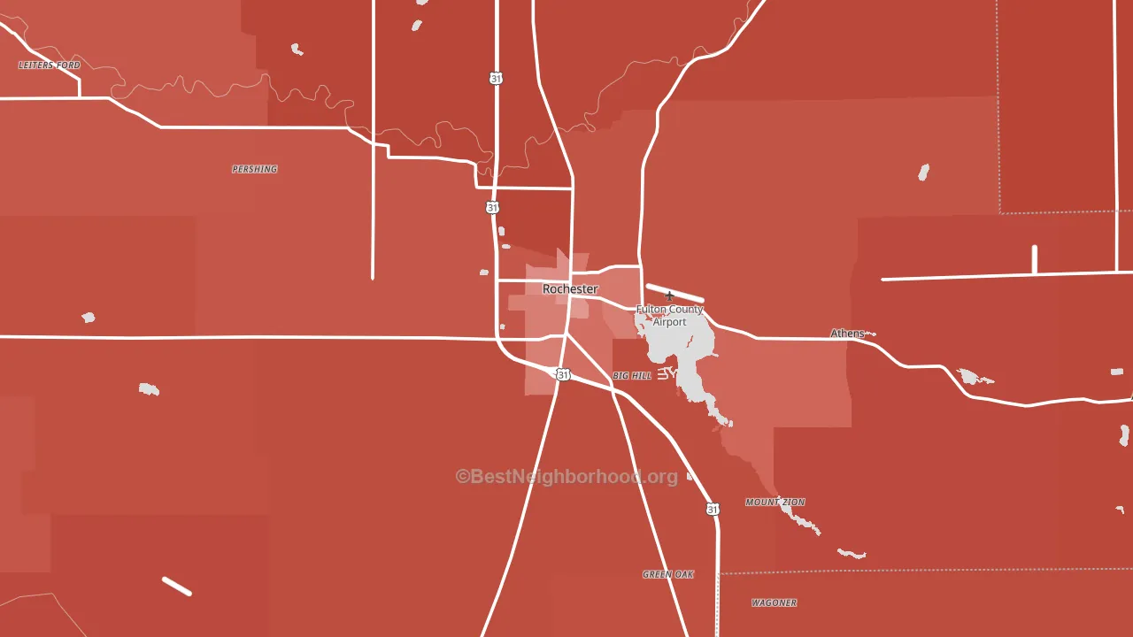
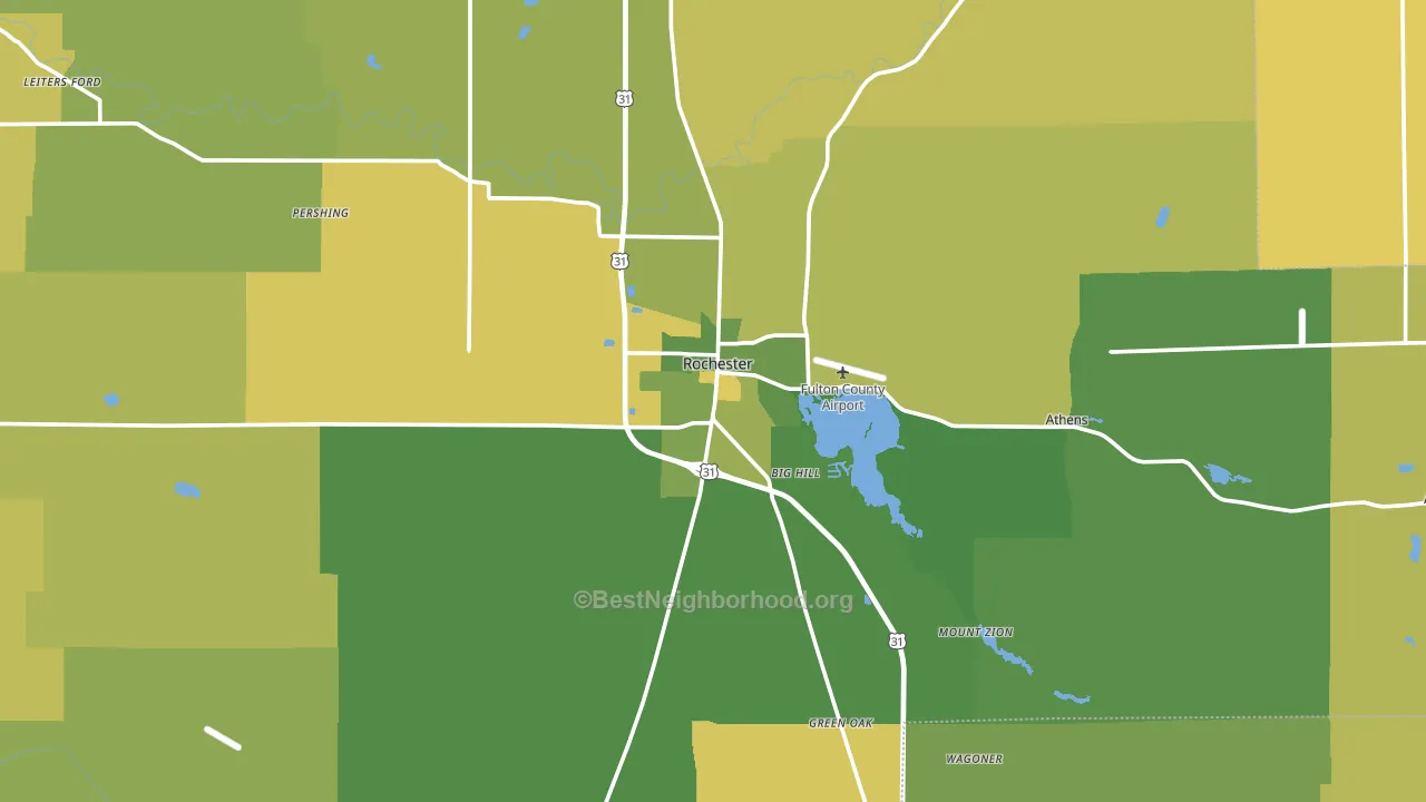
About 72% of adults in Fulton County typically vote, above the U.S. average of about 62%. Among adults in Fulton County, ~18% vote Democratic, ~54% Republican, and ~28% don't vote. The map below shows estimated turnout by block group.
How Fulton County compares
Among counties within 50 miles, Fulton County leans more Republican than 15 of 18 neighbors.
Fulton County runs about 32 points more Republican than Indiana as a whole.
Why Fulton County leans the way it does
This analysis examined 14,881 data points per county to find what predicts political lean and turnout. The items below are a few correlations that stood out for Fulton County, not a ranked or complete list of what matters most.
Areas with many family households vote Republican. About 69% of households in Fulton County are family households, above 75% of counties.
Never-married share and voter turnout
Places with a low never-married share tend to turn out at a higher rate; Fulton County, IN sits in the bottom quarter nationally on this measure.
Why turnout in Fulton County looks the way it does
Homeowners vote more often than renters. About 81% of households in Fulton County own their home, about 6 points above the U.S. average of 75%. Learn more about the findings and methodology on the political spectrum map.
Nearby Counties
- Marshall County, IN R+44
- Cass County, IN R+38
- Miami County, IN R+45
- Pulaski County, IN R+54
- Kosciusko County, IN R+47
- Wabash County, IN R+48
- Starke County, IN R+49
- White County, IN R+43
- Carroll County, IN R+53
- Whitley County, IN R+51
Counties with Similar Populations
- Henry County, IA R+31
- Jay County, IN R+58
- Woodward County, OK R+63
- Lincoln County, WV R+65
- Greene County, NC R+15
- Uinta County, WY R+62
- Breckinridge County, KY R+58
- Carbon County, UT R+56
- Greene County, VA R+26
- Colorado County, TX R+42
Sources and methodology
Precinct-level voting records used to fit the model come from Indiana Secretary of State, Elections, distributed by the Voting and Election Science Team. Demographic inputs come from the U.S. Census Bureau (ACS 5-year estimates and the 2020 Decennial Census). Health and environmental inputs come from the CDC (PLACES and the Environmental Justice Index). Land cover comes from the USGS and EPA. Election-day and lead-up weather come from PRISM 4km daily grids and the NOAA Global Historical Climatology Network. Mail-voting and election-administration patterns come from the MIT Election Lab's Survey of the Performance of American Elections. Block-group crime detail comes from CrimeGrade. Internet data and modeling support provided by ISPreports.org.
Modeling and analysis by the BestNeighborhood data science team. Full methodology and findings: political spectrum map.
Methodology reviewed by the BestNeighborhood data team. Last updated May 2026.