Fairfield County leans slightly Democratic by roughly 12 points: about 56% of voters vote Democratic and 44% Republican.
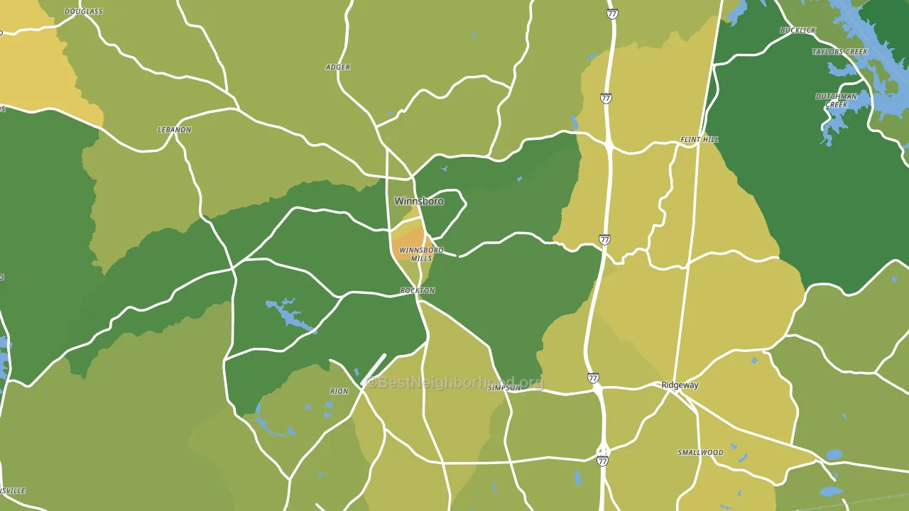
About 69% of adults in Fairfield County typically vote, above the U.S. average of about 62%. Among adults in Fairfield County, ~39% vote Democratic, ~30% Republican, and ~31% don't vote. The map below shows estimated turnout by block group.
How Fairfield County compares
Among counties within 50 miles, Fairfield County leans more Democratic than 10 of 12 neighbors.
Fairfield County runs about 30 points more Democratic than South Carolina as a whole. South Carolina leans Republican overall, while Fairfield County is one of the few Democratic-leaning pockets.
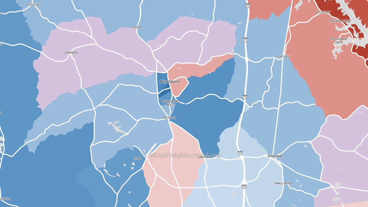
Politics vary noticeably by city within Fairfield County. The southwest side runs the most Democratic (D+45) and the northeast side runs the most Republican (R+34), a spread of about 79 points.
Why Fairfield County leans the way it does
This analysis examined 14,881 data points per county to find what predicts political lean and turnout. The items below are a few correlations that stood out for Fairfield County, not a ranked or complete list of what matters most.
Fairfield County votes against the grain of South Carolina. South Carolina leans Republican overall, while Fairfield County runs about 30 points more Democratic. A high never-married share predicts Democratic voting, and about 34% of adults in Fairfield County have never been married, above 82% of counties.
Preventive-care access and voter turnout
Places with limited routine preventive-care access tend to turn out at a lower rate; Fairfield County, SC sits in the bottom quarter nationally on this measure. Dental visits do not drive turnout; the rate reflects income, insurance, and healthcare access, which line up with who votes.
Why turnout in Fairfield County looks the way it does
Limited routine healthcare access lines up with lower turnout, and Fairfield County sits in the bottom quarter on routine-care measures. Learn more about the findings and methodology on the political spectrum map.
Nearby Counties
- Richland County, SC D+38
- Chester County, SC R+16
- Kershaw County, SC R+32
- Lexington County, SC R+30
- Newberry County, SC R+22
- Lancaster County, SC R+23
- Union County, SC R+28
- Saluda County, SC R+34
- York County, SC R+17
- Lee County, SC D+20
Counties with Similar Populations
- Perry County, IL R+49
- Shelby County, IL R+58
- Morgan County, MO R+63
- Dodge County, MN R+31
- Washington County, NE R+42
- Morgan County, TN R+70
- Assumption Parish, LA R+30
- Bandera County, TX R+59
- Buena Vista County, IA R+21
- Sullivan County, IN R+49
Sources and methodology
Precinct-level voting records used to fit the model come from South Carolina State Election Commission, distributed by the Voting and Election Science Team. Demographic inputs come from the U.S. Census Bureau (ACS 5-year estimates and the 2020 Decennial Census). Health and environmental inputs come from the CDC (PLACES and the Environmental Justice Index). Land cover comes from the USGS and EPA. Election-day and lead-up weather come from PRISM 4km daily grids and the NOAA Global Historical Climatology Network. Mail-voting and election-administration patterns come from the MIT Election Lab's Survey of the Performance of American Elections. Block-group crime detail comes from CrimeGrade. Internet data and modeling support provided by ISPreports.org.
Modeling and analysis by the BestNeighborhood data science team. Full methodology and findings: political spectrum map.
Methodology reviewed by the BestNeighborhood data team. Last updated May 2026.