Lancaster County leans Republican by roughly 22 points: about 39% of voters vote Democratic and 61% Republican.
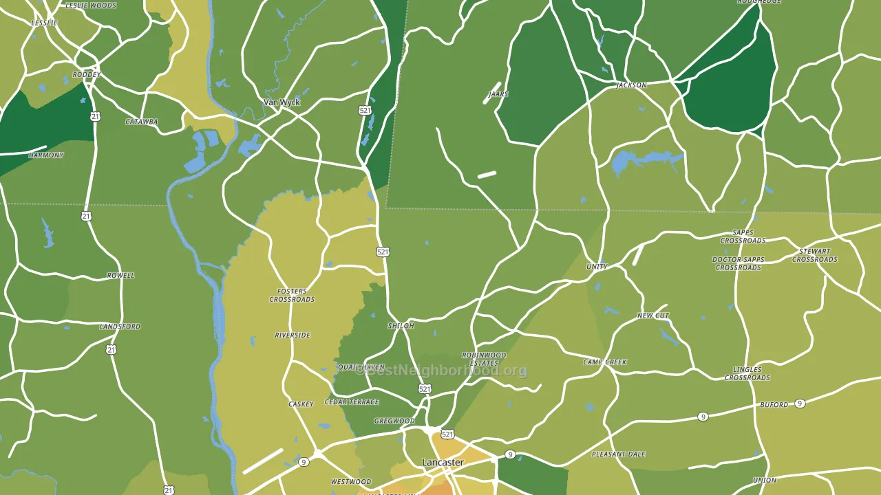
About 76% of adults in Lancaster County typically vote, above the U.S. average of about 62%. Among adults in Lancaster County, ~30% vote Democratic, ~46% Republican, and ~24% don't vote. The map below shows estimated turnout by block group.
How Lancaster County compares
Among counties within 50 miles, Lancaster County leans more Republican than 8 of 12 neighbors.
Lancaster County runs about 5 points more Republican than South Carolina as a whole.
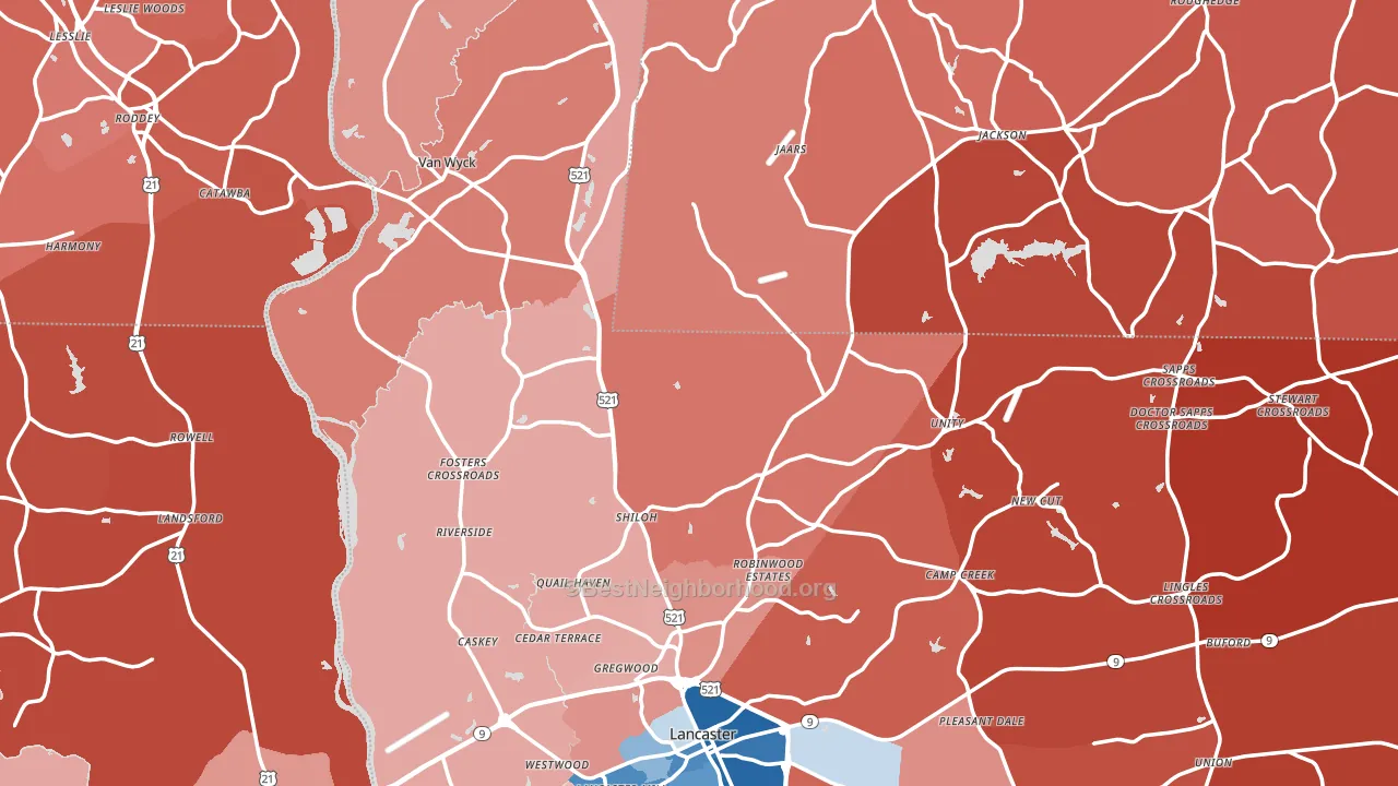
Politics vary noticeably by city within Lancaster County. The northeast side is the most Republican-leaning (R+67) and the west side is the least Republican-leaning (R+8), a spread of about 59 points.
Why Lancaster County leans the way it does
This analysis examined 14,881 data points per county to find what predicts political lean and turnout. The items below are a few correlations that stood out for Lancaster County, not a ranked or complete list of what matters most.
Areas with many family households vote Republican. About 69% of households in Lancaster County are family households, above 77% of counties.
Cancer-screening access and voter turnout
Places with high colon-cancer-screening access tend to turn out at a higher rate; Lancaster County, SC sits in the top quarter nationally on this measure. Cancer screening does not drive turnout; it reflects income, insurance, and healthcare access.
Why turnout in Lancaster County looks the way it does
Areas with strong routine healthcare access turn out at higher rates. Lancaster County is in the top quarter nationally for routine-care measures such as insurance coverage, preventive screenings, and dental visits. The dental-visit rate here is about 64%, above 73% of counties. Homeowners vote more often than renters, and about 83% of households in Lancaster County own their home, above 90% of counties. Learn more about the findings and methodology on the political spectrum map.
Nearby Counties
- Union County, NC R+20
- York County, SC R+17
- Chester County, SC R+16
- Mecklenburg County, NC D+35
- Fairfield County, SC D+13
- Chesterfield County, SC R+28
- Kershaw County, SC R+32
- Gaston County, NC R+18
- Anson County, NC Even
- Cabarrus County, NC R+7
Counties with Similar Populations
- Fairbanks North Star Borough, AK R+9
- Geauga County, OH R+30
- Walton County, GA R+37
- Franklin County, WA R+16
- Cape May County, NJ R+18
- Rogers County, OK R+49
- Grand Traverse County, MI R+3
- Benton County, OR D+42
- Roanoke County, VA R+23
- Nash County, NC D+3
Sources and methodology
Precinct-level voting records used to fit the model come from South Carolina State Election Commission, distributed by the Voting and Election Science Team. Demographic inputs come from the U.S. Census Bureau (ACS 5-year estimates and the 2020 Decennial Census). Health and environmental inputs come from the CDC (PLACES and the Environmental Justice Index). Land cover comes from the USGS and EPA. Election-day and lead-up weather come from PRISM 4km daily grids and the NOAA Global Historical Climatology Network. Mail-voting and election-administration patterns come from the MIT Election Lab's Survey of the Performance of American Elections. Block-group crime detail comes from CrimeGrade. Internet data and modeling support provided by ISPreports.org.
Modeling and analysis by the BestNeighborhood data science team. Full methodology and findings: political spectrum map.
Methodology reviewed by the BestNeighborhood data team. Last updated May 2026.