Chester County leans Republican by roughly 16 points: about 42% of voters vote Democratic and 58% Republican.
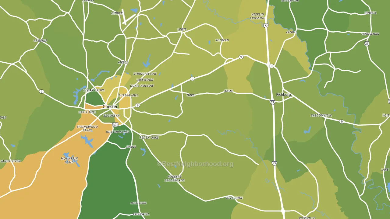
About 67% of adults in Chester County typically vote, near the U.S. average of about 62%. Among adults in Chester County, ~28% vote Democratic, ~39% Republican, and ~33% don't vote. The map below shows estimated turnout by block group.
How Chester County compares
Among counties within 50 miles, Chester County leans more Republican than 3 of 12 neighbors.
Politically, Chester County sits close to the rest of South Carolina.
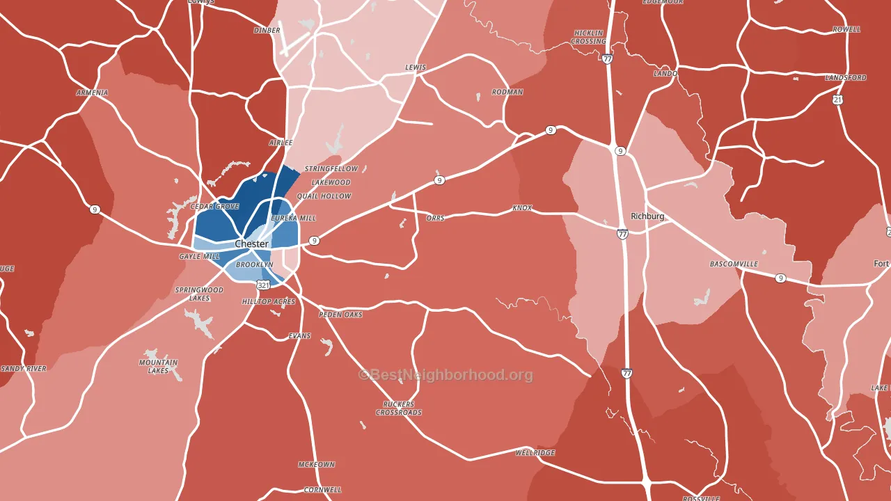
Politics vary noticeably by city within Chester County. The west side runs the most Democratic (D+34) and the northeast side runs the most Republican (R+51), a spread of about 85 points.
Why Chester County leans the way it does
This analysis examined 14,881 data points per county to find what predicts political lean and turnout. The items below are a few correlations that stood out for Chester County, not a ranked or complete list of what matters most.
Car-dependent areas vote Republican. About 85% of residents in Chester County drive to work alone, about 11 points above the U.S. average of 74%. Low college attainment predicts Republican voting, and Chester County sits in the bottom quarter (about 14%, below 91% of counties).
Walkability and Republican lean
Places with a low walkability score tend to lean Republican; Chester County, SC sits in the bottom quarter nationally on this measure. A walkable street grid does not change how people vote; it mostly reflects how urban a place is.
Why turnout in Chester County looks the way it does
Limited routine healthcare access lines up with lower turnout, and Chester County sits in the bottom quarter on routine-care measures. Learn more about the findings and methodology on the political spectrum map.
Nearby Counties
- York County, SC R+17
- Lancaster County, SC R+23
- Fairfield County, SC D+13
- Union County, SC R+28
- Union County, NC R+20
- Gaston County, NC R+18
- Cherokee County, SC R+42
- Mecklenburg County, NC D+35
- Newberry County, SC R+22
- Kershaw County, SC R+32
Counties with Similar Populations
- Juneau City and Borough, AK D+22
- Jefferson Davis Parish, LA R+60
- Evangeline Parish, LA R+39
- Henry County, TN R+55
- Lyon County, KS R+14
- Franklin County, AL R+63
- Hale County, TX R+44
- Dorchester County, MD R+9
- Claiborne County, TN R+70
- Logan County, WV R+66
Sources and methodology
Precinct-level voting records used to fit the model come from South Carolina State Election Commission, distributed by the Voting and Election Science Team. Demographic inputs come from the U.S. Census Bureau (ACS 5-year estimates and the 2020 Decennial Census). Health and environmental inputs come from the CDC (PLACES and the Environmental Justice Index). Land cover comes from the USGS and EPA. Election-day and lead-up weather come from PRISM 4km daily grids and the NOAA Global Historical Climatology Network. Mail-voting and election-administration patterns come from the MIT Election Lab's Survey of the Performance of American Elections. Block-group crime detail comes from CrimeGrade. Internet data and modeling support provided by ISPreports.org.
Modeling and analysis by the BestNeighborhood data science team. Full methodology and findings: political spectrum map.
Methodology reviewed by the BestNeighborhood data team. Last updated May 2026.