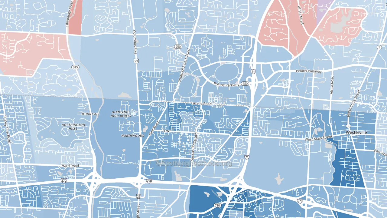
Far North leans Democratic by roughly 26 points: about 63% of voters vote Democratic and 37% Republican.
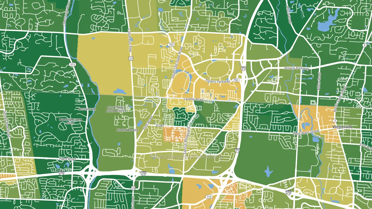
About 67% of adults in Far North typically vote, near the U.S. average of about 62%. Among adults in Far North, ~42% vote Democratic, ~25% Republican, and ~33% don't vote. The map below shows estimated turnout by block group.
How Far North compares
Far North runs about 38 points more Democratic than Ohio as a whole. Ohio leans Republican overall, while Far North is one of the few Democratic-leaning pockets.
Politics vary noticeably by block within Far North. The southwest side is the most Democratic-leaning (D+32) and the northeast side is the least Democratic-leaning (D+20), a spread of about 12 points.
Why Far North leans the way it does
This analysis examined 14,881 data points per neighborhood to find what predicts political lean and turnout. The items below are a few correlations that stood out for Far North, not a ranked or complete list of what matters most.
Far North votes against the grain of Ohio. Ohio leans Republican overall, while Far North runs about 38 points more Democratic.
Preventive-care access and voter turnout
Places with strong routine preventive-care access tend to turn out at a higher rate; Far North, Columbus, OH sits in the top quarter nationally on this measure. Dental visits do not drive turnout; the rate reflects income, insurance, and healthcare access, which line up with who votes.
Why turnout in Far North looks the way it does
Turnout in Far North sits close to the national pattern. Routine healthcare access, homeownership, education, and food security all land near their national averages here. Learn more about the findings and methodology on the political spectrum map.
Nearby Neighborhoods
- Northwest, Columbus, OH D+24
- Northland, Columbus, OH D+38
- Clintonville, Columbus, OH D+58
- North Linden, Columbus, OH D+37
- Northeast, Columbus, OH D+63
- Olentangy River Road, Columbus, OH D+34
- Dexter Falls, Columbus, OH D+21
- Rocky-Fork Blacklick Accord, Westerville, OH D+18
- Argyle Park, Columbus, OH D+80
- South Linden, Columbus, OH D+75
Neighborhoods with Similar Populations
- Bay Area, Corpus Christi, TX Even
- Unionport, Bronx, NY D+39
- Rancho Bernadino, San Diego, CA D+16
- Far West, Fort Worth, TX R+23
- Capitol Hill, Seattle, WA D+79
- Pacific, Stockton, CA D+24
- University, Columbus, OH D+56
- Morningside Heights, Manhattan, NY D+76
- West Side, Newark, NJ D+53
- Oak Cliff, Dallas, TX D+38
Sources and methodology
Precinct-level voting records used to fit the model come from Ohio Secretary of State, Elections, distributed by the Voting and Election Science Team. Demographic inputs come from the U.S. Census Bureau (ACS 5-year estimates and the 2020 Decennial Census). Health and environmental inputs come from the CDC (PLACES and the Environmental Justice Index). Land cover comes from the USGS and EPA. Election-day and lead-up weather come from PRISM 4km daily grids and the NOAA Global Historical Climatology Network. Mail-voting and election-administration patterns come from the MIT Election Lab's Survey of the Performance of American Elections. Block-group crime detail comes from CrimeGrade. Internet data and modeling support provided by ISPreports.org.
Modeling and analysis by the BestNeighborhood data science team. Full methodology and findings: political spectrum map.
Methodology reviewed by the BestNeighborhood data team. Last updated May 2026.