Fayette County leans heavily Republican by roughly 32 points: about 34% of voters vote Democratic and 66% Republican.
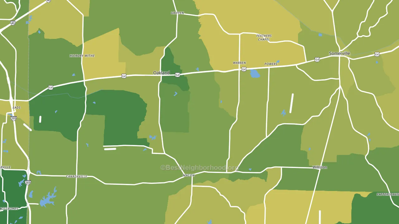
About 74% of adults in Fayette County typically vote, above the U.S. average of about 62%. Among adults in Fayette County, ~25% vote Democratic, ~49% Republican, and ~26% don't vote. The map below shows estimated turnout by block group.
How Fayette County compares
Among counties within 50 miles, Fayette County leans more Republican than 9 of 13 neighbors.
Politically, Fayette County sits close to the rest of Tennessee.
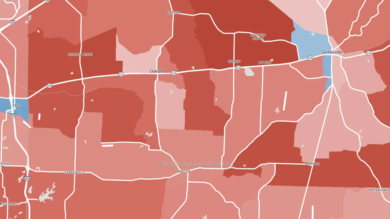
Politics vary noticeably by city within Fayette County. The west side is the most Republican-leaning (R+45) and the east side is the least Republican-leaning (R+12), a spread of about 33 points.
Why Fayette County leans the way it does
This analysis examined 14,881 data points per county to find what predicts political lean and turnout. The items below are a few correlations that stood out for Fayette County, not a ranked or complete list of what matters most.
Areas with many family households vote Republican. About 73% of households in Fayette County are family households, about 6 points above the U.S. average of 67%.
Paved land cover and Republican lean
Places with little paved surface tend to lean Republican; Fayette County, TN sits below the national average on this measure. Paved ground does not change how people vote; it mostly reflects how urban and built-up a place is.
Why turnout in Fayette County looks the way it does
Homeowners vote more often than renters. About 82% of households in Fayette County own their home, about 7 points above the U.S. average of 75%. Learn more about the findings and methodology on the political spectrum map.
Nearby Counties
- Shelby County, TN D+40
- Tipton County, TN R+47
- Hardeman County, TN R+14
- Marshall County, MS R+3
- Haywood County, TN D+13
- Benton County, MS R+26
- DeSoto County, MS R+15
- Lauderdale County, TN R+23
- Crittenden County, AR D+22
- Tippah County, MS R+61
Counties with Similar Populations
- Clinton County, OH R+53
- Crawford County, OH R+51
- Nez Perce County, ID R+35
- Okanogan County, WA R+16
- Marinette County, WI R+34
- Butler County, MO R+52
- Oconee County, GA R+41
- Pierce County, WI R+19
- Gratiot County, MI R+28
- Sweetwater County, WY R+53
Sources and methodology
Precinct-level voting records used to fit the model come from Tennessee Secretary of State, Division of Elections, distributed by the Voting and Election Science Team. Demographic inputs come from the U.S. Census Bureau (ACS 5-year estimates and the 2020 Decennial Census). Health and environmental inputs come from the CDC (PLACES and the Environmental Justice Index). Land cover comes from the USGS and EPA. Election-day and lead-up weather come from PRISM 4km daily grids and the NOAA Global Historical Climatology Network. Mail-voting and election-administration patterns come from the MIT Election Lab's Survey of the Performance of American Elections. Block-group crime detail comes from CrimeGrade. Internet data and modeling support provided by ISPreports.org.
Modeling and analysis by the BestNeighborhood data science team. Full methodology and findings: political spectrum map.
Methodology reviewed by the BestNeighborhood data team. Last updated May 2026.