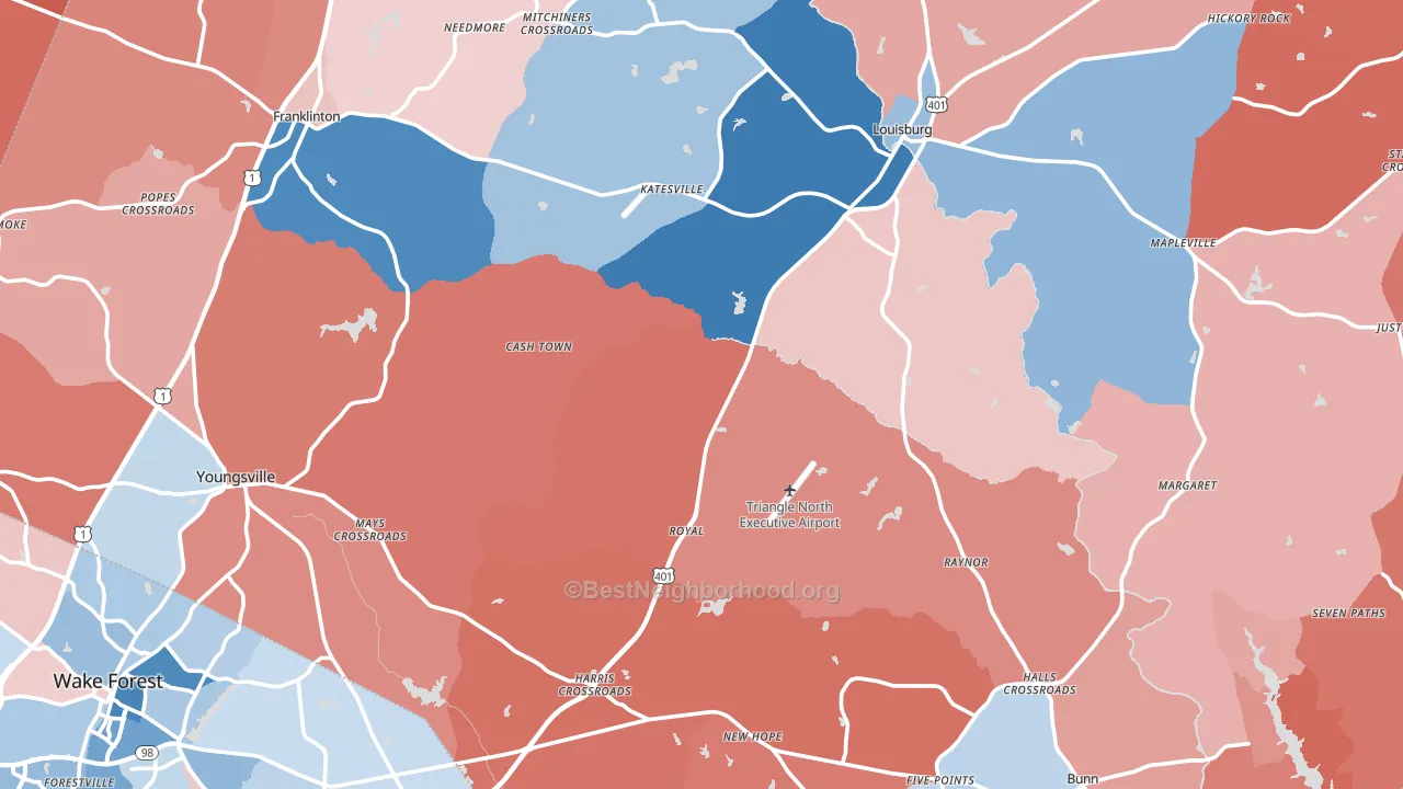
Franklin County leans Republican by roughly 18 points: about 41% of voters vote Democratic and 59% Republican.
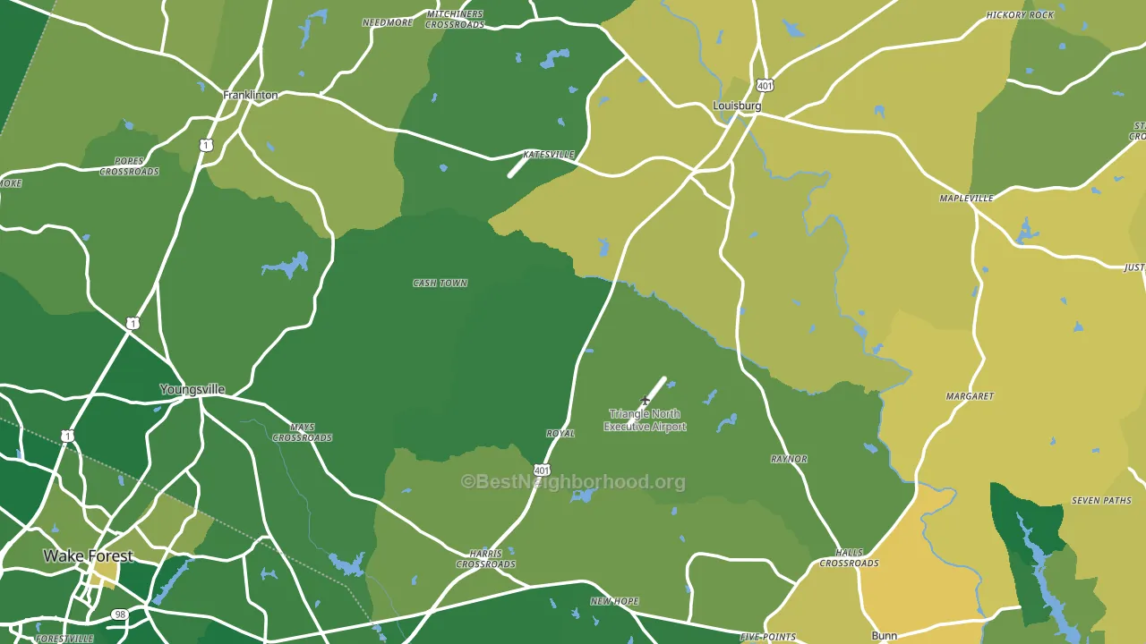
About 78% of adults in Franklin County typically vote, above the U.S. average of about 62%. Among adults in Franklin County, ~32% vote Democratic, ~46% Republican, and ~22% don't vote. The map below shows estimated turnout by block group.
How Franklin County compares
Among counties within 50 miles, Franklin County leans more Republican than 11 of 13 neighbors.
Franklin County runs about 15 points more Republican than North Carolina as a whole.
Politics vary noticeably by city within Franklin County. The south side is the most Republican-leaning (R+38) and the north side is the least Republican-leaning (R+4), a spread of about 34 points.
Why Franklin County leans the way it does
This analysis examined 14,881 data points per county to find what predicts political lean and turnout. The items below are a few correlations that stood out for Franklin County, not a ranked or complete list of what matters most.
Areas with many family households vote Republican. About 72% of households in Franklin County are family households, about 5 points above the U.S. average of 67%.
Walkability and Republican lean
Places with a low walkability score tend to lean Republican; Franklin County, NC sits below the national average on this measure. A walkable street grid does not change how people vote; it mostly reflects how urban a place is.
Why turnout in Franklin County looks the way it does
Turnout in Franklin County sits close to the national pattern. Routine healthcare access, homeownership, education, and food security all land near their national averages here. Learn more about the findings and methodology on the political spectrum map.
Nearby Counties
- Vance County, NC D+19
- Granville County, NC R+7
- Nash County, NC D+3
- Wake County, NC D+28
- Warren County, NC D+19
- Durham County, NC D+59
- Wilson County, NC D+11
- Johnston County, NC R+21
- Edgecombe County, NC D+26
- Orange County, NC D+48
Counties with Similar Populations
- Wise County, TX R+69
- San Patricio County, TX R+31
- Harrison County, TX R+39
- Lake County, CA R+4
- Allegany County, MD R+33
- Shiawassee County, MI R+27
- Blue Earth County, MN R+6
- Madison County, NY R+13
- McCracken County, KY R+30
- Catoosa County, GA R+54
Sources and methodology
Precinct-level voting records used to fit the model come from North Carolina State Board of Elections, distributed by the Voting and Election Science Team. Demographic inputs come from the U.S. Census Bureau (ACS 5-year estimates and the 2020 Decennial Census). Health and environmental inputs come from the CDC (PLACES and the Environmental Justice Index). Land cover comes from the USGS and EPA. Election-day and lead-up weather come from PRISM 4km daily grids and the NOAA Global Historical Climatology Network. Mail-voting and election-administration patterns come from the MIT Election Lab's Survey of the Performance of American Elections. Block-group crime detail comes from CrimeGrade. Internet data and modeling support provided by ISPreports.org.
Modeling and analysis by the BestNeighborhood data science team. Full methodology and findings: political spectrum map.
Methodology reviewed by the BestNeighborhood data team. Last updated May 2026.