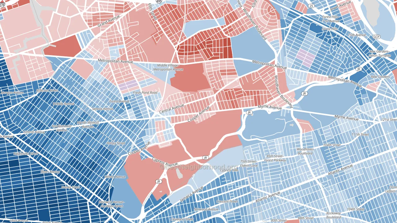
Glendale leans slightly Republican by roughly 8 points: about 46% of voters vote Democratic and 54% Republican.
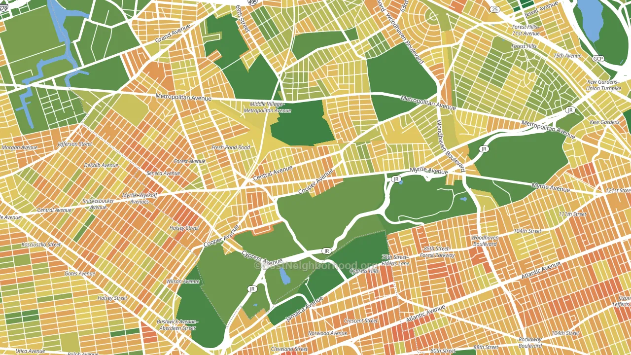
About 47% of adults in Glendale typically vote, below the U.S. average of about 62%. Among adults in Glendale, ~21% vote Democratic, ~25% Republican, and ~54% don't vote. The map below shows estimated turnout by block group.
How Glendale compares
Among neighborhoods within 5 miles, Glendale leans more Republican than 28 of 32 neighbors.
Glendale runs about 20 points more Republican than New York as a whole. New York leans Democratic overall, while Glendale is one of the few Republican-leaning pockets.
Politics vary noticeably by block within Glendale. The southwest side runs the most Democratic (D+12) and the northeast side runs the most Republican (R+23), a spread of about 35 points.
Why Glendale leans the way it does
This analysis examined 14,881 data points per neighborhood to find what predicts political lean and turnout. The items below are a few correlations that stood out for Glendale, not a ranked or complete list of what matters most.
Glendale votes Republican even though it is densely developed (more than 99%, far above the New York average of 36%). State and regional patterns outweigh the Democratic lean that density usually predicts here. Glendale runs against the grain of New York, a Republican-leaning pocket in a Democratic-leaning state.
Population density and Democratic lean
Places with high population density tend to lean Democratic; Glendale, Queens, NY sits in the top tenth nationally on this measure.
Why turnout in Glendale looks the way it does
Crowded housing lines up with lower turnout. About 6% of homes in Glendale have more than one occupant per room, above 80% of neighborhoods. Learn more about the findings and methodology on the political spectrum map.
Nearby Neighborhoods
Neighborhoods with Similar Populations
- Bustleton, Philadelphia, PA R+3
- Oakland Gardens, Queens, NY Even
- Brighton Park, Chicago, IL D+32
- University District, Seattle, WA D+67
- East Side, Long Beach, CA D+52
- Seaport, Stockton, CA D+27
- Central Southwest, Houston, TX D+51
- South Shore, Chicago, IL D+83
- Beacon Hill, Seattle, WA D+60
- Sugar House, Salt Lake City, UT D+53
Sources and methodology
Precinct-level voting records used to fit the model come from New York State Board of Elections, distributed by the Voting and Election Science Team. Demographic inputs come from the U.S. Census Bureau (ACS 5-year estimates and the 2020 Decennial Census). Health and environmental inputs come from the CDC (PLACES and the Environmental Justice Index). Land cover comes from the USGS and EPA. Election-day and lead-up weather come from PRISM 4km daily grids and the NOAA Global Historical Climatology Network. Mail-voting and election-administration patterns come from the MIT Election Lab's Survey of the Performance of American Elections. Block-group crime detail comes from CrimeGrade. Internet data and modeling support provided by ISPreports.org.
Modeling and analysis by the BestNeighborhood data science team. Full methodology and findings: political spectrum map.
Methodology reviewed by the BestNeighborhood data team. Last updated May 2026.