
Hoffman Estates leans Democratic by roughly 16 points: about 58% of voters vote Democratic and 42% Republican.
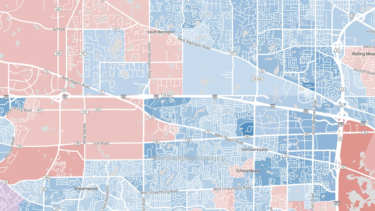
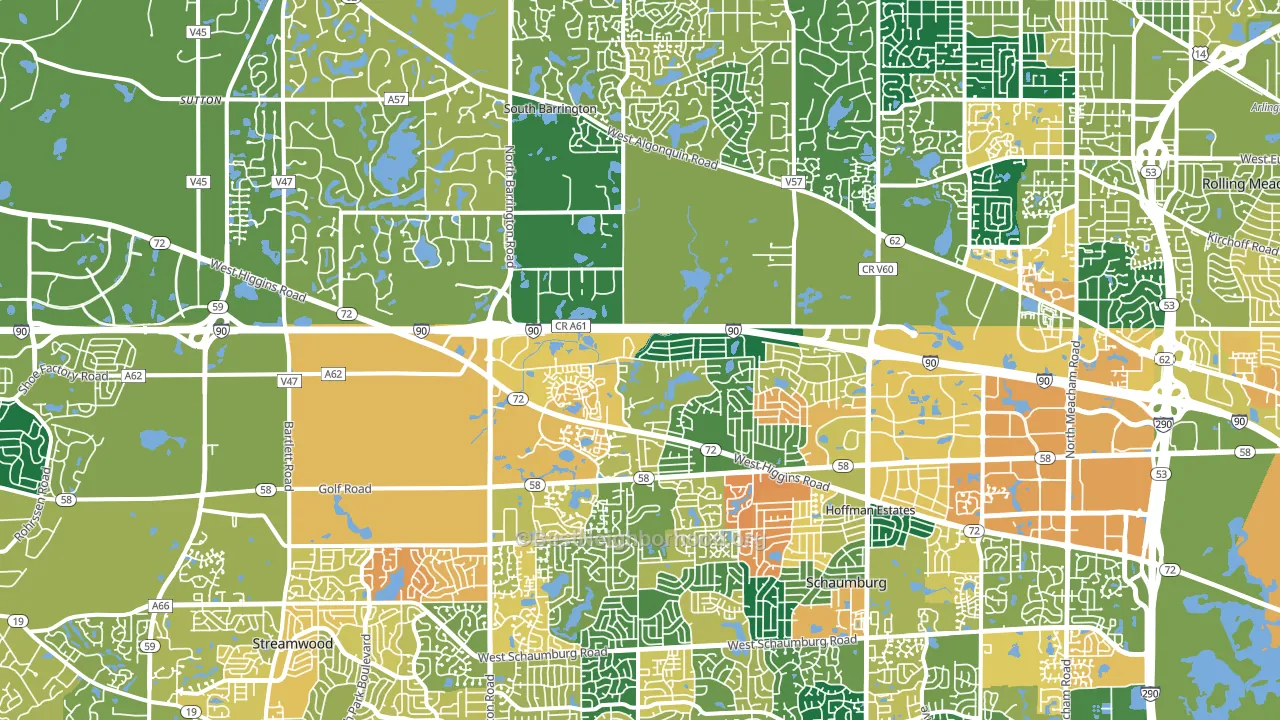
About 66% of adults in Hoffman Estates typically vote, near the U.S. average of about 62%. Among adults in Hoffman Estates, ~38% vote Democratic, ~28% Republican, and ~34% don't vote. The map below shows estimated turnout by block group.
How Hoffman Estates compares
Among cities within 25 miles, Hoffman Estates leans more Democratic than 115 of 188 neighbors.
Hoffman Estates runs about 4 points more Democratic than Illinois as a whole.
Why Hoffman Estates leans the way it does
This analysis examined 14,881 data points per city to find what predicts political lean and turnout. The items below are a few correlations that stood out for Hoffman Estates, not a ranked or complete list of what matters most.
Dense areas vote Democratic. About 91% of residents in Hoffman Estates live in densely developed areas, about 55 points above the U.S. average of 36%. High college attainment predicts Democratic voting, and Hoffman Estates sits in the top quarter (about 50%, above 94% of cities).
Walkability and Democratic lean
Places with a highly walkable street grid tend to lean Democratic; Hoffman Estates, IL sits in the top tenth nationally on this measure. A walkable street grid does not change how people vote; it mostly reflects how urban a place is.
Why turnout in Hoffman Estates looks the way it does
Areas with strong routine healthcare access turn out at higher rates. Hoffman Estates is in the top quarter nationally for routine-care measures such as insurance coverage, preventive screenings, and dental visits. The dental-visit rate here is about 68%, about 8 points above the U.S. average of 60%. Learn more about the findings and methodology on the political spectrum map.
Nearby Cities
- Schaumburg, IL D+13
- South Barrington, IL R+7
- Inverness, IL D+7
- Streamwood, IL D+11
- Rolling Meadows, IL D+14
- Hanover Park, IL D+14
- Roselle, IL Even
- Palatine, IL D+19
- Elk Grove Village, IL D+3
- Barrington, IL D+8
Cities with Similar Populations
- Meridian, MS D+11
- Union, NJ D+32
- Delaware, OH R+7
- Galveston, TX D+14
- Port Arthur, TX D+31
- Normal, IL D+23
- Downers Grove, IL D+17
- Tooele, UT R+40
- West Chester, OH R+9
- Hyattsville, MD D+57
Sources and methodology
Precinct-level voting records used to fit the model come from Illinois State Board of Elections, distributed by the Voting and Election Science Team. Demographic inputs come from the U.S. Census Bureau (ACS 5-year estimates and the 2020 Decennial Census). Health and environmental inputs come from the CDC (PLACES and the Environmental Justice Index). Land cover comes from the USGS and EPA. Election-day and lead-up weather come from PRISM 4km daily grids and the NOAA Global Historical Climatology Network. Mail-voting and election-administration patterns come from the MIT Election Lab's Survey of the Performance of American Elections. Block-group crime detail comes from CrimeGrade. Internet data and modeling support provided by ISPreports.org.
Modeling and analysis by the BestNeighborhood data science team. Full methodology and findings: political spectrum map.
Methodology reviewed by the BestNeighborhood data team. Last updated May 2026.