Home Gardens leans slightly Democratic by roughly 6 points: about 53% of voters vote Democratic and 47% Republican.
[sc name="abovemapcta"]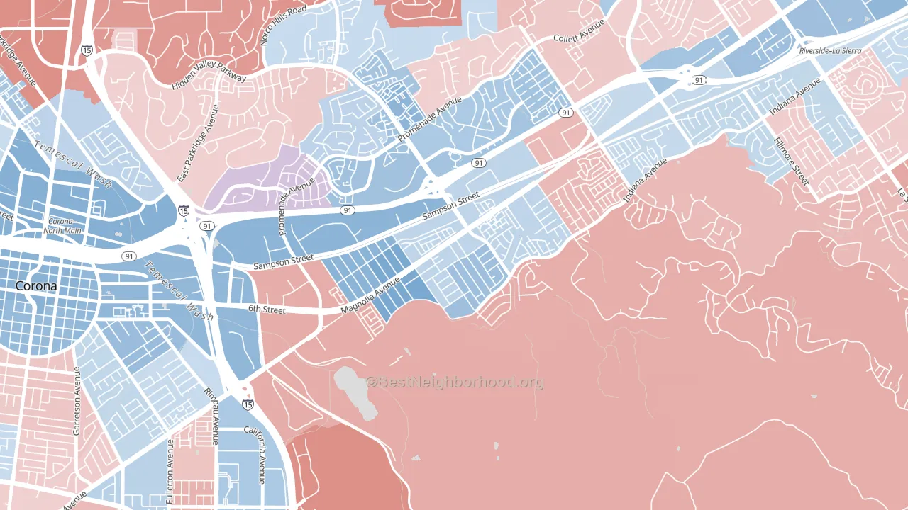 [bestneighborhood_map_controls]
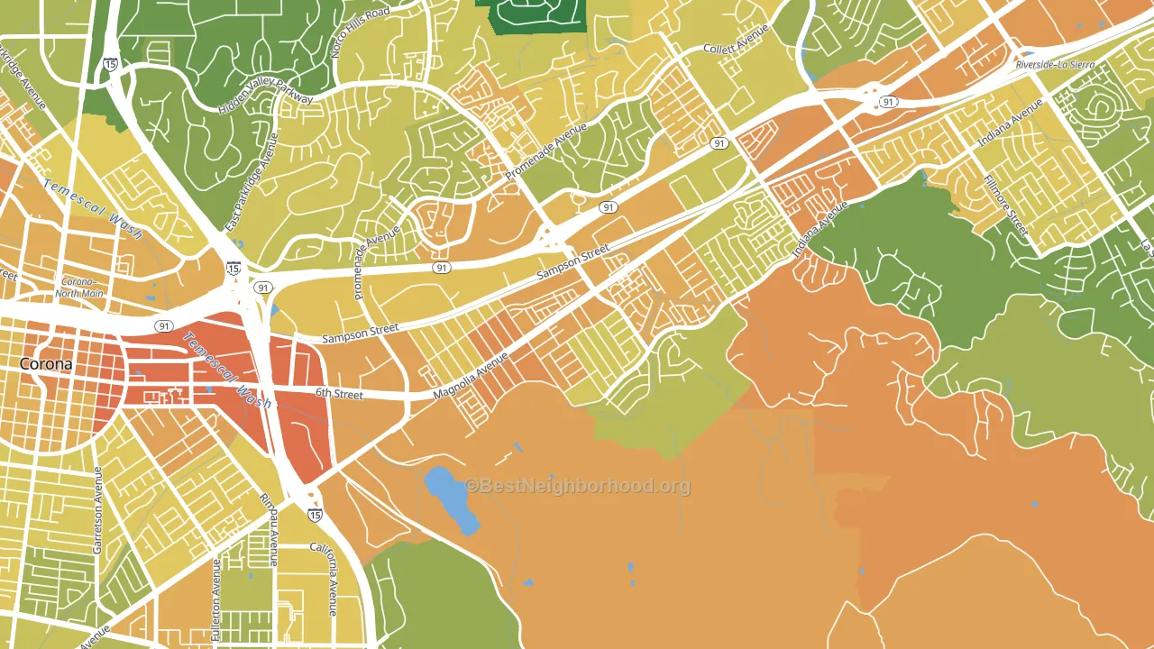
About 41% of adults in Home Gardens typically vote, below the U.S. average of about 62%. Among adults in Home Gardens, ~21% vote Democratic, ~19% Republican, and ~60% don't vote. The map below shows estimated turnout by block group.
 [bestneighborhood_map_controls]
How Home Gardens compares
Among neighborhoods within 5 miles, Home Gardens leans more Democratic than 4 of 8 neighbors.
Home Gardens runs about 14 points more Republican than California as a whole.
Politics vary noticeably by block within Home Gardens. The northwest side runs the most Democratic (D+19) and the southeast side runs the most Republican (R+7), a spread of about 26 points.
Why Home Gardens leans the way it does
Density, race composition, education, and family structure all sit close to their national averages in Home Gardens. The lean here lands roughly where demographic data alone would predict.
Population density and Democratic lean
Places with high population density tend to lean Democratic; Home Gardens, Corona, CA sits above the national average on this measure.
Why turnout in Home Gardens looks the way it does
Areas with limited routine healthcare access turn out at lower rates. Home Gardens is in the bottom quarter nationally for routine-care measures such as insurance coverage, preventive screenings, and dental visits. Crowded housing lines up with lower turnout, and about 14% of homes in Home Gardens have more than one occupant per room, above 96% of neighborhoods. Low high-school completion lines up with lower turnout, and about 71% of adults in Home Gardens have completed high school, below 94% of neighborhoods. Learn more about the findings and methodology on the political spectrum map.
[one_half]Nearby Neighborhoods
- La Sierra South, Riverside, CA Even
- La Sierra, Riverside, CA D+9
- Downtown Corona, Corona, CA D+17
- El Cerrito, Corona, CA R+18
- La Sierra Hills, Riverside, CA Even
- La Sierra Acres, Riverside, CA D+8
- Arlington South, Riverside, CA R+2
- Arlington, Riverside, CA D+11
- Arlanza, Riverside, CA D+15
- Presidential Park, Riverside, CA D+5
Neighborhoods with Similar Populations
- North Waltham, Waltham, MA D+33
- Central City East, Los Angeles, CA D+41
- Buckingham, Arlington, VA D+52
- Eiber, Lakewood, CO D+30
- Natomas Corporate Center, Sacramento, CA D+16
- Jefferson Westside, Eugene, OR D+71
- Nottingham, Katy, TX R+24
- Belvidere, Lowell, MA D+22
- Wickham, Coralville, IA D+34
- Arbor Lodge, Portland, OR D+75
Sources and methodology
Precinct-level voting records used to fit the model come from California Secretary of State, Elections, distributed by the Voting and Election Science Team. Demographic inputs come from the U.S. Census Bureau (ACS 5-year estimates and the 2020 Decennial Census). Health and environmental inputs come from the CDC (PLACES and the Environmental Justice Index). Land cover comes from the USGS and EPA. Election-day and lead-up weather come from PRISM 4km daily grids and the NOAA Global Historical Climatology Network. Mail-voting and election-administration patterns come from the MIT Election Lab's Survey of the Performance of American Elections. Block-group crime detail comes from CrimeGrade. Internet data and modeling support provided by ISPreports.org.
Modeling and analysis by the BestNeighborhood data science team. Full methodology and findings: political spectrum map.
Methodology reviewed by the BestNeighborhood data team. Last updated May 2026.