Home Park is a Democratic stronghold. About 80% of voters here vote Democratic and 20% Republican.
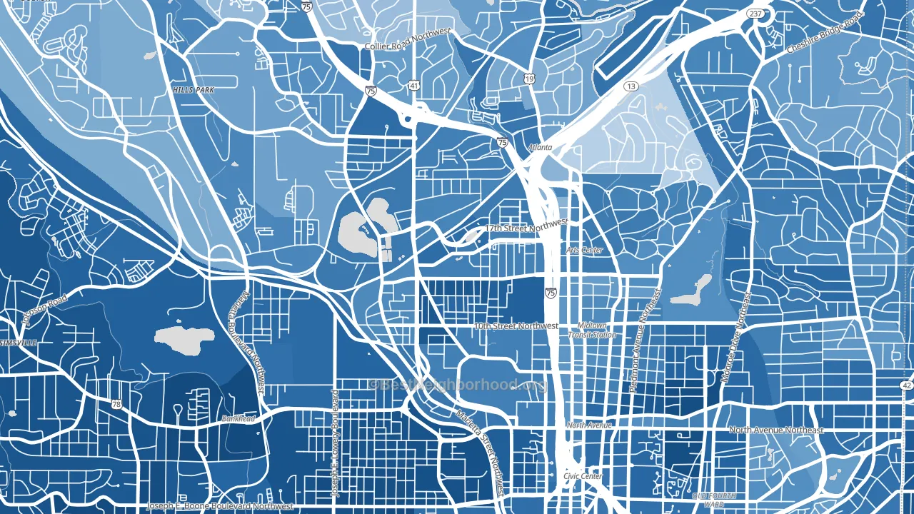
About 55% of adults in Home Park typically vote, below the U.S. average of about 62%. Among adults in Home Park, ~44% vote Democratic, ~11% Republican, and ~45% don't vote. The map below shows estimated turnout by block group.
How Home Park compares
Among neighborhoods within 5 miles, Home Park leans more Democratic than 8 of 21 neighbors.
Home Park runs about 62 points more Democratic than Georgia as a whole. Georgia is roughly evenly split, and Home Park sits clearly on the Democratic side.
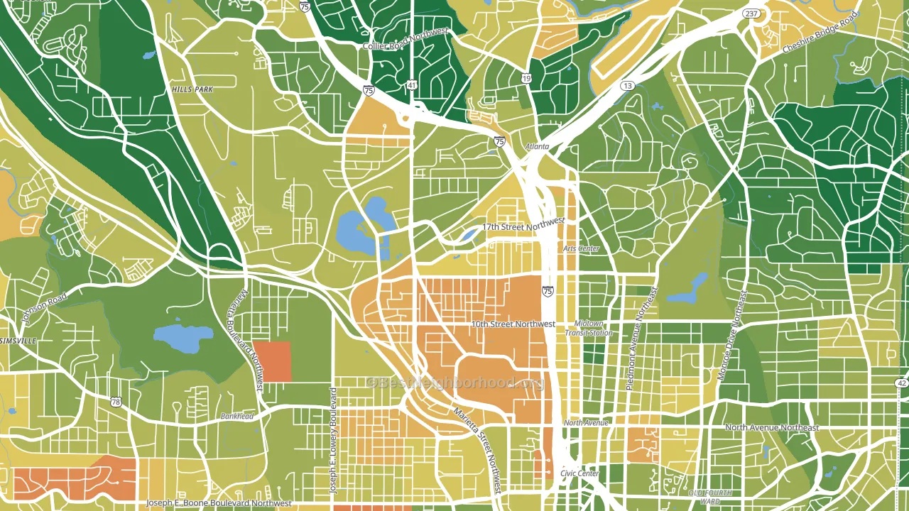
Politics vary noticeably by block within Home Park. The southwest side is the most Democratic-leaning (D+70) and the northwest side is the least Democratic-leaning (D+54), a spread of about 16 points.
Why Home Park leans the way it does
This analysis examined 14,881 data points per neighborhood to find what predicts political lean and turnout. The items below are a few correlations that stood out for Home Park, not a ranked or complete list of what matters most.
Areas with high college attainment vote Democratic. About 81% of adults in Home Park hold a bachelor's degree, about 52 points above the U.S. average of 28%. A high never-married share predicts Democratic voting, and about 75% of adults in Home Park have never been married, in the top fraction of neighborhoods. Home Park runs against the grain of Georgia, a Democratic-leaning outlier in a roughly evenly split state.
Paved land cover and Democratic lean
Places with extensive paved surfaces tend to lean Democratic; Home Park, Atlanta, GA sits in the top tenth nationally on this measure. Paved ground does not change how people vote; it mostly reflects how urban and built-up a place is.
Why turnout in Home Park looks the way it does
Renters vote less often than owners. About 74% of households in Home Park rent, about 49 points above the U.S. average of 25%. High-crime urban areas turn out at lower rates, and Home Park sits in the top 15% on a violent-crime measure. Learn more about the findings and methodology on the political spectrum map.
Nearby Neighborhoods
- Midtown Atlanta, Atlanta, GA D+56
- Downtown, Atlanta, GA D+60
- Vine City, Atlanta, GA D+78
- Five Points, Atlanta, GA D+76
- Old Fourth Ward, Atlanta, GA D+59
- Sweet Auburn, Atlanta, GA D+72
- Virginia-Highland, Atlanta, GA D+53
- Oakdale, Atlanta, GA D+24
- Rockdale, Atlanta, GA D+58
- University Center, Atlanta, GA D+88
Neighborhoods with Similar Populations
- South Semoran, Orlando, FL D+13
- South Ironbound, Newark, NJ D+25
- Park Hills, Yonkers, NY D+28
- Congress Heights, Washington, DC D+86
- Martin Luther King, Austin, TX D+64
- Maple Leaf, Seattle, WA D+78
- Pine Hills, Albany, NY D+62
- Harmony Village, Detroit, MI D+87
- South Redlands, Redlands, CA Even
- Morningside-Lenox Park, Atlanta, GA D+46
Sources and methodology
Precinct-level voting records used to fit the model come from Georgia Elections Division, distributed by the Voting and Election Science Team. Demographic inputs come from the U.S. Census Bureau (ACS 5-year estimates and the 2020 Decennial Census). Health and environmental inputs come from the CDC (PLACES and the Environmental Justice Index). Land cover comes from the USGS and EPA. Election-day and lead-up weather come from PRISM 4km daily grids and the NOAA Global Historical Climatology Network. Mail-voting and election-administration patterns come from the MIT Election Lab's Survey of the Performance of American Elections. Block-group crime detail comes from CrimeGrade. Internet data and modeling support provided by ISPreports.org.
Modeling and analysis by the BestNeighborhood data science team. Full methodology and findings: political spectrum map.
Methodology reviewed by the BestNeighborhood data team. Last updated May 2026.