Sweet Auburn is a Democratic stronghold. About 86% of voters here vote Democratic and 14% Republican.

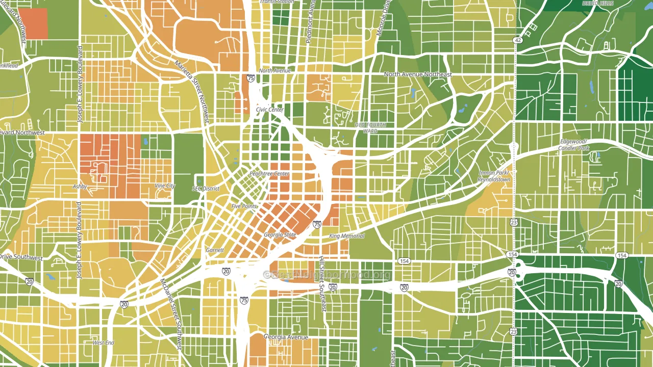
About 40% of adults in Sweet Auburn typically vote, below the U.S. average of about 62%. Among adults in Sweet Auburn, ~35% vote Democratic, ~5% Republican, and ~60% don't vote. The map below shows estimated turnout by block group.
How Sweet Auburn compares
Among neighborhoods within 5 miles, Sweet Auburn leans more Democratic than 13 of 24 neighbors.
Sweet Auburn runs about 74 points more Democratic than Georgia as a whole. Georgia is roughly evenly split, and Sweet Auburn sits clearly on the Democratic side.
Politics vary noticeably by block within Sweet Auburn. The west side is the most Democratic-leaning (D+78) and the southwest side is the least Democratic-leaning (D+64), a spread of about 14 points.
Why Sweet Auburn leans the way it does
This analysis examined 14,881 data points per neighborhood to find what predicts political lean and turnout. The items below are a few correlations that stood out for Sweet Auburn, not a ranked or complete list of what matters most.
Dense areas vote Democratic. More than 99% of residents in Sweet Auburn live in densely developed areas, about 64 points above the U.S. average of 36%. A high never-married share predicts Democratic voting, and about 83% of adults in Sweet Auburn have never been married, in the top fraction of neighborhoods. Sweet Auburn runs against the grain of Georgia, a Democratic-leaning outlier in a roughly evenly split state.
Paved land cover and Democratic lean
Places with extensive paved surfaces tend to lean Democratic; Sweet Auburn, Atlanta, GA sits in the top tenth nationally on this measure. Paved ground does not change how people vote; it mostly reflects how urban and built-up a place is.
Why turnout in Sweet Auburn looks the way it does
Renters vote less often than owners. About 86% of households in Sweet Auburn rent, about 61 points above the U.S. average of 25%. High-crime urban areas turn out at lower rates, and Sweet Auburn sits in the top 15% on a violent-crime measure. Learn more about the findings and methodology on the political spectrum map.
Nearby Neighborhoods
- Five Points, Atlanta, GA D+76
- Old Fourth Ward, Atlanta, GA D+59
- Cabbage Town, Atlanta, GA D+69
- Atlanta-Inman Park, Atlanta, GA D+56
- Downtown, Atlanta, GA D+60
- Grant Park, Atlanta, GA D+71
- Poncey-Highland, Atlanta, GA D+67
- Midtown Atlanta, Atlanta, GA D+56
- Mechanicsville, Atlanta, GA D+80
- Vine City, Atlanta, GA D+78
Neighborhoods with Similar Populations
- East End, Alameda, CA D+65
- North Towne, Toledo, OH D+8
- SBHS, San Bernardino, CA D+27
- Greenfield, Pittsburgh, PA D+50
- Walnut Grove, Broomfield, CO D+15
- Old Seward-Oceanview, Anchorage, AK D+20
- Bricktown, Chicago, IL D+64
- Bryn Mawr, Yonkers, NY D+6
- Federal Hill-Montgomery, Baltimore, MD D+67
- Cumberland, Atlanta, GA D+43
Sources and methodology
Precinct-level voting records used to fit the model come from Georgia Elections Division, distributed by the Voting and Election Science Team. Demographic inputs come from the U.S. Census Bureau (ACS 5-year estimates and the 2020 Decennial Census). Health and environmental inputs come from the CDC (PLACES and the Environmental Justice Index). Land cover comes from the USGS and EPA. Election-day and lead-up weather come from PRISM 4km daily grids and the NOAA Global Historical Climatology Network. Mail-voting and election-administration patterns come from the MIT Election Lab's Survey of the Performance of American Elections. Block-group crime detail comes from CrimeGrade. Internet data and modeling support provided by ISPreports.org.
Modeling and analysis by the BestNeighborhood data science team. Full methodology and findings: political spectrum map.
Methodology reviewed by the BestNeighborhood data team. Last updated May 2026.