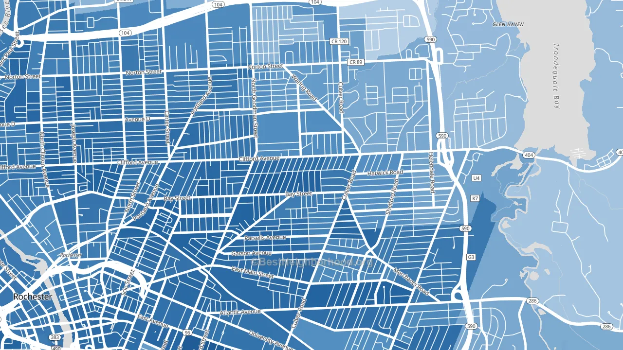
Homestead Heights is a Democratic stronghold. About 80% of voters here vote Democratic and 20% Republican.
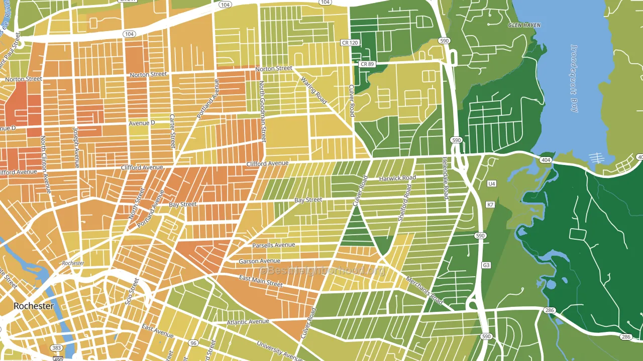
About 56% of adults in Homestead Heights typically vote, below the U.S. average of about 62%. Among adults in Homestead Heights, ~45% vote Democratic, ~11% Republican, and ~44% don't vote. The map below shows estimated turnout by block group.
How Homestead Heights compares
Among neighborhoods within 5 miles, Homestead Heights leans more Democratic than 14 of 27 neighbors.
Homestead Heights runs about 48 points more Democratic than New York as a whole.
Politics vary noticeably by block within Homestead Heights. The southwest side is the most Democratic-leaning (D+73) and the southeast side is the least Democratic-leaning (D+33), a spread of about 40 points.
Why Homestead Heights leans the way it does
This analysis examined 14,881 data points per neighborhood to find what predicts political lean and turnout. The items below are a few correlations that stood out for Homestead Heights, not a ranked or complete list of what matters most.
Areas with many never-married adults vote Democratic. About 52% of adults in Homestead Heights have never been married, about 23 points above the U.S. average of 29%.
Population density and Democratic lean
Places with high population density tend to lean Democratic; Homestead Heights, Rochester, NY sits in the top tenth nationally on this measure.
Why turnout in Homestead Heights looks the way it does
Turnout in Homestead Heights sits close to the national pattern. Routine healthcare access, homeownership, education, and food security all land near their national averages here. Learn more about the findings and methodology on the political spectrum map.
Nearby Neighborhoods
- Beechwood, Rochester, NY D+70
- Northland Lyceum, Rochester, NY D+41
- North Marketview Heights, Rochester, NY D+67
- Culver-Winton, Rochester, NY D+53
- South Marketview Heights, Rochester, NY D+70
- Browncroft, Rochester, NY D+47
- East Avenue, Rochester, NY D+64
- Park Avenue, Rochester, NY D+62
- Group 14621, Rochester, NY D+57
- Upper Falls, Rochester, NY D+59
Neighborhoods with Similar Populations
- Adair Park, Atlanta, GA D+83
- South Worcester, Worcester, MA D+26
- Sableridge, Aurora, CO D+40
- Barnum West, Denver, CO D+40
- South East End, Grand Rapids, MI D+54
- Braun's Farm, San Antonio, TX D+8
- El Miradero, Glendale, CA D+2
- University City, Philadelphia, PA D+65
- The Flatts, Morgantown, WV D+32
- Historic Old Northeast, St. Petersburg, FL D+23
Sources and methodology
Precinct-level voting records used to fit the model come from New York State Board of Elections, distributed by the Voting and Election Science Team. Demographic inputs come from the U.S. Census Bureau (ACS 5-year estimates and the 2020 Decennial Census). Health and environmental inputs come from the CDC (PLACES and the Environmental Justice Index). Land cover comes from the USGS and EPA. Election-day and lead-up weather come from PRISM 4km daily grids and the NOAA Global Historical Climatology Network. Mail-voting and election-administration patterns come from the MIT Election Lab's Survey of the Performance of American Elections. Block-group crime detail comes from CrimeGrade. Internet data and modeling support provided by ISPreports.org.
Modeling and analysis by the BestNeighborhood data science team. Full methodology and findings: political spectrum map.
Methodology reviewed by the BestNeighborhood data team. Last updated May 2026.