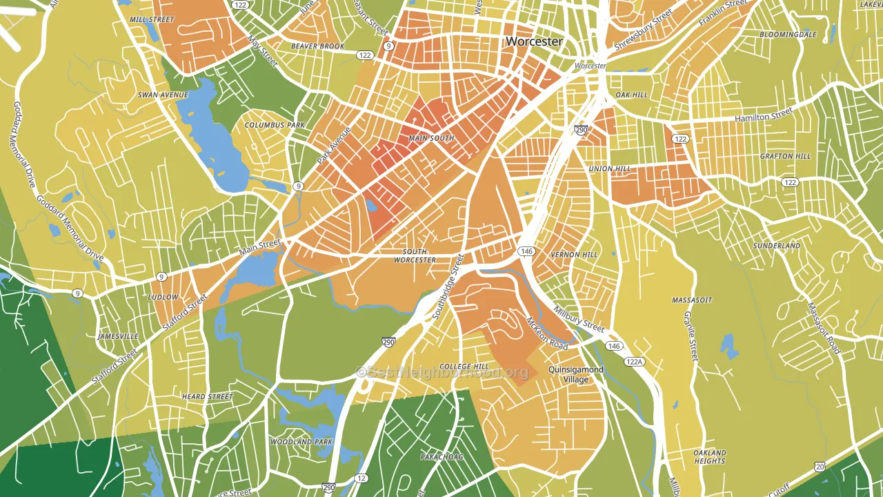
South Worcester leans Democratic by roughly 26 points: about 63% of voters vote Democratic and 37% Republican.
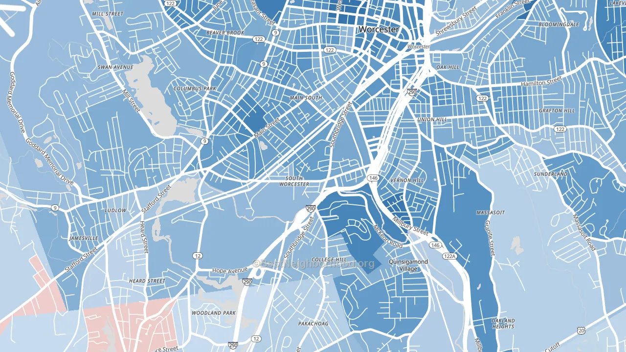
About 35% of adults in South Worcester typically vote, below the U.S. average of about 62%. Among adults in South Worcester, ~22% vote Democratic, ~13% Republican, and ~65% don't vote. The map below shows estimated turnout by block group.
How South Worcester compares
Among neighborhoods within 5 miles, South Worcester leans more Democratic than 4 of 23 neighbors.
Politically, South Worcester sits close to the rest of Massachusetts.
Why South Worcester leans the way it does
This analysis examined 14,881 data points per neighborhood to find what predicts political lean and turnout. The items below are a few correlations that stood out for South Worcester, not a ranked or complete list of what matters most.
Areas with many never-married adults vote Democratic. About 51% of adults in South Worcester have never been married, about 21 points above the U.S. average of 29%.
Population density and Democratic lean
Places with high population density tend to lean Democratic; South Worcester, Worcester, MA sits in the top quarter nationally on this measure.
Why turnout in South Worcester looks the way it does
Renters vote less often than owners. About 71% of households in South Worcester rent, about 46 points above the U.S. average of 25%. High food insecurity lines up with lower turnout, and about 32% of adults in South Worcester report food insecurity, above 86% of neighborhoods. High-crime urban areas turn out at lower rates, and South Worcester sits in the top 15% on a violent-crime measure. Learn more about the findings and methodology on the political spectrum map.
Nearby Neighborhoods
- University Park, Worcester, MA D+36
- North Quinsigamond Village, Worcester, MA D+37
- Vernon Hill, Worcester, MA D+30
- Green Island, Worcester, MA D+33
- Main Middle, Worcester, MA D+31
- Columbus Park, Worcester, MA D+29
- Hadwen Park, Worcester, MA D+20
- Union Hill, Worcester, MA D+29
- Central Business District, Worcester, MA D+42
- Institute Park, Worcester, MA D+50
Neighborhoods with Similar Populations
- South East End, Grand Rapids, MI D+54
- El Miradero, Glendale, CA D+2
- Barnum West, Denver, CO D+40
- Adair Park, Atlanta, GA D+83
- Homestead Heights, Rochester, NY D+61
- Baseline-Hardy, Tempe, AZ D+24
- South Menomonie, Menomonie, WI D+14
- Sableridge, Aurora, CO D+40
- Braun's Farm, San Antonio, TX D+8
- University City, Philadelphia, PA D+65
Sources and methodology
Precinct-level voting records used to fit the model come from Massachusetts Secretary of the Commonwealth, Elections, distributed by the Voting and Election Science Team. Demographic inputs come from the U.S. Census Bureau (ACS 5-year estimates and the 2020 Decennial Census). Health and environmental inputs come from the CDC (PLACES and the Environmental Justice Index). Land cover comes from the USGS and EPA. Election-day and lead-up weather come from PRISM 4km daily grids and the NOAA Global Historical Climatology Network. Mail-voting and election-administration patterns come from the MIT Election Lab's Survey of the Performance of American Elections. Block-group crime detail comes from CrimeGrade. Internet data and modeling support provided by ISPreports.org.
Modeling and analysis by the BestNeighborhood data science team. Full methodology and findings: political spectrum map.
Methodology reviewed by the BestNeighborhood data team. Last updated May 2026.