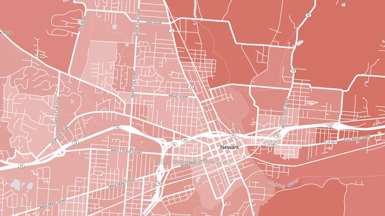
Hudson Avenue Historic District leans Republican by roughly 24 points: about 38% of voters vote Democratic and 62% Republican.
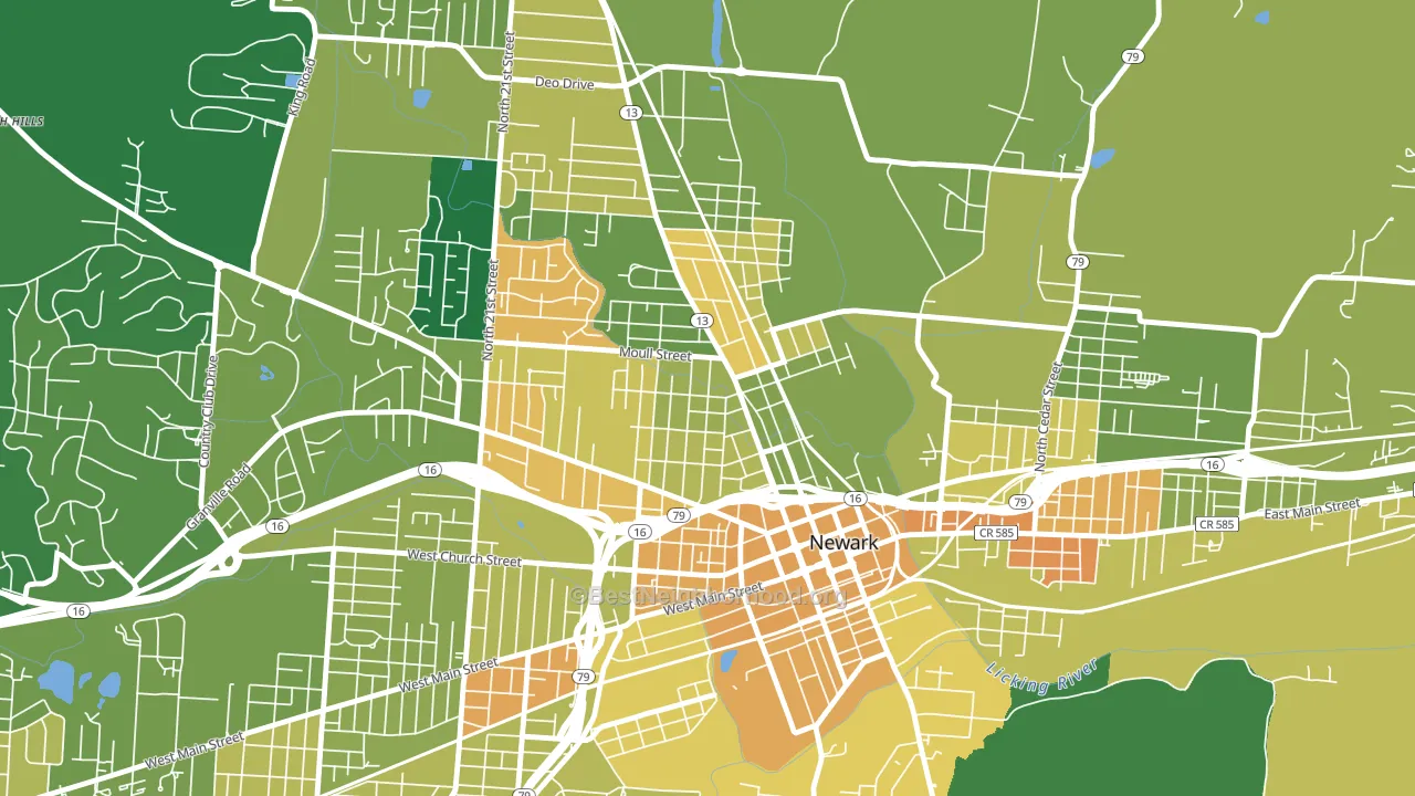
About 64% of adults in Hudson Avenue Historic District typically vote, near the U.S. average of about 62%. Among adults in Hudson Avenue Historic District, ~24% vote Democratic, ~40% Republican, and ~36% don't vote. The map below shows estimated turnout by block group.
How Hudson Avenue Historic District compares
Hudson Avenue Historic District runs about 13 points more Republican than Ohio as a whole.
Politics vary noticeably by block within Hudson Avenue Historic District. The northeast side is the most Republican-leaning (R+31) and the northwest side is the least Republican-leaning (R+17), a spread of about 14 points.
Why Hudson Avenue Historic District leans the way it does
This analysis examined 14,881 data points per neighborhood to find what predicts political lean and turnout. The items below are a few correlations that stood out for Hudson Avenue Historic District, not a ranked or complete list of what matters most.
Areas with a high white share and below-average college attainment vote Republican. In Hudson Avenue Historic District, about 92% of residents are non-Hispanic white, about 20 points above the U.S. average of 72%; about 14% of adults hold a bachelor's degree, about 10 points below the Ohio average of 23%.
Walkability and Republican lean
Places with a low walkability score tend to lean Republican; Hudson Avenue Historic District, Newark, OH sits in the bottom quarter nationally on this measure. A walkable street grid does not change how people vote; it mostly reflects how urban a place is.
Why turnout in Hudson Avenue Historic District looks the way it does
Turnout in Hudson Avenue Historic District sits close to the national pattern. Learn more about the findings and methodology on the political spectrum map.
Nearby Neighborhoods
- Granville Historic District, Granville, OH Even
- East Broad, Black Lick, OH D+33
- McIntire Terrace Historic District, Zanesville, OH R+12
- Brighton Historic District, Zanesville, OH R+17
- Rocky-Fork Blacklick Accord, Westerville, OH D+18
- North Main Historic District, Mount Vernon, OH R+36
- Olde Orchard, Columbus, OH D+35
- Brice-Tussing, Columbus, OH D+46
- Livingston-McNaughten, Columbus, OH D+58
- Shady Lane, Columbus, OH D+66
Neighborhoods with Similar Populations
- Evergreen, Everett, WA D+7
- The Ws, The Colony, TX R+9
- Bartolo Square North, Oxnard, CA D+39
- McKnight, Springfield, MA D+55
- Golden Gate, Emeryville, CA D+81
- Atlanta-Inman Park, Atlanta, GA D+56
- Forest Trails, Jacksonville, FL D+49
- Shore Acres, Staten Island, NY R+16
- Bennington, Vancouver, WA D+19
- Willamette-West Linn, West Linn, OR D+31
Sources and methodology
Precinct-level voting records used to fit the model come from Ohio Secretary of State, Elections, distributed by the Voting and Election Science Team. Demographic inputs come from the U.S. Census Bureau (ACS 5-year estimates and the 2020 Decennial Census). Health and environmental inputs come from the CDC (PLACES and the Environmental Justice Index). Land cover comes from the USGS and EPA. Election-day and lead-up weather come from PRISM 4km daily grids and the NOAA Global Historical Climatology Network. Mail-voting and election-administration patterns come from the MIT Election Lab's Survey of the Performance of American Elections. Block-group crime detail comes from CrimeGrade. Internet data and modeling support provided by ISPreports.org.
Modeling and analysis by the BestNeighborhood data science team. Full methodology and findings: political spectrum map.
Methodology reviewed by the BestNeighborhood data team. Last updated May 2026.