
Atlanta-Inman Park is a Democratic stronghold. About 78% of voters here vote Democratic and 22% Republican.
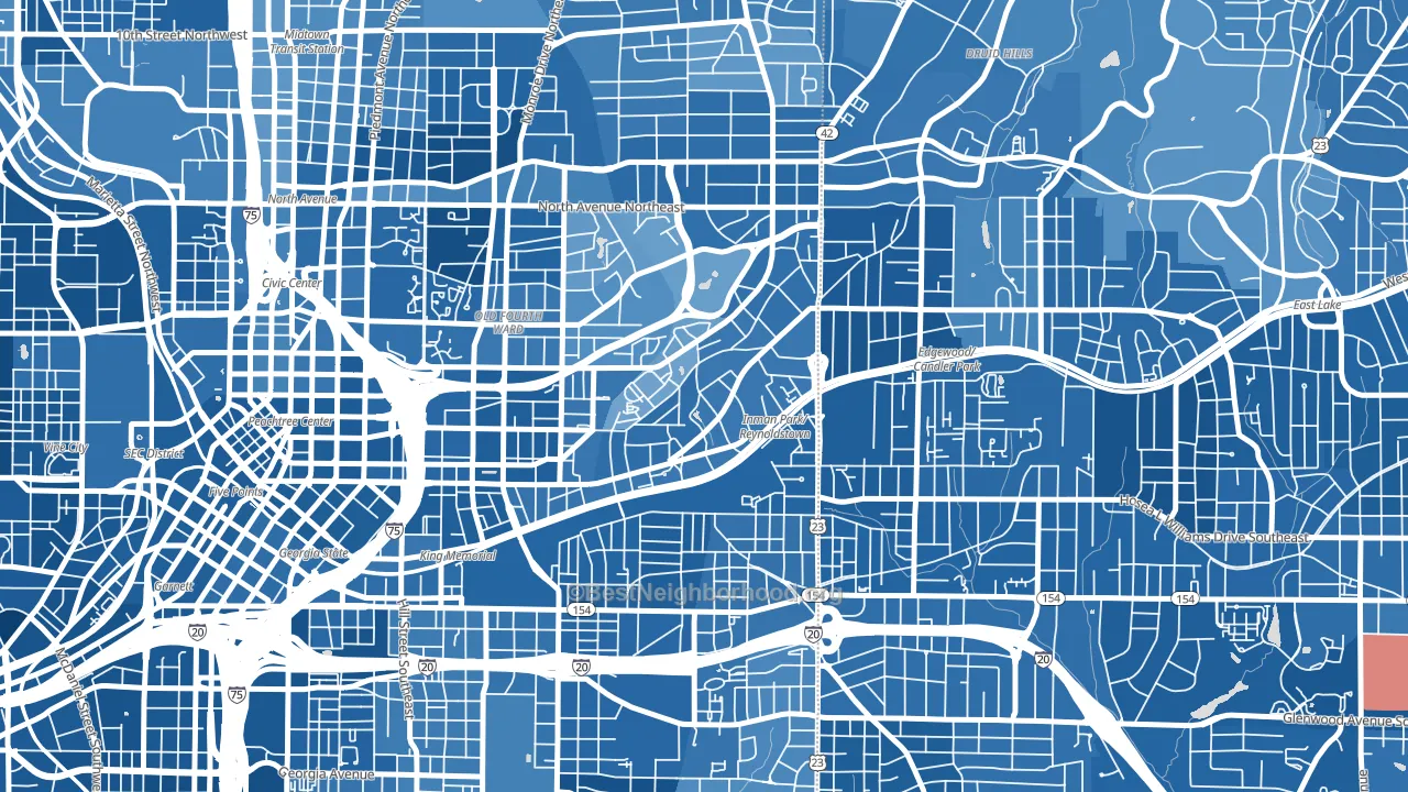
About 71% of adults in Atlanta-Inman Park typically vote, above the U.S. average of about 62%. Among adults in Atlanta-Inman Park, ~56% vote Democratic, ~16% Republican, and ~28% don't vote. The map below shows estimated turnout by block group.
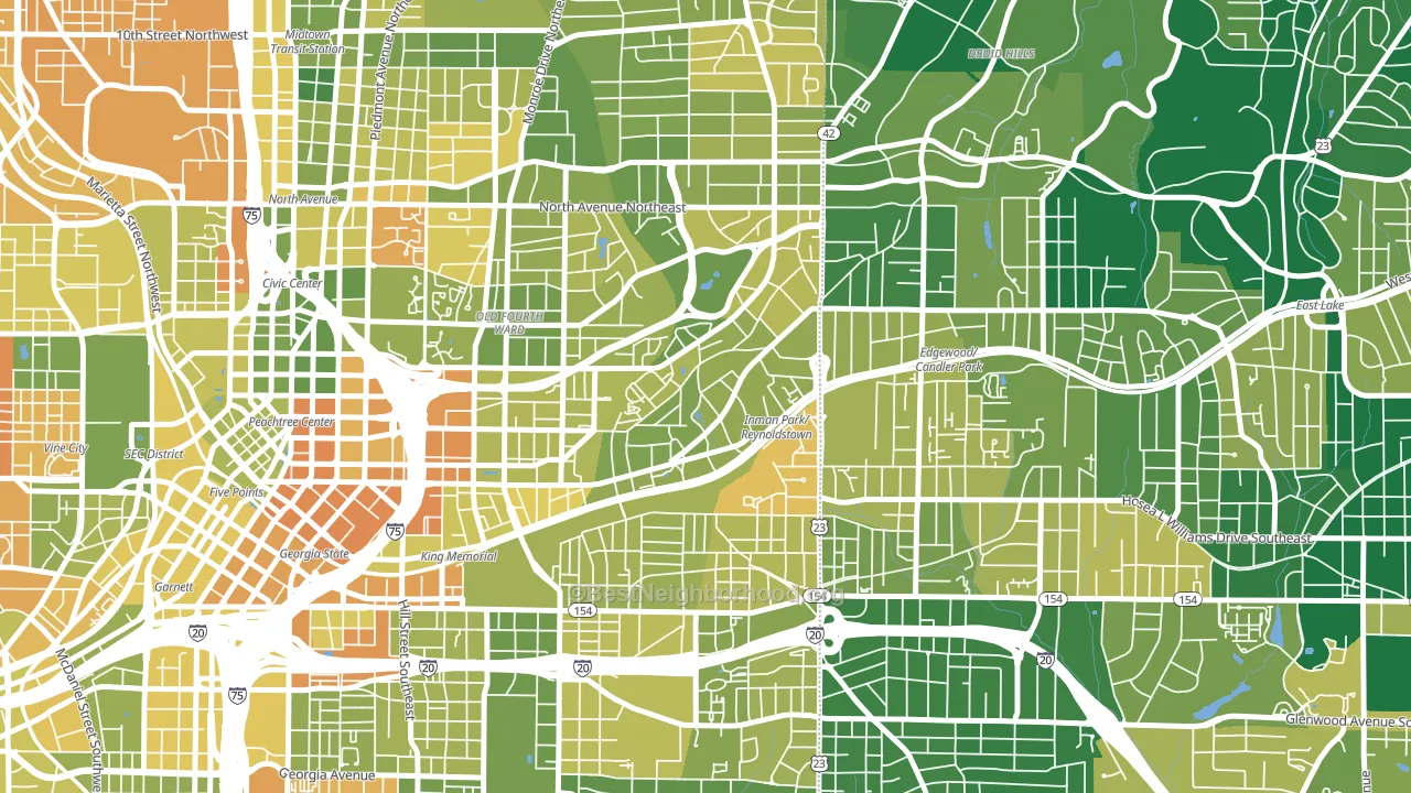
How Atlanta-Inman Park compares
Among neighborhoods within 5 miles, Atlanta-Inman Park leans more Democratic than 2 of 22 neighbors.
Atlanta-Inman Park runs about 58 points more Democratic than Georgia as a whole. Georgia is roughly evenly split, and Atlanta-Inman Park sits clearly on the Democratic side.
Politics vary noticeably by block within Atlanta-Inman Park. The southeast side is the most Democratic-leaning (D+71) and the west side is the least Democratic-leaning (D+48), a spread of about 24 points.
Why Atlanta-Inman Park leans the way it does
This analysis examined 14,881 data points per neighborhood to find what predicts political lean and turnout. The items below are a few correlations that stood out for Atlanta-Inman Park, not a ranked or complete list of what matters most.
Areas with high college attainment vote Democratic. About 86% of adults in Atlanta-Inman Park hold a bachelor's degree, about 57 points above the U.S. average of 28%. Dense areas vote Democratic, and Atlanta-Inman Park sits in the top fifth on density (more than 99%, above 89% of neighborhoods). Atlanta-Inman Park runs against the grain of Georgia, a Democratic-leaning outlier in a roughly evenly split state.
Preventive-care access and voter turnout
Places with strong routine preventive-care access tend to turn out at a higher rate; Atlanta-Inman Park, Atlanta, GA sits in the top tenth nationally on this measure. Dental visits do not drive turnout; the rate reflects income, insurance, and healthcare access, which line up with who votes.
Why turnout in Atlanta-Inman Park looks the way it does
Areas with strong routine healthcare access turn out at higher rates. Atlanta-Inman Park is in the top quarter nationally for routine-care measures such as insurance coverage, preventive screenings, and dental visits. The dental-visit rate here is about 74%, about 14 points above the U.S. average of 60%. High high-school completion lines up with higher turnout, and about 99% of adults in Atlanta-Inman Park have completed high school, above 88% of neighborhoods. Learn more about the findings and methodology on the political spectrum map.
Nearby Neighborhoods
- Poncey-Highland, Atlanta, GA D+67
- Cabbage Town, Atlanta, GA D+69
- Old Fourth Ward, Atlanta, GA D+59
- Sweet Auburn, Atlanta, GA D+72
- Candler Park, Atlanta, GA D+64
- Five Points, Atlanta, GA D+76
- Virginia-Highland, Atlanta, GA D+53
- Edgewood-Kirkwood, Atlanta, GA D+75
- Midtown Atlanta, Atlanta, GA D+56
- Grant Park, Atlanta, GA D+71
Neighborhoods with Similar Populations
- Bennington, Vancouver, WA D+19
- McKnight, Springfield, MA D+55
- Evergreen, Everett, WA D+7
- Bartolo Square North, Oxnard, CA D+39
- Camp Curtin, Harrisburg, PA D+73
- Arlington Park, Sarasota, FL Even
- West Gate, Columbus, OH D+27
- Hudson Avenue Historic District, Newark, OH R+24
- The Ws, The Colony, TX R+9
- Golden Gate, Emeryville, CA D+81
Sources and methodology
Precinct-level voting records used to fit the model come from Georgia Elections Division, distributed by the Voting and Election Science Team. Demographic inputs come from the U.S. Census Bureau (ACS 5-year estimates and the 2020 Decennial Census). Health and environmental inputs come from the CDC (PLACES and the Environmental Justice Index). Land cover comes from the USGS and EPA. Election-day and lead-up weather come from PRISM 4km daily grids and the NOAA Global Historical Climatology Network. Mail-voting and election-administration patterns come from the MIT Election Lab's Survey of the Performance of American Elections. Block-group crime detail comes from CrimeGrade. Internet data and modeling support provided by ISPreports.org.
Modeling and analysis by the BestNeighborhood data science team. Full methodology and findings: political spectrum map.
Methodology reviewed by the BestNeighborhood data team. Last updated May 2026.