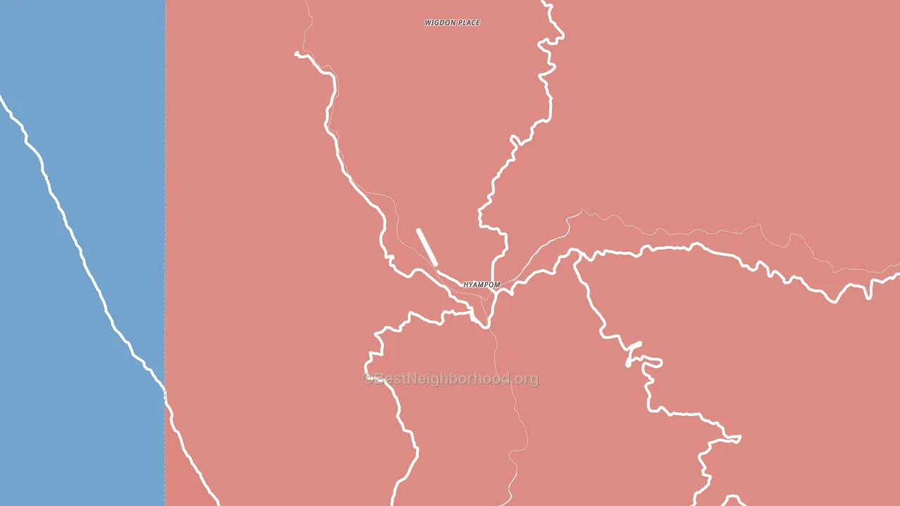
Hyampom leans Republican by roughly 18 points: about 41% of voters vote Democratic and 59% Republican.
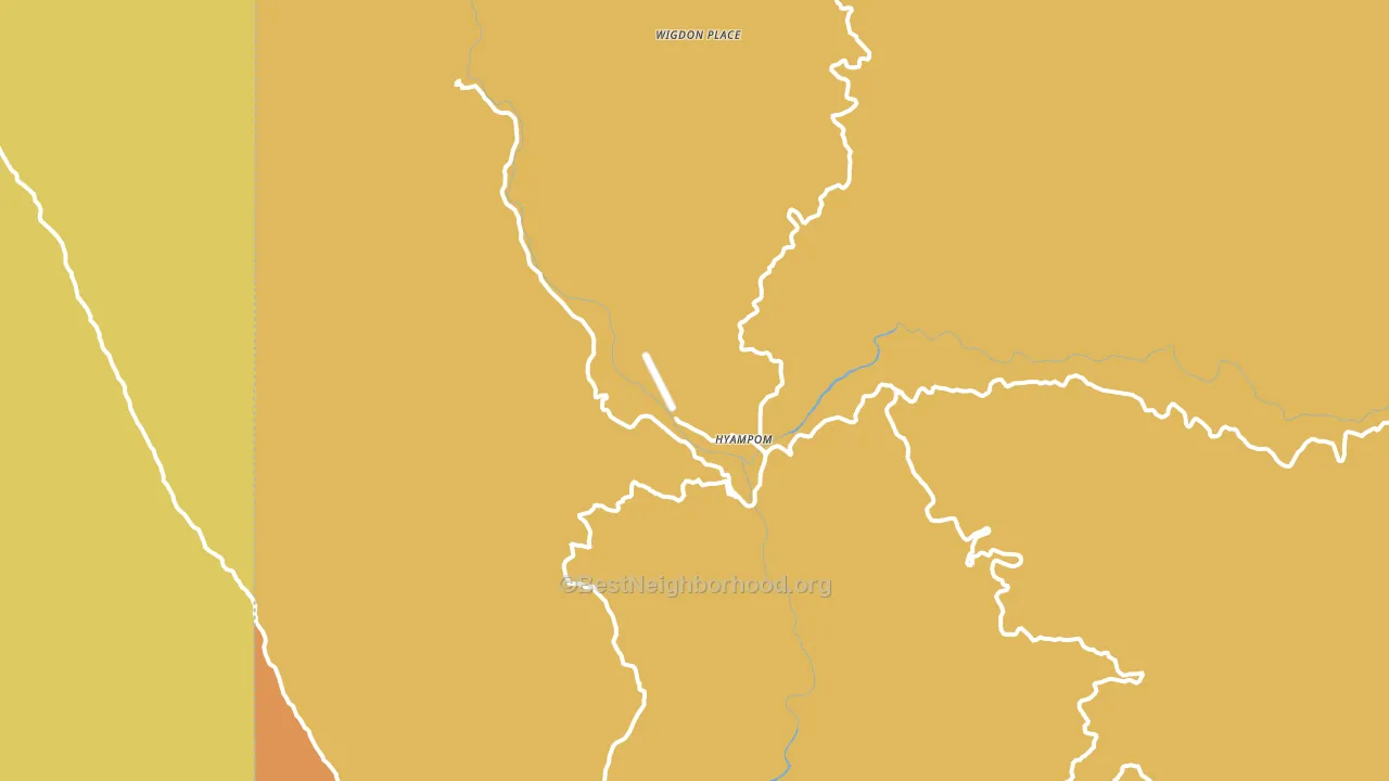
About 37% of adults in Hyampom typically vote, below the U.S. average of about 62%. Among adults in Hyampom, ~15% vote Democratic, ~22% Republican, and ~63% don't vote. The map below shows estimated turnout by block group.
How Hyampom compares
Among cities within 25 miles, Hyampom leans more Republican than 13 of 16 neighbors.
Hyampom runs about 37 points more Republican than California as a whole. California leans Democratic overall, while Hyampom is one of the few Republican-leaning pockets.
Why Hyampom leans the way it does
This analysis examined 14,881 data points per city to find what predicts political lean and turnout. The items below are a few correlations that stood out for Hyampom, not a ranked or complete list of what matters most.
Rural areas vote Republican. About 3% of residents in Hyampom live in densely developed areas, about 54 points below the California average of 58%. Hyampom runs against the grain of California, a Republican-leaning pocket in a Democratic-leaning state.
Preventive-care access and voter turnout
Places with limited routine preventive-care access tend to turn out at a lower rate; Hyampom, CA sits in the bottom tenth nationally on this measure. Dental visits do not drive turnout; the rate reflects income, insurance, and healthcare access, which line up with who votes.
Why turnout in Hyampom looks the way it does
Renters vote less often than owners. About 64% of households in Hyampom rent, about 39 points above the U.S. average of 25%. High food insecurity lines up with lower turnout, and about 24% of adults in Hyampom report food insecurity, above 88% of cities. Learn more about the findings and methodology on the political spectrum map.
Nearby Cities
- Big Bar, CA R+8
- Dinsmore, CA R+16
- Mad River, CA R+20
- Burnt Ranch, CA R+11
- Bridgeville, CA R+19
- Hayfork, CA R+7
- Ruth, CA R+19
- Forest Glen, CA R+9
- Peanut, CA R+4
- Salyer, CA R+9
Cities with Similar Populations
- Robinwood, MS R+59
- Ladelle, AR R+61
- Lamberton, NY R+15
- Chulafinnee, AL R+83
- Rosemary, MS D+14
- Clarksville, NH R+36
- Rainsville, NM D+15
- Reads Landing, MN R+23
- Sawyerville, IL R+44
- Salona, PA R+61
Sources and methodology
Precinct-level voting records used to fit the model come from California Secretary of State, Elections, distributed by the Voting and Election Science Team. Demographic inputs come from the U.S. Census Bureau (ACS 5-year estimates and the 2020 Decennial Census). Health and environmental inputs come from the CDC (PLACES and the Environmental Justice Index). Land cover comes from the USGS and EPA. Election-day and lead-up weather come from PRISM 4km daily grids and the NOAA Global Historical Climatology Network. Mail-voting and election-administration patterns come from the MIT Election Lab's Survey of the Performance of American Elections. Block-group crime detail comes from CrimeGrade. Internet data and modeling support provided by ISPreports.org.
Modeling and analysis by the BestNeighborhood data science team. Full methodology and findings: political spectrum map.
Methodology reviewed by the BestNeighborhood data team. Last updated May 2026.