Iron County is a Republican stronghold. About 20% of voters here vote Democratic and 80% Republican.
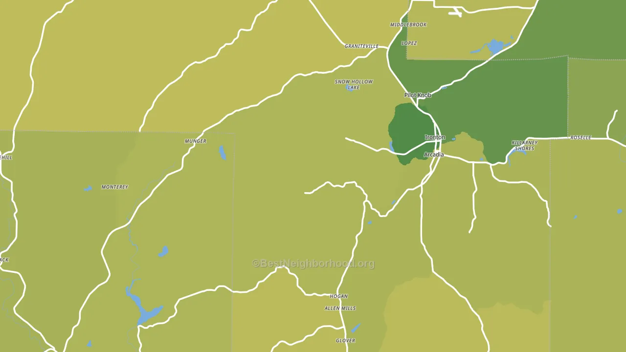
About 71% of adults in Iron County typically vote, above the U.S. average of about 62%. Among adults in Iron County, ~14% vote Democratic, ~57% Republican, and ~29% don't vote. The map below shows estimated turnout by block group.
How Iron County compares
Among counties within 50 miles, Iron County leans more Republican than 2 of 11 neighbors.
Iron County runs about 41 points more Republican than Missouri as a whole.
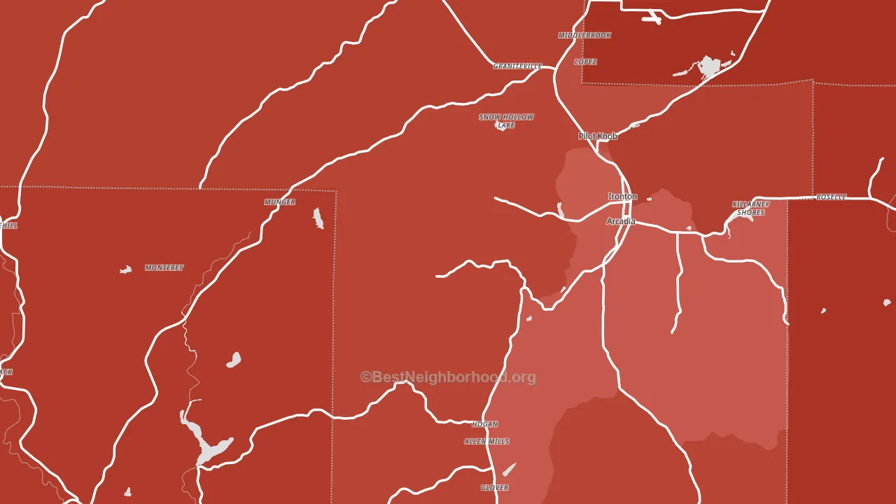
Politics vary noticeably by city within Iron County. The northwest side is the most Republican-leaning (R+67) and the east side is the least Republican-leaning (R+54), a spread of about 13 points.
Why Iron County leans the way it does
This analysis examined 14,881 data points per county to find what predicts political lean and turnout. The items below are a few correlations that stood out for Iron County, not a ranked or complete list of what matters most.
Rural areas vote Republican. About 8% of residents in Iron County live in densely developed areas, about 13 points below the Missouri average of 22%. A high white share with below-average college attainment predicts Republican voting, and Iron County fits that profile on both counts.
Paved land cover and Republican lean
Places with little paved surface tend to lean Republican; Iron County, MO sits in the bottom quarter nationally on this measure. Paved ground does not change how people vote; it mostly reflects how urban and built-up a place is.
Why turnout in Iron County looks the way it does
Turnout in Iron County sits close to the national pattern. Learn more about the findings and methodology on the political spectrum map.
Nearby Counties
- St. Francois County, MO R+48
- Reynolds County, MO R+67
- Madison County, MO R+63
- Washington County, MO R+63
- Wayne County, MO R+68
- Ste. Genevieve County, MO R+55
- Bollinger County, MO R+70
- Carter County, MO R+71
- Dent County, MO R+65
- Crawford County, MO R+61
Counties with Similar Populations
- Benewah County, ID R+60
- Yellow Medicine County, MN R+47
- Brewster County, TX R+12
- McCormick County, SC R+5
- Greenlee County, AZ R+45
- Wilkes County, GA R+13
- Chattahoochee County, GA R+14
- Brown County, KS R+42
- Linn County, KS R+61
- Humboldt County, IA R+43
Sources and methodology
Precinct-level voting records used to fit the model come from Missouri Secretary of State, Elections, distributed by the Voting and Election Science Team. Demographic inputs come from the U.S. Census Bureau (ACS 5-year estimates and the 2020 Decennial Census). Health and environmental inputs come from the CDC (PLACES and the Environmental Justice Index). Land cover comes from the USGS and EPA. Election-day and lead-up weather come from PRISM 4km daily grids and the NOAA Global Historical Climatology Network. Mail-voting and election-administration patterns come from the MIT Election Lab's Survey of the Performance of American Elections. Block-group crime detail comes from CrimeGrade. Internet data and modeling support provided by ISPreports.org.
Modeling and analysis by the BestNeighborhood data science team. Full methodology and findings: political spectrum map.
Methodology reviewed by the BestNeighborhood data team. Last updated May 2026.