Iroquois County leans heavily Republican by roughly 48 points: about 26% of voters vote Democratic and 74% Republican.
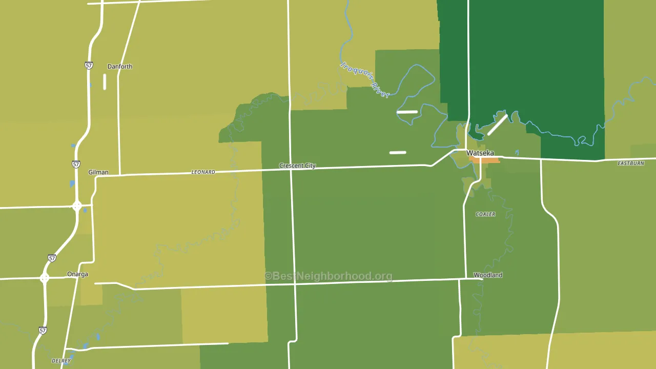
About 70% of adults in Iroquois County typically vote, above the U.S. average of about 62%. Among adults in Iroquois County, ~18% vote Democratic, ~52% Republican, and ~30% don't vote. The map below shows estimated turnout by block group.
How Iroquois County compares
Among counties within 50 miles, Iroquois County leans more Republican than 6 of 10 neighbors.
Iroquois County runs about 59 points more Republican than Illinois as a whole. Illinois leans Democratic overall, while Iroquois County is one of the few Republican-leaning pockets.
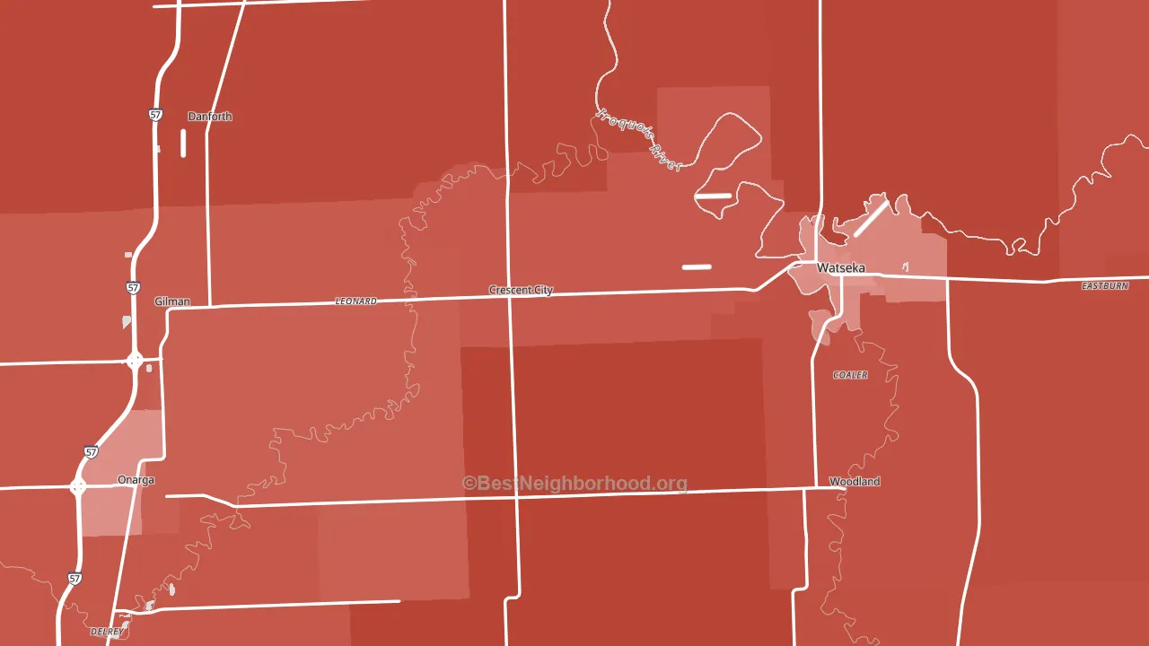
Politics vary noticeably by city within Iroquois County. The south side is the most Republican-leaning (R+64) and the east side is the least Republican-leaning (R+36), a spread of about 28 points.
Why Iroquois County leans the way it does
This analysis examined 14,881 data points per county to find what predicts political lean and turnout. The items below are a few correlations that stood out for Iroquois County, not a ranked or complete list of what matters most.
Iroquois County votes against the grain of Illinois. Illinois leans Democratic overall, while Iroquois County runs about 59 points more Republican.
Housing overcrowding and voter turnout
Places with low overcrowding tend to turn out at a higher rate; Iroquois County, IL sits in the bottom quarter nationally on this measure.
Why turnout in Iroquois County looks the way it does
Homeowners vote more often than renters. About 81% of households in Iroquois County own their home, about 6 points above the U.S. average of 75%. Learn more about the findings and methodology on the political spectrum map.
Nearby Counties
- Ford County, IL R+40
- Kankakee County, IL R+9
- Newton County, IN R+54
- Benton County, IN R+49
- Livingston County, IL R+38
- Warren County, IN R+58
- Jasper County, IN R+50
- Vermilion County, IL R+22
- Grundy County, IL R+26
- Champaign County, IL D+29
Counties with Similar Populations
- Pike County, OH R+58
- Toombs County, GA R+34
- Cibola County, NM D+10
- West Baton Rouge Parish, LA R+9
- San Miguel County, NM D+24
- Caddo County, OK R+54
- Mineral County, WV R+58
- McDonough County, IL R+11
- Union County, SC R+28
- Fluvanna County, VA R+16
Sources and methodology
Precinct-level voting records used to fit the model come from Illinois State Board of Elections, distributed by the Voting and Election Science Team. Demographic inputs come from the U.S. Census Bureau (ACS 5-year estimates and the 2020 Decennial Census). Health and environmental inputs come from the CDC (PLACES and the Environmental Justice Index). Land cover comes from the USGS and EPA. Election-day and lead-up weather come from PRISM 4km daily grids and the NOAA Global Historical Climatology Network. Mail-voting and election-administration patterns come from the MIT Election Lab's Survey of the Performance of American Elections. Block-group crime detail comes from CrimeGrade. Internet data and modeling support provided by ISPreports.org.
Modeling and analysis by the BestNeighborhood data science team. Full methodology and findings: political spectrum map.
Methodology reviewed by the BestNeighborhood data team. Last updated May 2026.