Newton County is a Republican stronghold. About 23% of voters here vote Democratic and 77% Republican.
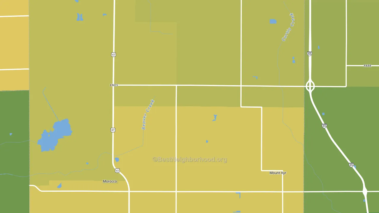
About 66% of adults in Newton County typically vote, near the U.S. average of about 62%. Among adults in Newton County, ~15% vote Democratic, ~51% Republican, and ~34% don't vote. The map below shows estimated turnout by block group.
How Newton County compares
Among counties within 50 miles, Newton County leans more Republican than 10 of 11 neighbors.
Newton County runs about 35 points more Republican than Indiana as a whole.
Politics vary noticeably by city within Newton County. The northwest side is the most Republican-leaning (R+59) and the south side is the least Republican-leaning (R+45), a spread of about 14 points.
Why Newton County leans the way it does
This analysis examined 14,881 data points per county to find what predicts political lean and turnout. The items below are a few correlations that stood out for Newton County, not a ranked or complete list of what matters most.
Areas with low college attainment vote Republican. About 15% of adults in Newton County hold a bachelor's degree, about 7 points below the Indiana average of 22%. A high family-household share predicts Republican voting, and about 73% of households in Newton County are family households, above 91% of counties.
Homeownership and voter turnout
Places with homeowner-heavy households tend to turn out at a higher rate; Newton County, IN sits in the top quarter nationally on this measure.
Why turnout in Newton County looks the way it does
Homeowners vote more often than renters. About 82% of households in Newton County own their home, about 6 points above the U.S. average of 75%. Learn more about the findings and methodology on the political spectrum map.
Nearby Counties
- Jasper County, IN R+50
- Kankakee County, IL R+9
- Iroquois County, IL R+48
- Benton County, IN R+49
- White County, IN R+43
- Lake County, IN D+14
- Pulaski County, IN R+54
- Porter County, IN R+11
- Starke County, IN R+49
- Warren County, IN R+58
Counties with Similar Populations
- Madison County, VA R+34
- Morgan County, OH R+55
- White County, IL R+59
- Glacier County, MT D+32
- Walthall County, MS R+26
- Zapata County, TX R+7
- Washington County, IL R+53
- Murray County, OK R+59
- Winn Parish, LA R+44
- Converse County, WY R+66
Sources and methodology
Precinct-level voting records used to fit the model come from Indiana Secretary of State, Elections, distributed by the Voting and Election Science Team. Demographic inputs come from the U.S. Census Bureau (ACS 5-year estimates and the 2020 Decennial Census). Health and environmental inputs come from the CDC (PLACES and the Environmental Justice Index). Land cover comes from the USGS and EPA. Election-day and lead-up weather come from PRISM 4km daily grids and the NOAA Global Historical Climatology Network. Mail-voting and election-administration patterns come from the MIT Election Lab's Survey of the Performance of American Elections. Block-group crime detail comes from CrimeGrade. Internet data and modeling support provided by ISPreports.org.
Modeling and analysis by the BestNeighborhood data science team. Full methodology and findings: political spectrum map.
Methodology reviewed by the BestNeighborhood data team. Last updated May 2026.