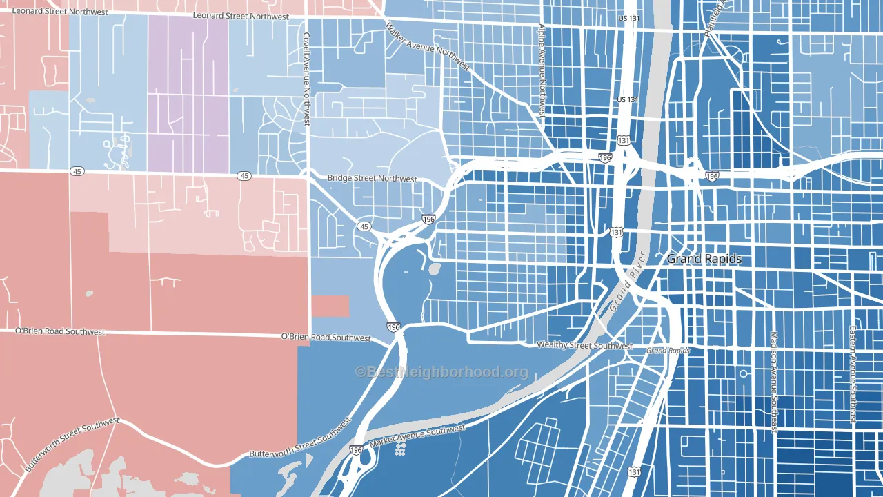
John Ball Park leans heavily Democratic by roughly 32 points: about 66% of voters vote Democratic and 34% Republican.
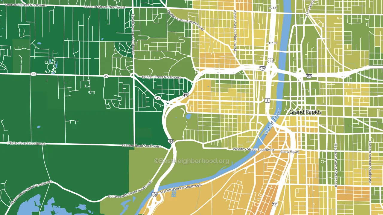
About 73% of adults in John Ball Park typically vote, above the U.S. average of about 62%. Among adults in John Ball Park, ~48% vote Democratic, ~25% Republican, and ~27% don't vote. The map below shows estimated turnout by block group.
How John Ball Park compares
Among neighborhoods within 5 miles, John Ball Park leans more Democratic than 2 of 19 neighbors.
John Ball Park runs about 33 points more Democratic than Michigan as a whole. Michigan is roughly evenly split, and John Ball Park sits clearly on the Democratic side.
Politics vary noticeably by block within John Ball Park. The northeast side is the most Democratic-leaning (D+44) and the west side is the least Democratic-leaning (D+16), a spread of about 28 points.
Why John Ball Park leans the way it does
This analysis examined 14,881 data points per neighborhood to find what predicts political lean and turnout. The items below are a few correlations that stood out for John Ball Park, not a ranked or complete list of what matters most.
John Ball Park votes against the grain of Michigan. Michigan is roughly evenly split, while John Ball Park runs about 33 points more Democratic. A high never-married share predicts Democratic voting, and about 50% of adults in John Ball Park have never been married, above 81% of neighborhoods.
Cancer-screening access and voter turnout
Places with high colon-cancer-screening access tend to turn out at a higher rate; John Ball Park, Grand Rapids, MI sits above the national average on this measure. Cancer screening does not drive turnout; it reflects income, insurance, and healthcare access.
Why turnout in John Ball Park looks the way it does
Turnout in John Ball Park sits close to the national pattern. Routine healthcare access, homeownership, education, and food security all land near their national averages here. Learn more about the findings and methodology on the political spectrum map.
Nearby Neighborhoods
- Swan, Grand Rapids, MI D+45
- West Grand, Grand Rapids, MI D+33
- Heartside-Downtown, Grand Rapids, MI D+55
- Westside, Grand Rapids, MI D+7
- Roosevelt Park, Grand Rapids, MI D+39
- Belknap Lookout, Grand Rapids, MI D+50
- Heritage Hill, Grand Rapids, MI D+61
- South East Community, Grand Rapids, MI D+66
- Midtown-Grand Rapids, Grand Rapids, MI D+62
- East Hills, Grand Rapids, MI D+58
Neighborhoods with Similar Populations
- Washington Park, Hollywood, FL D+62
- Presidential Park, Riverside, CA D+5
- Mays Chapel Village, Mays Chapel, MD D+13
- Greek Track, Simi Valley, CA Even
- Washington Park, Milwaukee, WI D+68
- Northwest Everett, Everett, WA D+39
- Fairlane, Kansas City, MO D+58
- Palm Springs North, Hialeah, FL R+47
- Chadwick Manor, Woodlawn, MD D+59
- Como, Fort Worth, TX D+65
Sources and methodology
Precinct-level voting records used to fit the model come from Michigan Department of State, Elections, distributed by the Voting and Election Science Team. Demographic inputs come from the U.S. Census Bureau (ACS 5-year estimates and the 2020 Decennial Census). Health and environmental inputs come from the CDC (PLACES and the Environmental Justice Index). Land cover comes from the USGS and EPA. Election-day and lead-up weather come from PRISM 4km daily grids and the NOAA Global Historical Climatology Network. Mail-voting and election-administration patterns come from the MIT Election Lab's Survey of the Performance of American Elections. Block-group crime detail comes from CrimeGrade. Internet data and modeling support provided by ISPreports.org.
Modeling and analysis by the BestNeighborhood data science team. Full methodology and findings: political spectrum map.
Methodology reviewed by the BestNeighborhood data team. Last updated May 2026.