Johnson County leans heavily Republican by roughly 34 points: about 33% of voters vote Democratic and 67% Republican.
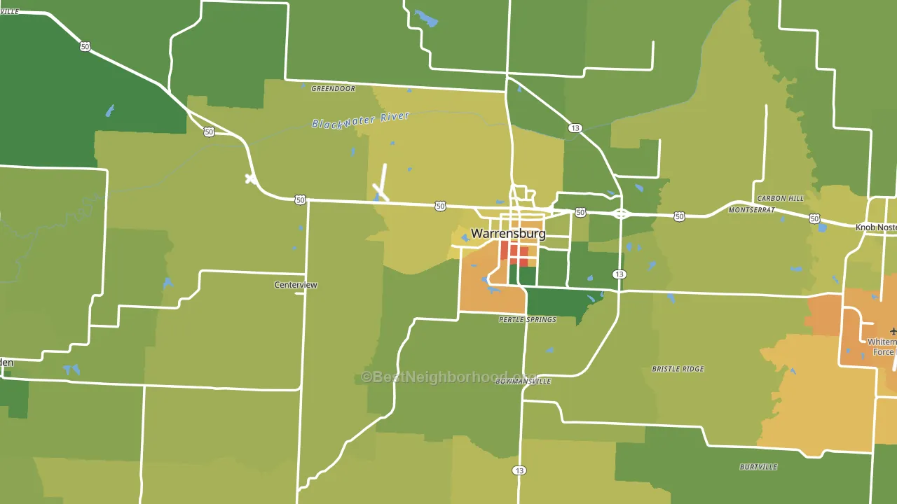
About 64% of adults in Johnson County typically vote, near the U.S. average of about 62%. Among adults in Johnson County, ~21% vote Democratic, ~43% Republican, and ~36% don't vote. The map below shows estimated turnout by block group.
How Johnson County compares
Among counties within 50 miles, Johnson County leans more Republican than 2 of 11 neighbors.
Johnson County runs about 17 points more Republican than Missouri as a whole.
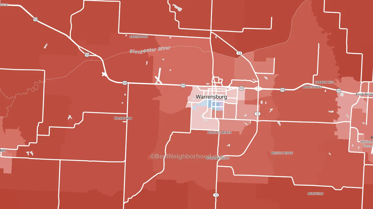
Politics vary noticeably by city within Johnson County. The northwest side is the most Republican-leaning (R+58) and the east side is the least Republican-leaning (R+37), a spread of about 21 points.
Why Johnson County leans the way it does
Density, race composition, education, and family structure all sit close to their national averages in Johnson County. The lean here lands roughly where demographic data alone would predict.
Adult arthritis and voter turnout
Places with a low adult-arthritis rate tend to turn out at a higher rate; Johnson County, MO sits in the bottom quarter nationally on this measure. Arthritis does not drive turnout; it reflects the age and health profile of an area.
Why turnout in Johnson County looks the way it does
Areas with high high-school completion turn out at higher rates. About 94% of adults in Johnson County have completed high school, above 81% of counties. Learn more about the findings and methodology on the political spectrum map.
Nearby Counties
- Lafayette County, MO R+51
- Henry County, MO R+54
- Pettis County, MO R+43
- Cass County, MO R+32
- Saline County, MO R+36
- Jackson County, MO D+24
- Benton County, MO R+60
- Ray County, MO R+53
- Bates County, MO R+60
- Carroll County, MO R+61
Counties with Similar Populations
- Pulaski County, MO R+36
- Watauga County, NC D+6
- Washington County, VA R+52
- Saline County, KS R+26
- Dickson County, TN R+55
- Elko County, NV R+46
- Franklin County, VA R+46
- Coffee County, AL R+46
- Boone County, IL R+15
- Roane County, TN R+57
Sources and methodology
Precinct-level voting records used to fit the model come from Missouri Secretary of State, Elections, distributed by the Voting and Election Science Team. Demographic inputs come from the U.S. Census Bureau (ACS 5-year estimates and the 2020 Decennial Census). Health and environmental inputs come from the CDC (PLACES and the Environmental Justice Index). Land cover comes from the USGS and EPA. Election-day and lead-up weather come from PRISM 4km daily grids and the NOAA Global Historical Climatology Network. Mail-voting and election-administration patterns come from the MIT Election Lab's Survey of the Performance of American Elections. Block-group crime detail comes from CrimeGrade. Internet data and modeling support provided by ISPreports.org.
Modeling and analysis by the BestNeighborhood data science team. Full methodology and findings: political spectrum map.
Methodology reviewed by the BestNeighborhood data team. Last updated May 2026.