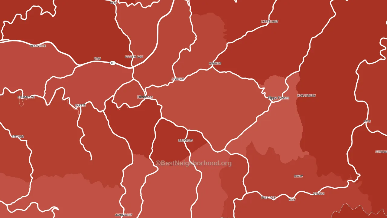
Knott County is a Republican stronghold. About 17% of voters here vote Democratic and 83% Republican.
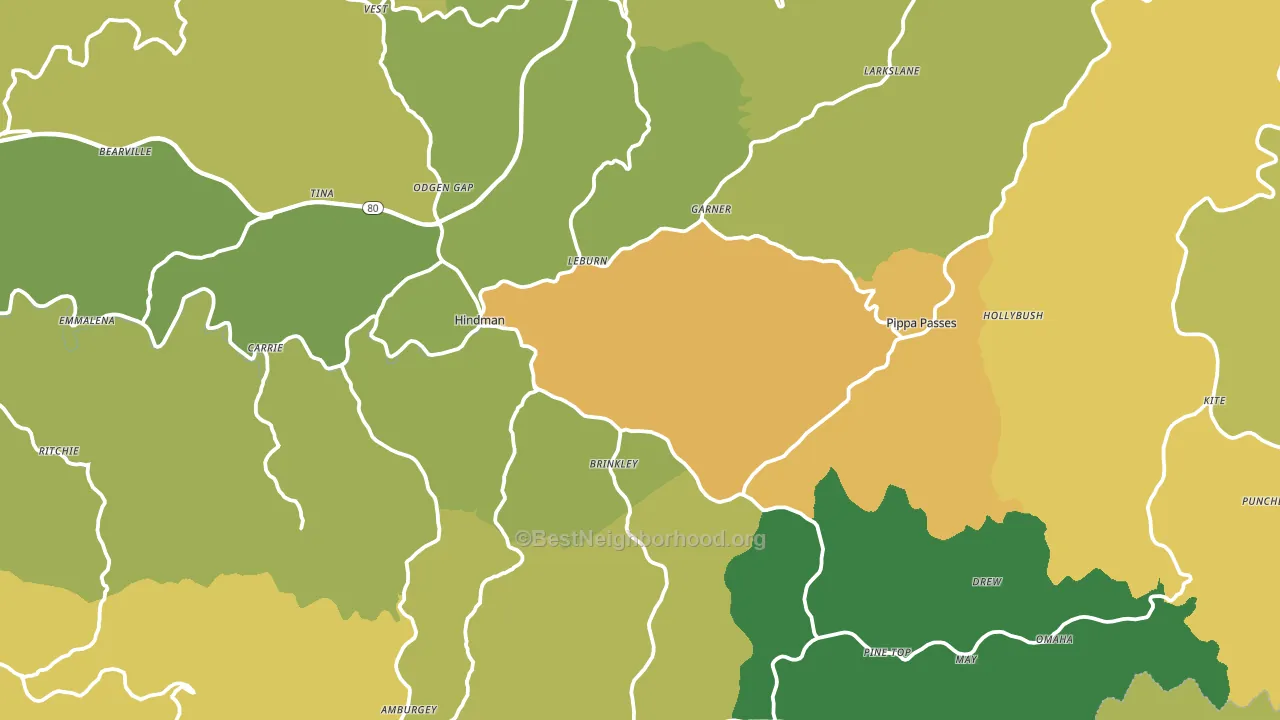
About 63% of adults in Knott County typically vote, near the U.S. average of about 62%. Among adults in Knott County, ~11% vote Democratic, ~52% Republican, and ~37% don't vote. The map below shows estimated turnout by block group.
How Knott County compares
Among counties within 50 miles, Knott County leans more Republican than 14 of 21 neighbors.
Knott County runs about 36 points more Republican than Kentucky as a whole.
Why Knott County leans the way it does
This analysis examined 14,881 data points per county to find what predicts political lean and turnout. The items below are a few correlations that stood out for Knott County, not a ranked or complete list of what matters most.
Rural areas with a high white share vote Republican. Knott County sits in the bottom quarter on density and about 97% of residents are non-Hispanic white, about 6 points above the Kentucky average of 91%. A high family-household share predicts Republican voting, and about 70% of households in Knott County are family households, above 81% of counties.
Population density and Republican lean
Places with low population density tend to lean Republican; Knott County, KY sits in the bottom quarter nationally on this measure.
Why turnout in Knott County looks the way it does
Turnout in Knott County sits close to the national pattern. Learn more about the findings and methodology on the political spectrum map.
Nearby Counties
- Letcher County, KY R+65
- Perry County, KY R+61
- Floyd County, KY R+61
- Breathitt County, KY R+62
- Leslie County, KY R+76
- Magoffin County, KY R+67
- Pike County, KY R+63
- Wise County, VA R+55
- Norton City, VA R+39
- Dickenson County, VA R+66
Counties with Similar Populations
- Nantucket County, MA D+23
- Clay County, AL R+65
- Saline County, NE R+38
- Smith County, MS R+59
- Choctaw County, OK R+54
- Hardy County, WV R+61
- Franklin County, ID R+77
- Gulf County, FL R+56
- Cedar County, MO R+65
- Rusk County, WI R+38
Sources and methodology
Precinct-level voting records used to fit the model come from Kentucky State Board of Elections, distributed by the Voting and Election Science Team. Demographic inputs come from the U.S. Census Bureau (ACS 5-year estimates and the 2020 Decennial Census). Health and environmental inputs come from the CDC (PLACES and the Environmental Justice Index). Land cover comes from the USGS and EPA. Election-day and lead-up weather come from PRISM 4km daily grids and the NOAA Global Historical Climatology Network. Mail-voting and election-administration patterns come from the MIT Election Lab's Survey of the Performance of American Elections. Block-group crime detail comes from CrimeGrade. Internet data and modeling support provided by ISPreports.org.
Modeling and analysis by the BestNeighborhood data science team. Full methodology and findings: political spectrum map.
Methodology reviewed by the BestNeighborhood data team. Last updated May 2026.