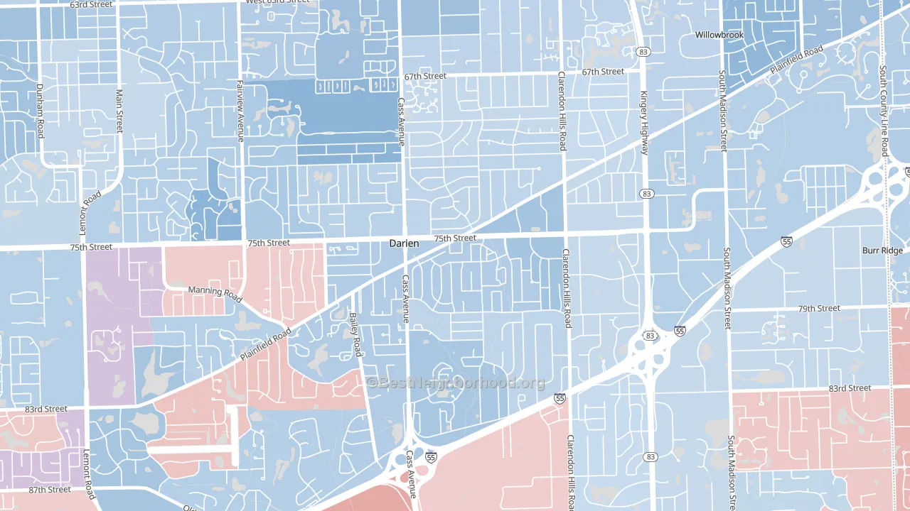
Lace leans slightly Democratic by roughly 6 points: about 53% of voters vote Democratic and 47% Republican.
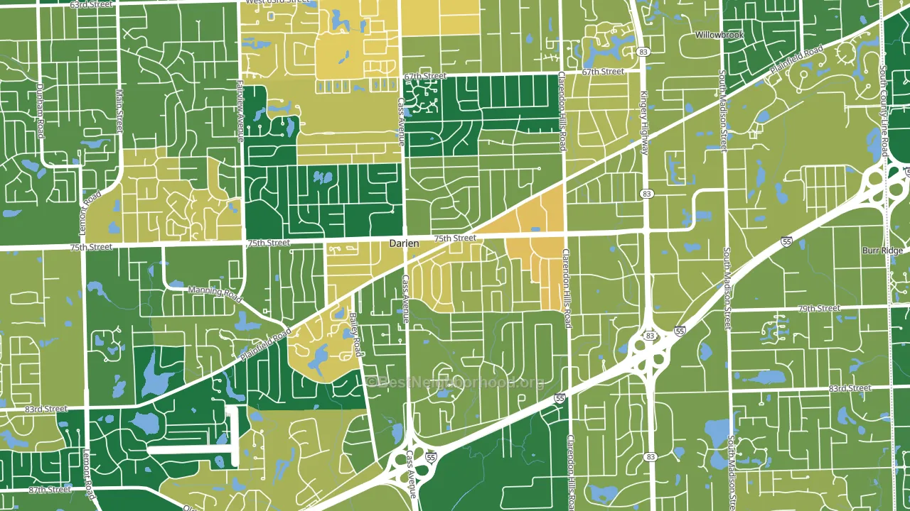
About 70% of adults in Lace typically vote, above the U.S. average of about 62%. Among adults in Lace, ~37% vote Democratic, ~33% Republican, and ~30% don't vote. The map below shows estimated turnout by block group.
How Lace compares
Lace runs about 5 points more Republican than Illinois as a whole.
Politics vary noticeably by block within Lace. The east side runs the most Democratic (D+11) and the southwest side runs the most Republican (Even), a spread of about 11 points.
Why Lace leans the way it does
This analysis examined 14,881 data points per neighborhood to find what predicts political lean and turnout. The items below are a few correlations that stood out for Lace, not a ranked or complete list of what matters most.
Density pulls a place toward Democrats and a high white share pulls it toward Republicans. In Lace the two roughly cancel.
Developed land and Democratic lean
Places with a heavily developed built environment tend to lean Democratic; Lace, Darien, IL sits in the top quarter nationally on this measure. Developed land does not change how people vote; it mostly reflects how urban a place is.
Why turnout in Lace looks the way it does
Turnout in Lace sits close to the national pattern. Routine healthcare access, homeownership, education, and food security all land near their national averages here. Learn more about the findings and methodology on the political spectrum map.
Nearby Neighborhoods
- Belmont, Downers Grove, IL D+19
- Yorkfield, Elmhurst, IL D+16
- Garfield Ridge, Chicago, IL Even
- Clearing, Chicago, IL D+6
- Archer Limits, Chicago, IL D+36
- West Lawn, Chicago, IL D+32
- Edmund F Burton, Oak Park, IL D+75
- Samuel A Rothermel, Oak Park, IL D+73
- Clarkdale, Chicago, IL D+48
- West Elsdon, Chicago, IL D+28
Neighborhoods with Similar Populations
- Crestwood, Tuckahoe, NY D+5
- Terra del Sol, Tucson, AZ D+11
- Fairmont Park, Norfolk, VA D+63
- McKinley Avenue Corridor, Columbus, OH D+34
- Dam East-West, Aurora, CO D+36
- Belle Haven, Belle View, VA D+45
- Middlebury, Akron, OH D+42
- Village 9, Sacramento, CA D+33
- Vernon Hill, Worcester, MA D+30
- West Central Jackson, Jackson, MS D+87
Sources and methodology
Precinct-level voting records used to fit the model come from Illinois State Board of Elections, distributed by the Voting and Election Science Team. Demographic inputs come from the U.S. Census Bureau (ACS 5-year estimates and the 2020 Decennial Census). Health and environmental inputs come from the CDC (PLACES and the Environmental Justice Index). Land cover comes from the USGS and EPA. Election-day and lead-up weather come from PRISM 4km daily grids and the NOAA Global Historical Climatology Network. Mail-voting and election-administration patterns come from the MIT Election Lab's Survey of the Performance of American Elections. Block-group crime detail comes from CrimeGrade. Internet data and modeling support provided by ISPreports.org.
Modeling and analysis by the BestNeighborhood data science team. Full methodology and findings: political spectrum map.
Methodology reviewed by the BestNeighborhood data team. Last updated May 2026.