Mabury Park leans Democratic by roughly 20 points: about 60% of voters vote Democratic and 40% Republican.
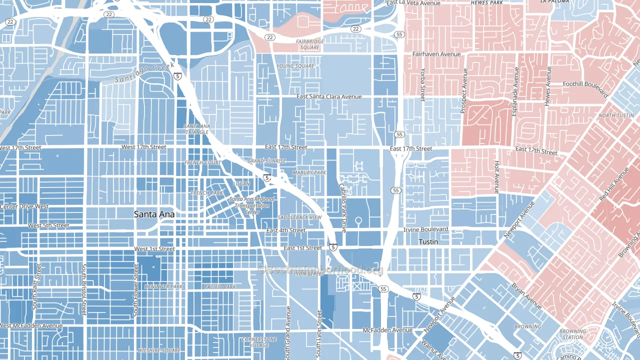
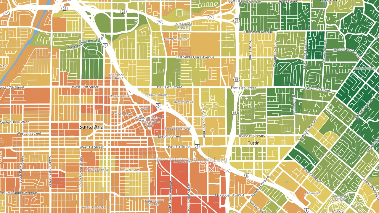
About 43% of adults in Mabury Park typically vote, below the U.S. average of about 62%. Among adults in Mabury Park, ~26% vote Democratic, ~17% Republican, and ~57% don't vote. The map below shows estimated turnout by block group.
How Mabury Park compares
Among neighborhoods within 5 miles, Mabury Park leans more Democratic than 6 of 33 neighbors.
Politically, Mabury Park sits close to the rest of California.
Why Mabury Park leans the way it does
This analysis examined 14,881 data points per neighborhood to find what predicts political lean and turnout. The items below are a few correlations that stood out for Mabury Park, not a ranked or complete list of what matters most.
Dense areas vote Democratic. More than 99% of residents in Mabury Park live in densely developed areas, about 64 points above the U.S. average of 36%. A high never-married share predicts Democratic voting, and about 46% of adults in Mabury Park have never been married, above 76% of neighborhoods.
Population density and Democratic lean
Places with high population density tend to lean Democratic; Mabury Park, Santa Ana, CA sits in the top quarter nationally on this measure.
Why turnout in Mabury Park looks the way it does
Crowded housing lines up with lower turnout. About 10% of homes in Mabury Park have more than one occupant per room, above 92% of neighborhoods. Renters vote less often than owners, and about 63% of households in Mabury Park rent, about 38 points above the U.S. average of 25%. Learn more about the findings and methodology on the political spectrum map.
Nearby Neighborhoods
- Meredith Parkwood, Santa Ana, CA D+13
- Lyon Street, Santa Ana, CA D+31
- Lacy, Santa Ana, CA D+31
- Park Santiago, Santa Ana, CA D+22
- Eastside Santa Ana, Santa Ana, CA D+33
- Cornerstone Village, Santa Ana, CA D+29
- Floral Park, Santa Ana, CA D+26
- Henninger Park, Santa Ana, CA D+32
- Washington Square, Santa Ana, CA D+24
- Flower Park, Santa Ana, CA D+20
Neighborhoods with Similar Populations
- Downtown Kent, Kent, OH D+29
- Arlington Heights, Milwaukee, WI D+88
- Howland Hook, Staten Island, NY D+58
- Ghent, Norfolk, VA D+49
- Oakland-Winchell, Kalamazoo, MI D+46
- Hubbell, Pasadena, TX R+5
- Durrs Homeowners, Fort Lauderdale, FL D+80
- South Pointe, San Bernardino, CA D+13
- Ybor City, Tampa, FL D+48
- Tarpon River, Fort Lauderdale, FL D+4
Sources and methodology
Precinct-level voting records used to fit the model come from California Secretary of State, Elections, distributed by the Voting and Election Science Team. Demographic inputs come from the U.S. Census Bureau (ACS 5-year estimates and the 2020 Decennial Census). Health and environmental inputs come from the CDC (PLACES and the Environmental Justice Index). Land cover comes from the USGS and EPA. Election-day and lead-up weather come from PRISM 4km daily grids and the NOAA Global Historical Climatology Network. Mail-voting and election-administration patterns come from the MIT Election Lab's Survey of the Performance of American Elections. Block-group crime detail comes from CrimeGrade. Internet data and modeling support provided by ISPreports.org.
Modeling and analysis by the BestNeighborhood data science team. Full methodology and findings: political spectrum map.
Methodology reviewed by the BestNeighborhood data team. Last updated May 2026.