Marin County leans heavily Democratic by roughly 48 points: about 74% of voters vote Democratic and 26% Republican.
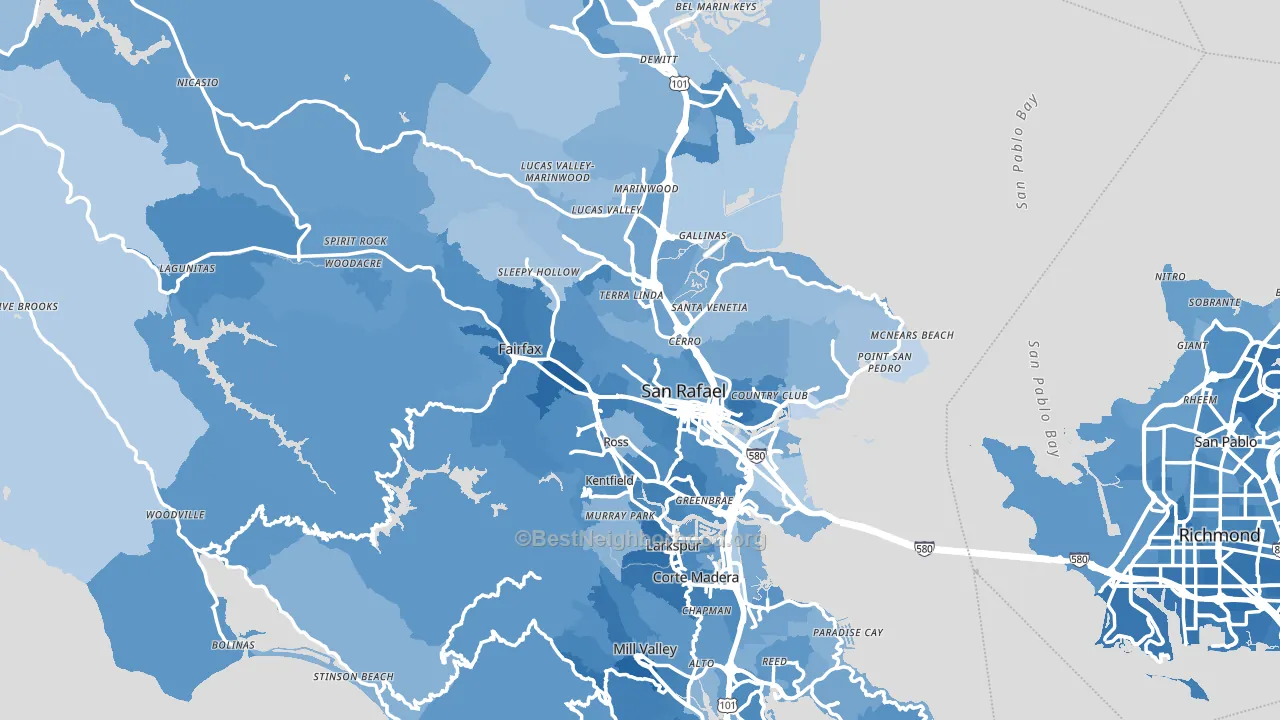
About 74% of adults in Marin County typically vote, above the U.S. average of about 62%. Among adults in Marin County, ~55% vote Democratic, ~19% Republican, and ~26% don't vote. The map below shows estimated turnout by block group.
How Marin County compares
Among counties within 50 miles, Marin County leans more Democratic than 5 of 7 neighbors.
Marin County runs about 28 points more Democratic than California as a whole.
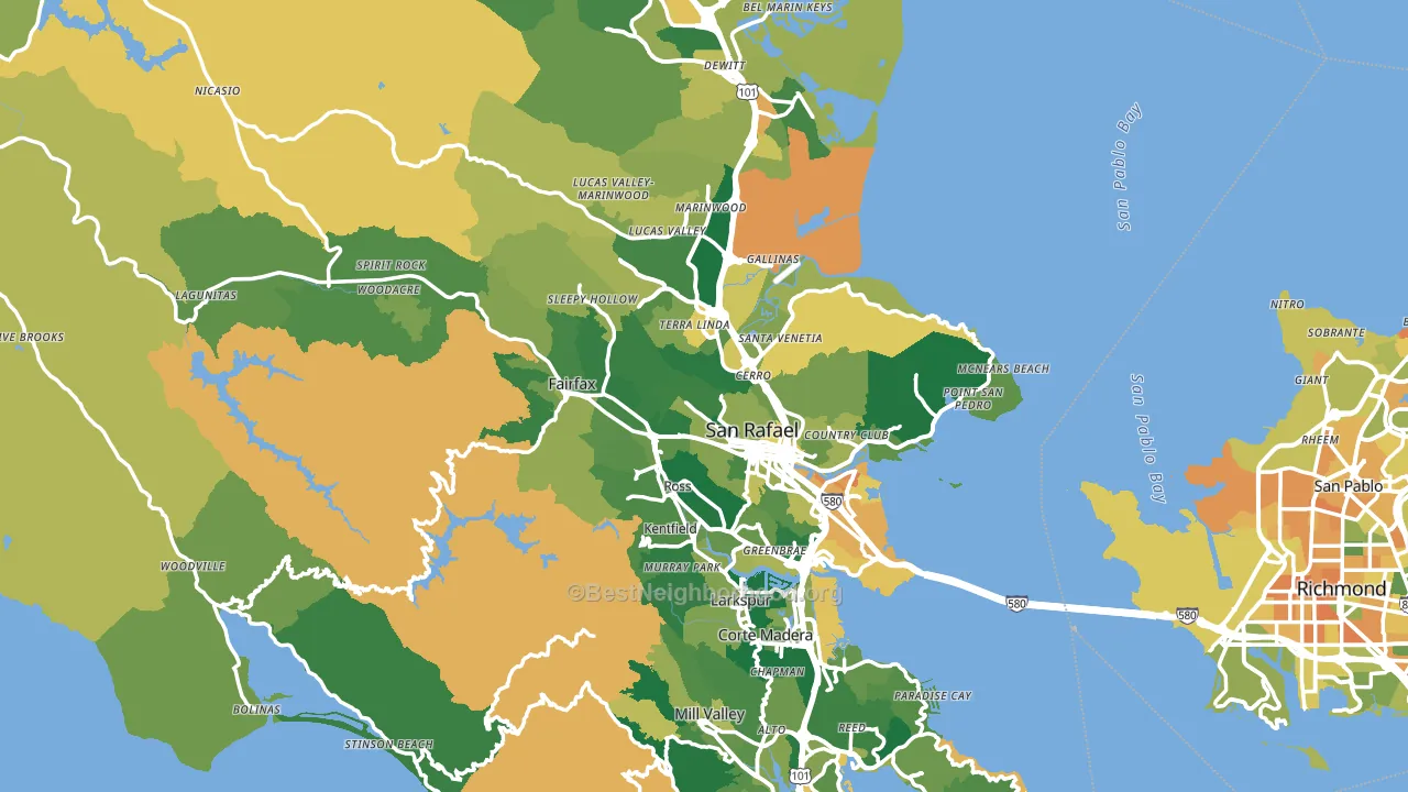
Politics vary noticeably by city within Marin County. The west side is the most Democratic-leaning (D+65) and the northeast side is the least Democratic-leaning (D+35), a spread of about 31 points.
Why Marin County leans the way it does
This analysis examined 14,881 data points per county to find what predicts political lean and turnout. The items below are a few correlations that stood out for Marin County, not a ranked or complete list of what matters most.
Areas with high college attainment vote Democratic. About 60% of adults in Marin County hold a bachelor's degree, about 32 points above the U.S. average of 28%. Dense areas vote Democratic, and Marin County sits in the top fifth on density (about 71%, above 91% of counties).
Population density and Democratic lean
Places with high population density tend to lean Democratic; Marin County, CA sits in the top tenth nationally on this measure.
Why turnout in Marin County looks the way it does
Areas with strong routine healthcare access turn out at higher rates. Marin County is in the top quarter nationally for routine-care measures such as insurance coverage, preventive screenings, and dental visits. The dental-visit rate here is about 73%, about 13 points above the U.S. average of 60%. Learn more about the findings and methodology on the political spectrum map.
Nearby Counties
- San Francisco County, CA D+61
- Napa County, CA D+32
- Contra Costa County, CA D+36
- Sonoma County, CA D+42
- Alameda County, CA D+49
- Solano County, CA D+21
- San Mateo County, CA D+48
- Santa Clara County, CA D+32
- Yolo County, CA D+35
- San Joaquin County, CA D+4
Counties with Similar Populations
- Weber County, UT R+21
- Kalamazoo County, MI D+17
- Harford County, MD R+4
- McLennan County, TX R+19
- St. Tammany Parish, LA R+35
- Cumberland County, PA R+9
- Madison County, IL R+11
- Cherokee County, GA R+33
- Webb County, TX Even
- St. Clair County, IL D+13
Sources and methodology
Precinct-level voting records used to fit the model come from California Secretary of State, Elections, distributed by the Voting and Election Science Team. Demographic inputs come from the U.S. Census Bureau (ACS 5-year estimates and the 2020 Decennial Census). Health and environmental inputs come from the CDC (PLACES and the Environmental Justice Index). Land cover comes from the USGS and EPA. Election-day and lead-up weather come from PRISM 4km daily grids and the NOAA Global Historical Climatology Network. Mail-voting and election-administration patterns come from the MIT Election Lab's Survey of the Performance of American Elections. Block-group crime detail comes from CrimeGrade. Internet data and modeling support provided by ISPreports.org.
Modeling and analysis by the BestNeighborhood data science team. Full methodology and findings: political spectrum map.
Methodology reviewed by the BestNeighborhood data team. Last updated May 2026.