Nicholas County is a Republican stronghold. About 20% of voters here vote Democratic and 80% Republican.
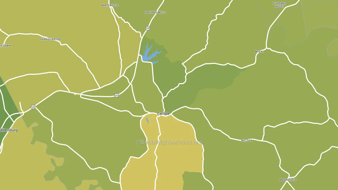
About 66% of adults in Nicholas County typically vote, near the U.S. average of about 62%. Among adults in Nicholas County, ~13% vote Democratic, ~53% Republican, and ~34% don't vote. The map below shows estimated turnout by block group.
How Nicholas County compares
Among counties within 50 miles, Nicholas County leans more Republican than 14 of 27 neighbors.
Nicholas County runs about 29 points more Republican than Kentucky as a whole.
Why Nicholas County leans the way it does
This analysis examined 14,881 data points per county to find what predicts political lean and turnout. The items below are a few correlations that stood out for Nicholas County, not a ranked or complete list of what matters most.
Areas with a high white share and below-average college attainment vote Republican. In Nicholas County, about 95% of residents are non-Hispanic white, about 23 points above the U.S. average of 72%; about 10% of adults hold a bachelor's degree, about 9 points below the Kentucky average of 19%. Rural areas vote Republican, and Nicholas County sits in the bottom quarter on density (about 8%, below 88% of counties).
Walkability and Republican lean
Places with a low walkability score tend to lean Republican; Nicholas County, KY sits in the bottom tenth nationally on this measure. A walkable street grid does not change how people vote; it mostly reflects how urban a place is.
Why turnout in Nicholas County looks the way it does
Turnout in Nicholas County sits close to the national pattern. Learn more about the findings and methodology on the political spectrum map.
Nearby Counties
- Robertson County, KY R+61
- Bourbon County, KY R+37
- Harrison County, KY R+51
- Fleming County, KY R+61
- Bath County, KY R+61
- Montgomery County, KY R+52
- Mason County, KY R+42
- Clark County, KY R+39
- Bracken County, KY R+58
- Scott County, KY R+29
Counties with Similar Populations
- Cleveland County, AR R+69
- Grant County, SD R+52
- Doniphan County, KS R+58
- Dade County, MO R+67
- Marion County, GA R+29
- Monroe County, IA R+43
- Valley County, MT R+48
- Adair County, IA R+46
- Harney County, OR R+47
- Clay County, TN R+67
Sources and methodology
Precinct-level voting records used to fit the model come from Kentucky State Board of Elections, distributed by the Voting and Election Science Team. Demographic inputs come from the U.S. Census Bureau (ACS 5-year estimates and the 2020 Decennial Census). Health and environmental inputs come from the CDC (PLACES and the Environmental Justice Index). Land cover comes from the USGS and EPA. Election-day and lead-up weather come from PRISM 4km daily grids and the NOAA Global Historical Climatology Network. Mail-voting and election-administration patterns come from the MIT Election Lab's Survey of the Performance of American Elections. Block-group crime detail comes from CrimeGrade. Internet data and modeling support provided by ISPreports.org.
Modeling and analysis by the BestNeighborhood data science team. Full methodology and findings: political spectrum map.
Methodology reviewed by the BestNeighborhood data team. Last updated May 2026.