Marlboro County leans slightly Democratic by roughly 10 points: about 55% of voters vote Democratic and 45% Republican.
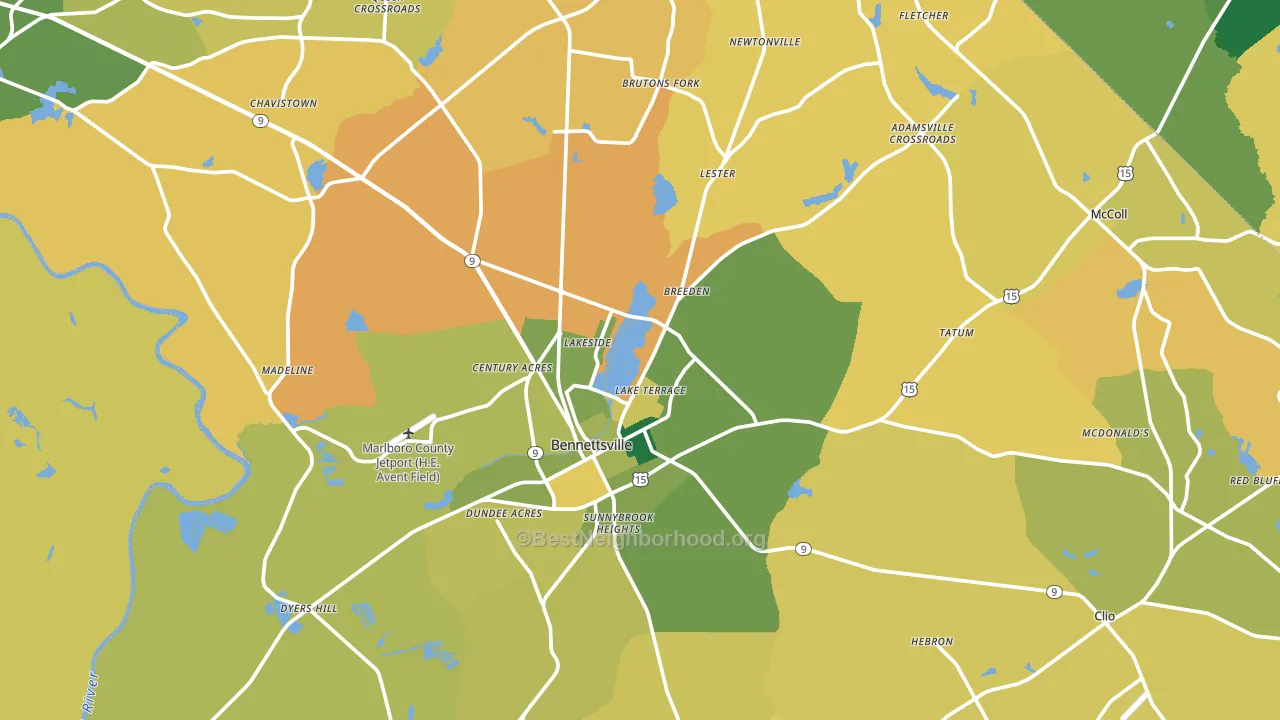
About 57% of adults in Marlboro County typically vote, near the U.S. average of about 62%. Among adults in Marlboro County, ~31% vote Democratic, ~26% Republican, and ~43% don't vote. The map below shows estimated turnout by block group.
How Marlboro County compares
Among counties within 50 miles, Marlboro County leans more Democratic than 10 of 12 neighbors.
Marlboro County runs about 27 points more Democratic than South Carolina as a whole. South Carolina leans Republican overall, while Marlboro County is one of the few Democratic-leaning pockets.
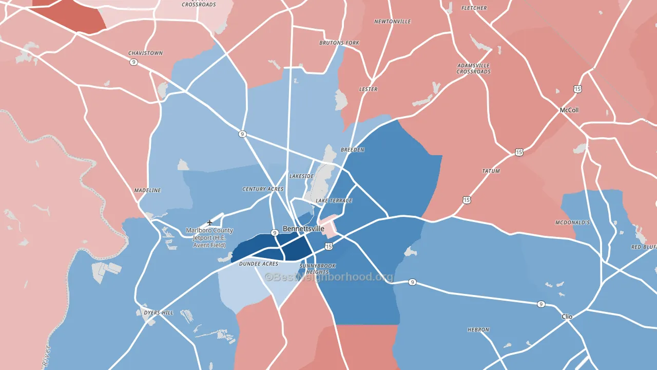
Politics vary noticeably by city within Marlboro County. The west side runs the most Democratic (D+39) and the northeast side runs the most Republican (R+29), a spread of about 68 points.
Why Marlboro County leans the way it does
This analysis examined 14,881 data points per county to find what predicts political lean and turnout. The items below are a few correlations that stood out for Marlboro County, not a ranked or complete list of what matters most.
Areas with many never-married adults vote Democratic. About 43% of adults in Marlboro County have never been married, well above similar-sized counties (around 25%). Marlboro County runs against the grain of South Carolina, a Democratic-leaning pocket in a Republican-leaning state.
High-school completion, uninsured rate, and voter turnout
Places that combine low high-school-completion share and a high uninsured rate tend to turn out at a lower rate, as Marlboro County, SC does.
Why turnout in Marlboro County looks the way it does
Areas with limited routine healthcare access turn out at lower rates. Marlboro County is in the bottom quarter nationally for routine-care measures such as insurance coverage, preventive screenings, and dental visits. The dental-visit rate here is about 49%, about 10 points below the South Carolina average of 58%. Renters vote less often than owners, and about 37% of households in Marlboro County rent, above 90% of counties. High food insecurity lines up with lower turnout, and about 33% of adults in Marlboro County report food insecurity, above 98% of counties. Learn more about the findings and methodology on the political spectrum map.
Nearby Counties
- Scotland County, NC D+2
- Richmond County, NC R+15
- Dillon County, SC R+5
- Chesterfield County, SC R+28
- Darlington County, SC R+8
- Robeson County, NC R+13
- Anson County, NC Even
- Florence County, SC Even
- Hoke County, NC D+7
- Marion County, SC D+17
Counties with Similar Populations
- Wasco County, OR R+14
- Geneva County, AL R+74
- Oceana County, MI R+28
- Carter County, KY R+61
- Boone County, IA R+24
- Juneau County, WI R+31
- Carroll County, OH R+55
- King George County, VA R+23
- Gillespie County, TX R+56
- Cass County, NE R+42
Sources and methodology
Precinct-level voting records used to fit the model come from South Carolina State Election Commission, distributed by the Voting and Election Science Team. Demographic inputs come from the U.S. Census Bureau (ACS 5-year estimates and the 2020 Decennial Census). Health and environmental inputs come from the CDC (PLACES and the Environmental Justice Index). Land cover comes from the USGS and EPA. Election-day and lead-up weather come from PRISM 4km daily grids and the NOAA Global Historical Climatology Network. Mail-voting and election-administration patterns come from the MIT Election Lab's Survey of the Performance of American Elections. Block-group crime detail comes from CrimeGrade. Internet data and modeling support provided by ISPreports.org.
Modeling and analysis by the BestNeighborhood data science team. Full methodology and findings: political spectrum map.
Methodology reviewed by the BestNeighborhood data team. Last updated May 2026.