Carter County is a Republican stronghold. About 19% of voters here vote Democratic and 81% Republican.
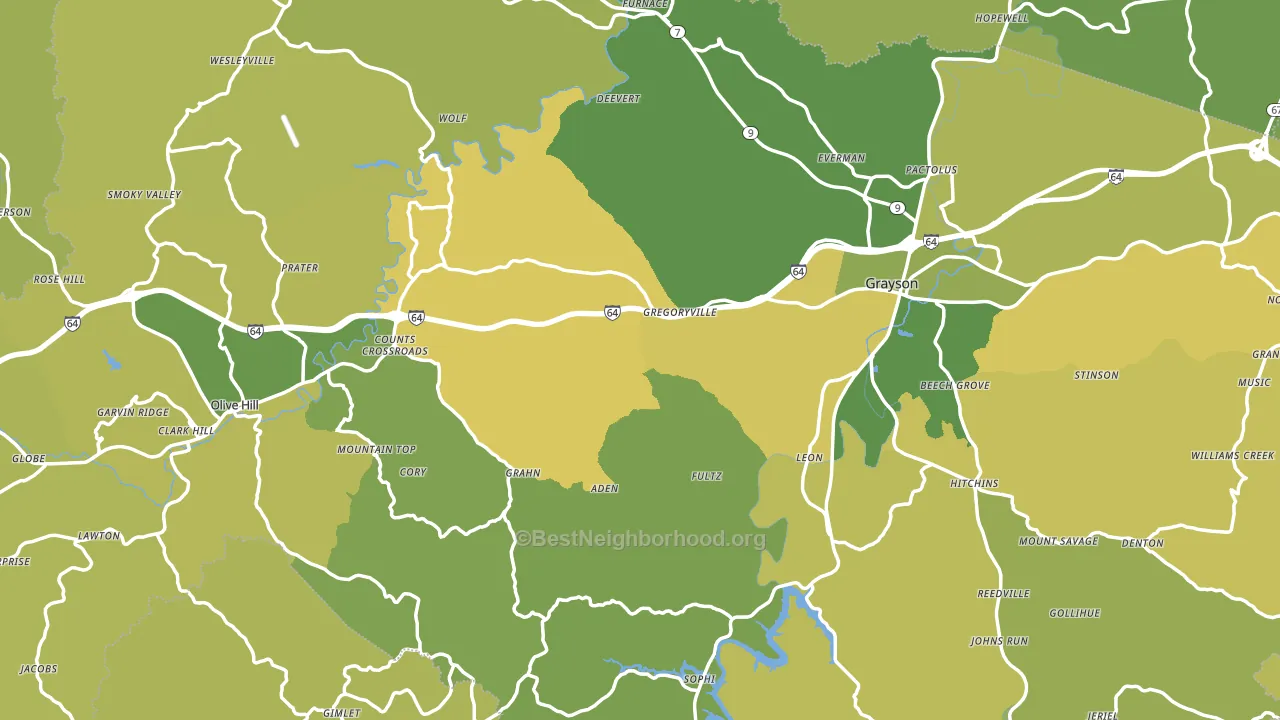
About 67% of adults in Carter County typically vote, near the U.S. average of about 62%. Among adults in Carter County, ~13% vote Democratic, ~54% Republican, and ~33% don't vote. The map below shows estimated turnout by block group.
How Carter County compares
Among counties within 50 miles, Carter County leans more Republican than 10 of 20 neighbors.
Carter County runs about 30 points more Republican than Kentucky as a whole.
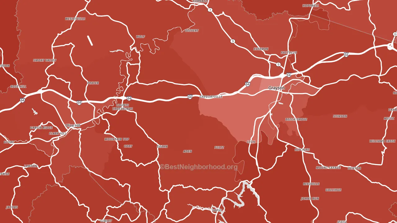
Politics vary noticeably by city within Carter County. The southeast side is the most Republican-leaning (R+69) and the north side is the least Republican-leaning (R+55), a spread of about 14 points.
Why Carter County leans the way it does
This analysis examined 14,881 data points per county to find what predicts political lean and turnout. The items below are a few correlations that stood out for Carter County, not a ranked or complete list of what matters most.
Areas with a high white share and below-average college attainment vote Republican. In Carter County, about 95% of residents are non-Hispanic white, about 23 points above the U.S. average of 72%; about 16% of adults hold a bachelor's degree, about 13 points below the U.S. average of 28%.
Never-married share, developed land, and voter turnout
Places that combine a low never-married share and a rural land-use pattern tend to turn out at a higher rate, as Carter County, KY does.
Why turnout in Carter County looks the way it does
Homeowners vote more often than renters. About 80% of households in Carter County own their home, about 5 points above the U.S. average of 75%. Learn more about the findings and methodology on the political spectrum map.
Nearby Counties
- Elliott County, KY R+57
- Greenup County, KY R+52
- Boyd County, KY R+38
- Rowan County, KY R+34
- Lewis County, KY R+66
- Lawrence County, KY R+67
- Wayne County, WV R+55
- Lawrence County, OH R+50
- Morgan County, KY R+64
- Scioto County, OH R+47
Counties with Similar Populations
- Cass County, NE R+42
- Geneva County, AL R+74
- Oceana County, MI R+28
- Marlboro County, SC D+9
- Wasco County, OR R+14
- Lewis County, NY R+48
- Ashe County, NC R+47
- Boone County, IA R+24
- Juneau County, WI R+31
- Carroll County, OH R+55
Sources and methodology
Precinct-level voting records used to fit the model come from Kentucky State Board of Elections, distributed by the Voting and Election Science Team. Demographic inputs come from the U.S. Census Bureau (ACS 5-year estimates and the 2020 Decennial Census). Health and environmental inputs come from the CDC (PLACES and the Environmental Justice Index). Land cover comes from the USGS and EPA. Election-day and lead-up weather come from PRISM 4km daily grids and the NOAA Global Historical Climatology Network. Mail-voting and election-administration patterns come from the MIT Election Lab's Survey of the Performance of American Elections. Block-group crime detail comes from CrimeGrade. Internet data and modeling support provided by ISPreports.org.
Modeling and analysis by the BestNeighborhood data science team. Full methodology and findings: political spectrum map.
Methodology reviewed by the BestNeighborhood data team. Last updated May 2026.