Montclair is a Democratic stronghold. About 85% of voters here vote Democratic and 15% Republican.

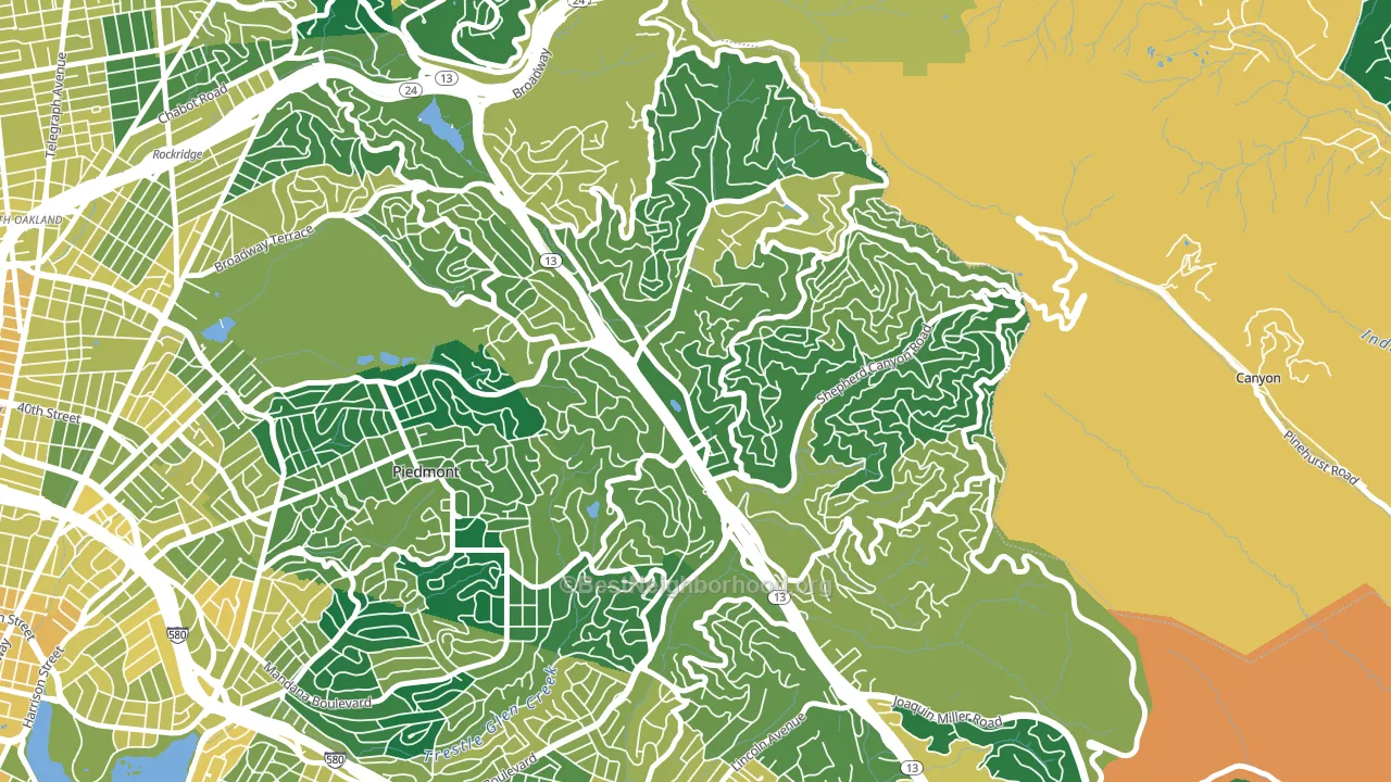
About 89% of adults in Montclair typically vote, above the U.S. average of about 62%. Among adults in Montclair, ~76% vote Democratic, ~13% Republican, and ~11% don't vote. The map below shows estimated turnout by block group.
How Montclair compares
Among neighborhoods within 5 miles, Montclair leans more Democratic than 21 of 58 neighbors.
Montclair runs about 51 points more Democratic than California as a whole.
Politics vary noticeably by block within Montclair. The north side is the most Democratic-leaning (D+77) and the southwest side is the least Democratic-leaning (D+54), a spread of about 23 points.
Why Montclair leans the way it does
This analysis examined 14,881 data points per neighborhood to find what predicts political lean and turnout. The items below are a few correlations that stood out for Montclair, not a ranked or complete list of what matters most.
Areas with high college attainment vote Democratic. About 83% of adults in Montclair hold a bachelor's degree, about 55 points above the U.S. average of 28%.
Food insecurity and voter turnout
Places with low food insecurity tend to turn out at a higher rate; Montclair, Oakland, CA sits in the bottom tenth nationally on this measure. Food insecurity does not directly drive turnout; it reflects economic hardship, which lines up with lower voting.
Why turnout in Montclair looks the way it does
Areas with strong routine healthcare access turn out at higher rates. Montclair is in the top quarter nationally for routine-care measures such as insurance coverage, preventive screenings, and dental visits. The dental-visit rate here is about 80%, about 20 points above the U.S. average of 60%. Homeowners vote more often than renters, and about 94% of households in Montclair own their home, compared to around 64% in nearby neighborhoods. High high-school completion lines up with higher turnout, and about 99% of adults in Montclair have completed high school, above 88% of neighborhoods. Learn more about the findings and methodology on the political spectrum map.
Nearby Neighborhoods
- Piedmont Pines, Oakland, CA D+66
- Merriwood, Oakland, CA D+64
- Upper Rockridge, Oakland, CA D+72
- Glenview, Oakland, CA D+79
- Trestle Glen, Oakland, CA D+80
- Lakeshore-Oakland, Oakland, CA D+85
- Upper Dimond, Oakland, CA D+78
- Piedmont Avenue, Oakland, CA D+84
- Dimond, Oakland, CA D+67
- Grand Lake, Oakland, CA D+83
Neighborhoods with Similar Populations
- Jacksonville Heights South, Jacksonville, FL D+10
- Hampden South, Denver, CO D+37
- Rolling Mill Hill, Wilkes-Barre, PA D+13
- Treme' Lafitte, New Orleans, LA D+76
- Mantua, Fairfax, VA D+40
- Terra del Sol, Houston, TX D+40
- Tollgate Overlook, Aurora, CO D+36
- Bashford Manor, Louisville, KY D+40
- Bayside, Everett, WA D+36
- Uptown, Milwaukee, WI D+76
Sources and methodology
Precinct-level voting records used to fit the model come from California Secretary of State, Elections, distributed by the Voting and Election Science Team. Demographic inputs come from the U.S. Census Bureau (ACS 5-year estimates and the 2020 Decennial Census). Health and environmental inputs come from the CDC (PLACES and the Environmental Justice Index). Land cover comes from the USGS and EPA. Election-day and lead-up weather come from PRISM 4km daily grids and the NOAA Global Historical Climatology Network. Mail-voting and election-administration patterns come from the MIT Election Lab's Survey of the Performance of American Elections. Block-group crime detail comes from CrimeGrade. Internet data and modeling support provided by ISPreports.org.
Modeling and analysis by the BestNeighborhood data science team. Full methodology and findings: political spectrum map.
Methodology reviewed by the BestNeighborhood data team. Last updated May 2026.