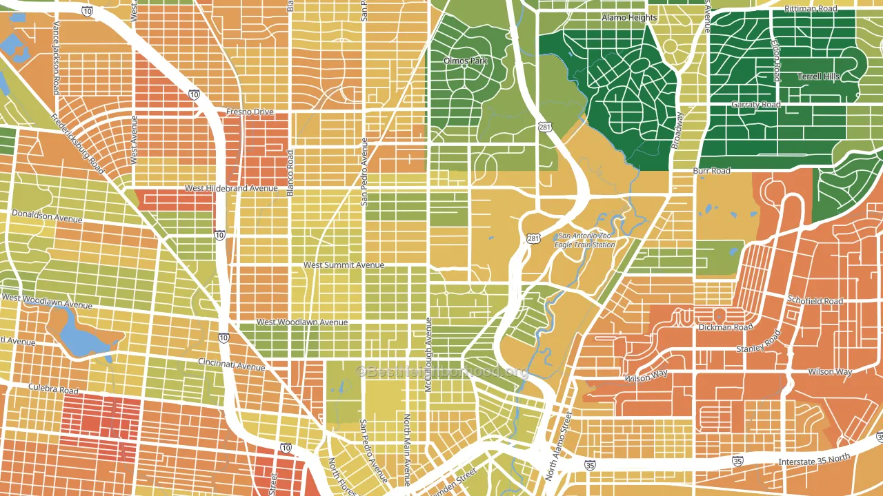
Monte Vista is a Democratic stronghold. About 76% of voters here vote Democratic and 24% Republican.
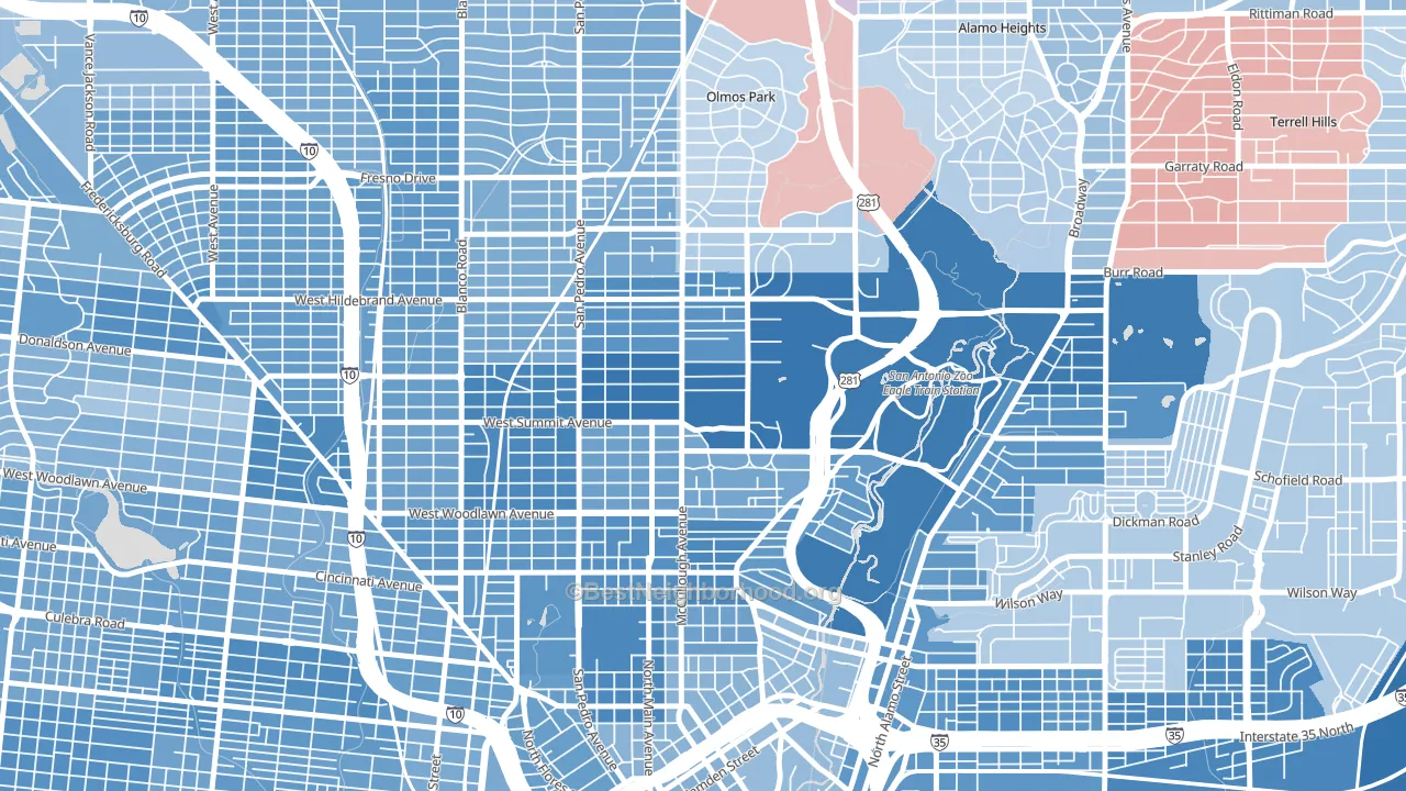
About 51% of adults in Monte Vista typically vote, below the U.S. average of about 62%. Among adults in Monte Vista, ~39% vote Democratic, ~12% Republican, and ~49% don't vote. The map below shows estimated turnout by block group.
How Monte Vista compares
Among neighborhoods within 5 miles, Monte Vista leans more Democratic than 34 of 35 neighbors.
Monte Vista runs about 65 points more Democratic than Texas as a whole. Texas leans Republican overall, while Monte Vista is one of the few Democratic-leaning pockets.
Why Monte Vista leans the way it does
This analysis examined 14,881 data points per neighborhood to find what predicts political lean and turnout. The items below are a few correlations that stood out for Monte Vista, not a ranked or complete list of what matters most.
Areas with high college attainment vote Democratic. About 67% of adults in Monte Vista hold a bachelor's degree, about 39 points above the U.S. average of 28%. A high never-married share predicts Democratic voting, and about 54% of adults in Monte Vista have never been married, above 88% of neighborhoods. Monte Vista runs against the grain of Texas, a Democratic-leaning pocket in a Republican-leaning state.
Never-married share, developed land, and voter turnout
Places that combine a never-married-heavy adult population and a heavily developed built environment tend to turn out at a lower rate, as Monte Vista, San Antonio, TX does.
Why turnout in Monte Vista looks the way it does
Turnout in Monte Vista sits close to the national pattern. Routine healthcare access, homeownership, education, and food security all land near their national averages here. Learn more about the findings and methodology on the political spectrum map.
Nearby Neighborhoods
- Beacon Hill, San Antonio, TX D+43
- Tobin Hill, San Antonio, TX D+40
- Edison, San Antonio, TX D+35
- Mahncke Park, San Antonio, TX D+33
- Northwest Los Angeles Heights, San Antonio, TX D+32
- Los Angeles Heights-Keystone, San Antonio, TX D+36
- Government Hill Alliance, San Antonio, TX D+42
- Cattleman Square, San Antonio, TX D+35
- Downtown San Antonio, San Antonio, TX D+36
- Woodlawn Lake, San Antonio, TX D+37
Neighborhoods with Similar Populations
- Larkfield-Wikiup, Santa Rosa, CA D+31
- Village Centre, Menomonee Falls, WI R+4
- Jahnke, Richmond, VA D+74
- Fauntleroy, Seattle, WA D+73
- Northwest Village, West Sacramento, CA D+21
- Northbrook, Cincinnati, OH D+29
- Kelsey City, Lake Park, FL D+21
- Five Mile Creek, Dallas, TX D+54
- Downtown, Providence, RI D+64
- Kennedy Heights, Cincinnati, OH D+70
Sources and methodology
Precinct-level voting records used to fit the model come from Texas Secretary of State, Elections Division, distributed by the Voting and Election Science Team. Demographic inputs come from the U.S. Census Bureau (ACS 5-year estimates and the 2020 Decennial Census). Health and environmental inputs come from the CDC (PLACES and the Environmental Justice Index). Land cover comes from the USGS and EPA. Election-day and lead-up weather come from PRISM 4km daily grids and the NOAA Global Historical Climatology Network. Mail-voting and election-administration patterns come from the MIT Election Lab's Survey of the Performance of American Elections. Block-group crime detail comes from CrimeGrade. Internet data and modeling support provided by ISPreports.org.
Modeling and analysis by the BestNeighborhood data science team. Full methodology and findings: political spectrum map.
Methodology reviewed by the BestNeighborhood data team. Last updated May 2026.