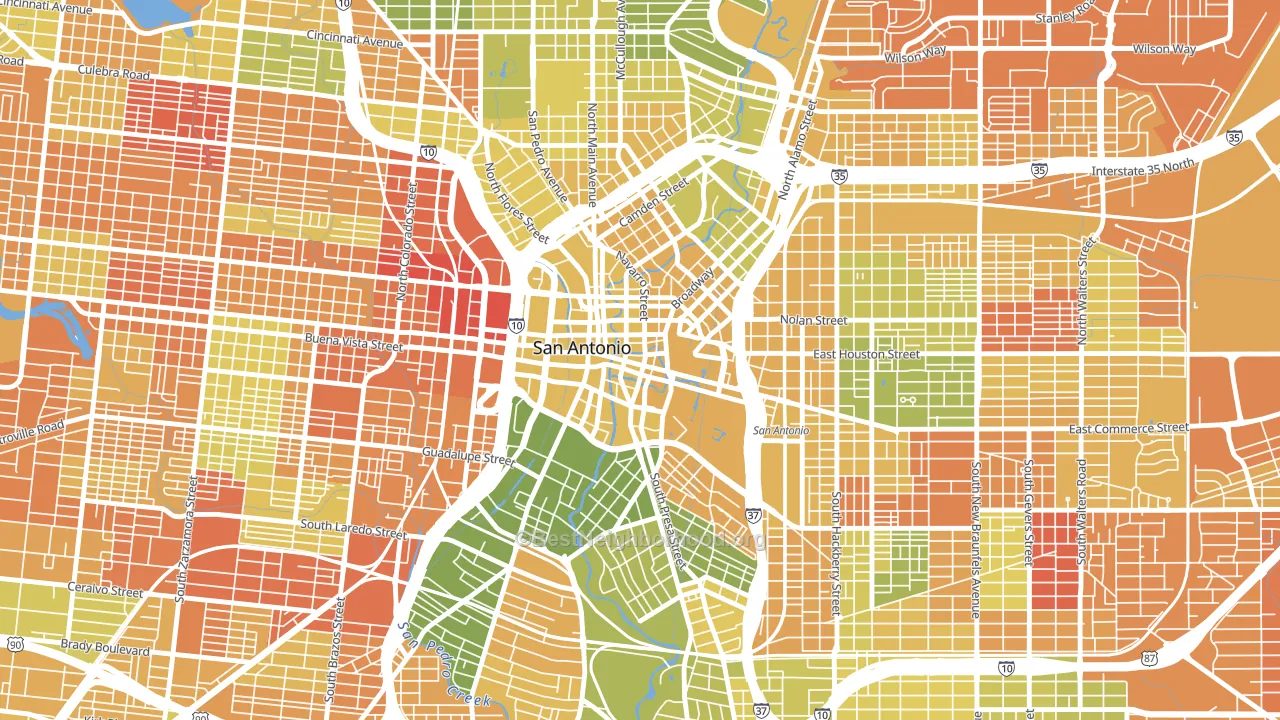
Downtown San Antonio leans heavily Democratic by roughly 36 points: about 68% of voters vote Democratic and 32% Republican.
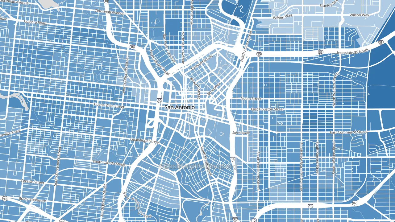
About 40% of adults in Downtown San Antonio typically vote, below the U.S. average of about 62%. Among adults in Downtown San Antonio, ~27% vote Democratic, ~13% Republican, and ~60% don't vote. The map below shows estimated turnout by block group.
How Downtown San Antonio compares
Among neighborhoods within 5 miles, Downtown San Antonio leans more Democratic than 19 of 36 neighbors.
Downtown San Antonio runs about 49 points more Democratic than Texas as a whole. Texas leans Republican overall, while Downtown San Antonio is one of the few Democratic-leaning pockets.
Politics vary noticeably by block within Downtown San Antonio. The south side is the most Democratic-leaning (D+42) and the northeast side is the least Democratic-leaning (D+31), a spread of about 11 points.
Why Downtown San Antonio leans the way it does
This analysis examined 14,881 data points per neighborhood to find what predicts political lean and turnout. The items below are a few correlations that stood out for Downtown San Antonio, not a ranked or complete list of what matters most.
Dense areas vote Democratic. More than 99% of residents in Downtown San Antonio live in densely developed areas, about 64 points above the U.S. average of 36%. A high never-married share predicts Democratic voting, and about 47% of adults in Downtown San Antonio have never been married, above 76% of neighborhoods. Downtown San Antonio runs against the grain of Texas, a Democratic-leaning pocket in a Republican-leaning state.
Paved land cover and Democratic lean
Places with extensive paved surfaces tend to lean Democratic; Downtown San Antonio, San Antonio, TX sits in the top tenth nationally on this measure. Paved ground does not change how people vote; it mostly reflects how urban and built-up a place is.
Why turnout in Downtown San Antonio looks the way it does
Areas with limited routine healthcare access turn out at lower rates. Downtown San Antonio is in the bottom quarter nationally for routine-care measures such as insurance coverage, preventive screenings, and dental visits. Renters vote less often than owners, and about 93% of households in Downtown San Antonio rent, compared to around 58% in nearby neighborhoods. High-crime urban areas turn out at lower rates, and Downtown San Antonio sits in the top 15% on a violent-crime measure. Learn more about the findings and methodology on the political spectrum map.
Nearby Neighborhoods
- Cattleman Square, San Antonio, TX D+35
- Dignowity Hill, San Antonio, TX D+42
- Tobin Hill, San Antonio, TX D+40
- Lone Star, San Antonio, TX D+36
- Avenida Guadalupe, San Antonio, TX D+37
- Denver Heights, San Antonio, TX D+41
- Government Hill Alliance, San Antonio, TX D+42
- Jefferson Heights, San Antonio, TX D+49
- Harvard Place-Eastlawn, San Antonio, TX D+52
- Collins Gardens, San Antonio, TX D+36
Neighborhoods with Similar Populations
- Lakewood, New Orleans, LA R+9
- Iveywood, Oakland, CA D+61
- Lowell, Colorado Springs, CO D+33
- Longwood, Cypress, TX R+32
- Acorn, Oakland, CA D+69
- Willow Park, Fargo, ND D+25
- Stratford Hills, Richmond, VA D+38
- Moon Lake Estates, Moon Lake, FL R+45
- Leavenworth, Omaha, NE D+51
- South Main Street Historic District, Middletown, OH D+7
Sources and methodology
Precinct-level voting records used to fit the model come from Texas Secretary of State, Elections Division, distributed by the Voting and Election Science Team. Demographic inputs come from the U.S. Census Bureau (ACS 5-year estimates and the 2020 Decennial Census). Health and environmental inputs come from the CDC (PLACES and the Environmental Justice Index). Land cover comes from the USGS and EPA. Election-day and lead-up weather come from PRISM 4km daily grids and the NOAA Global Historical Climatology Network. Mail-voting and election-administration patterns come from the MIT Election Lab's Survey of the Performance of American Elections. Block-group crime detail comes from CrimeGrade. Internet data and modeling support provided by ISPreports.org.
Modeling and analysis by the BestNeighborhood data science team. Full methodology and findings: political spectrum map.
Methodology reviewed by the BestNeighborhood data team. Last updated May 2026.