Mount Pleasant Area is a Republican stronghold. About 21% of voters here vote Democratic and 79% Republican.
[sc name="abovemapcta"]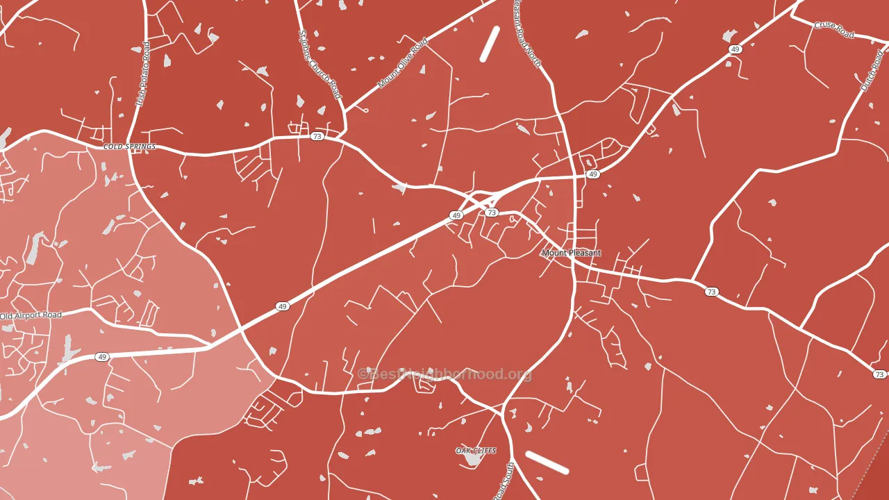 [bestneighborhood_map_controls]
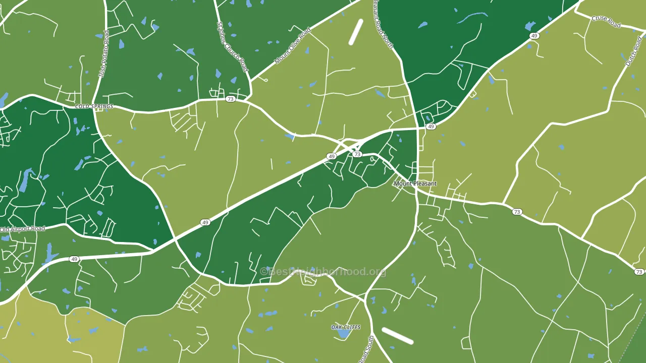
About 84% of adults in Mount Pleasant Area typically vote, above the U.S. average of about 62%. Among adults in Mount Pleasant Area, ~18% vote Democratic, ~66% Republican, and ~16% don't vote. The map below shows estimated turnout by block group.
 [bestneighborhood_map_controls]
How Mount Pleasant Area compares
Mount Pleasant Area runs about 56 points more Republican than North Carolina as a whole.
Why Mount Pleasant Area leans the way it does
This analysis examined 14,881 data points per neighborhood to find what predicts political lean and turnout. The items below are a few correlations that stood out for Mount Pleasant Area, not a ranked or complete list of what matters most.
Rural areas with a high white share vote Republican. Mount Pleasant Area sits in the bottom quarter on density and about 87% of residents are non-Hispanic white, about 20 points above the North Carolina average of 66%. A high family-household share predicts Republican voting, and about 78% of households in Mount Pleasant Area are family households, above 82% of neighborhoods.
Walkability and Republican lean
Places with a low walkability score tend to lean Republican; Mount Pleasant Area, Mount Pleasant, NC sits in the bottom tenth nationally on this measure. A walkable street grid does not change how people vote; it mostly reflects how urban a place is.
Why turnout in Mount Pleasant Area looks the way it does
Homeowners vote more often than renters. About 85% of households in Mount Pleasant Area own their home, about 11 points above the North Carolina average of 74%. Learn more about the findings and methodology on the political spectrum map.
[one_half]Nearby Neighborhoods
- Car Town, Kannapolis, NC D+10
- Harris-Houston, Charlotte, NC D+56
- Mallard Creek-Withrow Downs, Charlotte, NC D+60
- Back Creek Church Road, Charlotte, NC D+62
- Newell, Charlotte, NC D+66
- University City South, Charlotte, NC D+52
- University City North, Charlotte, NC D+56
- Highland Creek, Charlotte, NC D+38
- Skybrook, Huntersville, NC D+7
- Fairview, Charlotte, NC R+60
Neighborhoods with Similar Populations
- West Atherton, Atherton, CA D+43
- Fondren Gardens, Houston, TX D+44
- Idylwood, Redmond, WA D+51
- Biscayne Terrace, Jacksonville, FL D+65
- Rothfield, Semmes, AL R+41
- Norton Commons, Prospect, KY R+4
- Highland Farms-San Antonio, San Antonio, TX D+36
- Raintree, Kissimmee, FL R+5
- Talus, Issaquah, WA D+54
- White Gables, Summerville, SC R+27
Sources and methodology
Precinct-level voting records used to fit the model come from North Carolina State Board of Elections, distributed by the Voting and Election Science Team. Demographic inputs come from the U.S. Census Bureau (ACS 5-year estimates and the 2020 Decennial Census). Health and environmental inputs come from the CDC (PLACES and the Environmental Justice Index). Land cover comes from the USGS and EPA. Election-day and lead-up weather come from PRISM 4km daily grids and the NOAA Global Historical Climatology Network. Mail-voting and election-administration patterns come from the MIT Election Lab's Survey of the Performance of American Elections. Block-group crime detail comes from CrimeGrade. Internet data and modeling support provided by ISPreports.org.
Modeling and analysis by the BestNeighborhood data science team. Full methodology and findings: political spectrum map.
Methodology reviewed by the BestNeighborhood data team. Last updated May 2026.