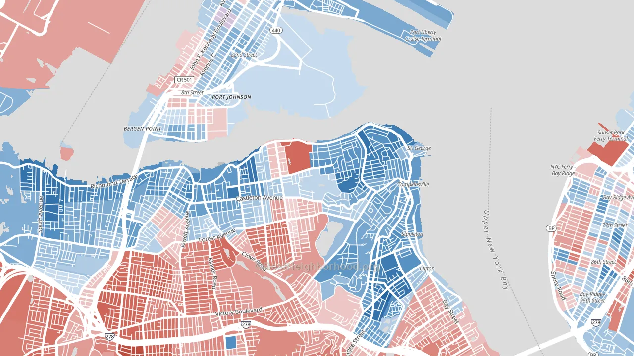
New Brighton leans heavily Democratic by roughly 36 points: about 68% of voters vote Democratic and 32% Republican.
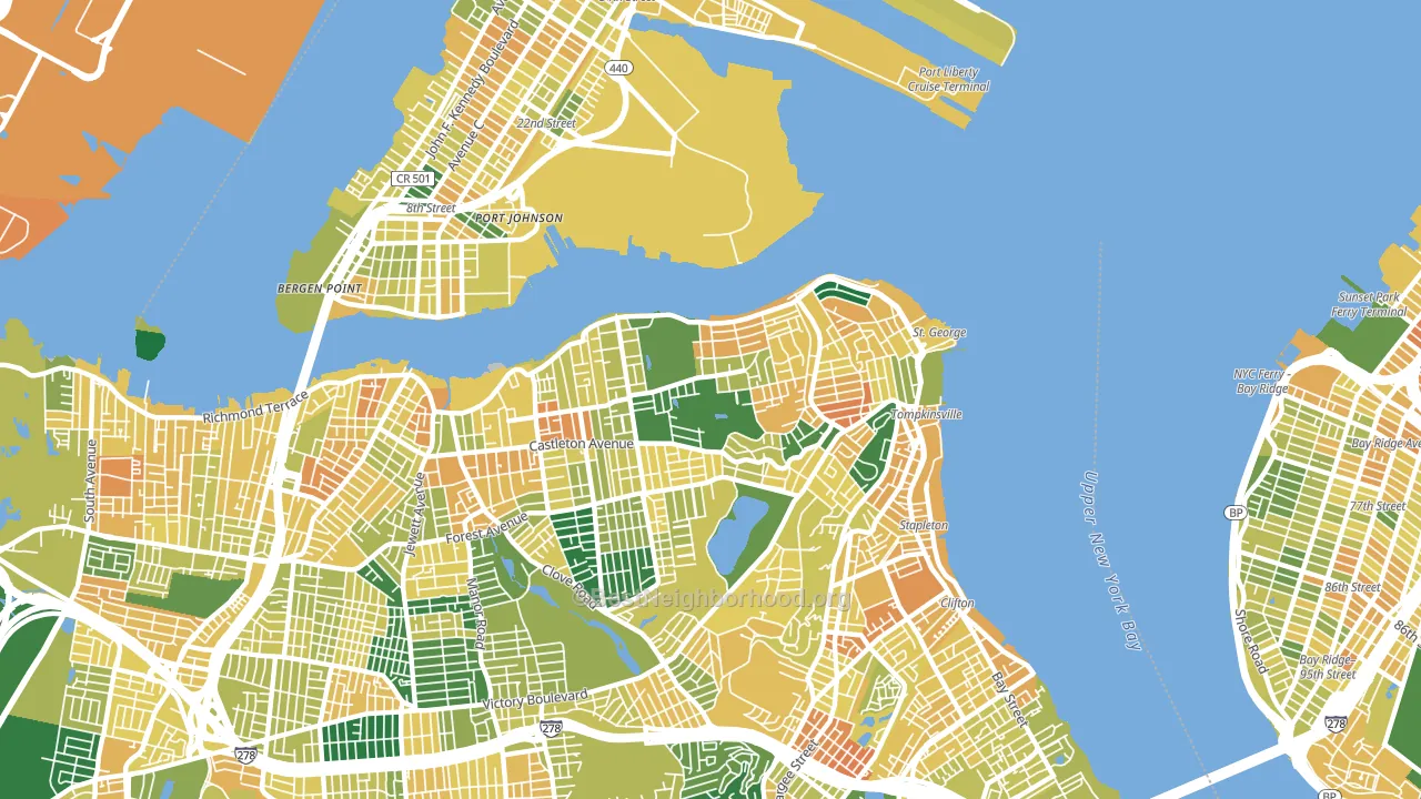
About 51% of adults in New Brighton typically vote, below the U.S. average of about 62%. Among adults in New Brighton, ~35% vote Democratic, ~16% Republican, and ~49% don't vote. The map below shows estimated turnout by block group.
How New Brighton compares
Among neighborhoods within 5 miles, New Brighton leans more Democratic than 18 of 21 neighbors.
New Brighton runs about 24 points more Democratic than New York as a whole.
Politics vary noticeably by block within New Brighton. The northeast side is the most Democratic-leaning (D+55) and the south side is the least Democratic-leaning (D+8), a spread of about 46 points.
Why New Brighton leans the way it does
Density, race composition, education, and family structure all sit close to their national averages in New Brighton. The lean here lands roughly where demographic data alone would predict.
Population density and Democratic lean
Places with high population density tend to lean Democratic; New Brighton, Staten Island, NY sits in the top tenth nationally on this measure.
Why turnout in New Brighton looks the way it does
Crowded housing lines up with lower turnout. About 7% of homes in New Brighton have more than one occupant per room, above 86% of neighborhoods. Learn more about the findings and methodology on the political spectrum map.
Nearby Neighborhoods
- Sunset Hill, Staten Island, NY R+14
- Clifton, Staten Island, NY D+33
- Constable Hook, Bayonne, NJ D+6
- Port Richmond, Staten Island, NY D+24
- Concord, Staten Island, NY D+6
- Westerleigh-Castleton, Staten Island, NY R+32
- Rosebank, Staten Island, NY R+12
- Shore Acres, Staten Island, NY R+16
- Todt Hill, Staten Island, NY R+26
- South Beach, Staten Island, NY R+33
Neighborhoods with Similar Populations
- Mission, San Francisco, CA D+72
- Fenway-Kenmore, Boston, MA D+67
- Watts, Los Angeles, CA D+49
- South Dorchester, Boston, MA D+57
- Woodhaven, Queens, NY D+9
- Northeast, Anaheim, CA D+16
- Dyker Heights, Brooklyn, NY R+20
- Greater Memorial, Houston, TX R+14
- Auburndale, Queens, NY R+2
- Capitol Hill, Washington, DC D+77
Sources and methodology
Precinct-level voting records used to fit the model come from New York State Board of Elections, distributed by the Voting and Election Science Team. Demographic inputs come from the U.S. Census Bureau (ACS 5-year estimates and the 2020 Decennial Census). Health and environmental inputs come from the CDC (PLACES and the Environmental Justice Index). Land cover comes from the USGS and EPA. Election-day and lead-up weather come from PRISM 4km daily grids and the NOAA Global Historical Climatology Network. Mail-voting and election-administration patterns come from the MIT Election Lab's Survey of the Performance of American Elections. Block-group crime detail comes from CrimeGrade. Internet data and modeling support provided by ISPreports.org.
Modeling and analysis by the BestNeighborhood data science team. Full methodology and findings: political spectrum map.
Methodology reviewed by the BestNeighborhood data team. Last updated May 2026.