Niagara Falls leans slightly Democratic by roughly 10 points: about 55% of voters vote Democratic and 45% Republican.
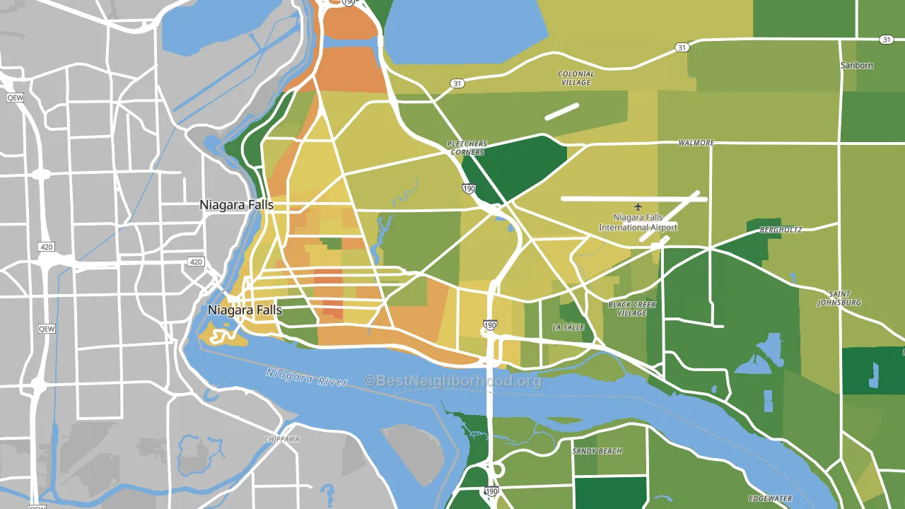
About 60% of adults in Niagara Falls typically vote, near the U.S. average of about 62%. Among adults in Niagara Falls, ~33% vote Democratic, ~27% Republican, and ~40% don't vote. The map below shows estimated turnout by block group.
How Niagara Falls compares
Among cities within 25 miles, Niagara Falls leans more Democratic than 41 of 48 neighbors.
Politically, Niagara Falls sits close to the rest of New York.
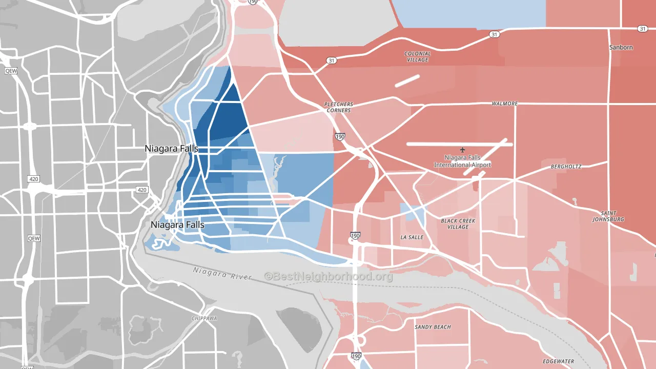
Politics vary noticeably by neighborhood within Niagara Falls. The northwest side runs the most Democratic (D+42) and the northeast side runs the most Republican (R+23), a spread of about 65 points.
Why Niagara Falls leans the way it does
This analysis examined 14,881 data points per city to find what predicts political lean and turnout. The items below are a few correlations that stood out for Niagara Falls, not a ranked or complete list of what matters most.
Dense areas vote Democratic. About 87% of residents in Niagara Falls live in densely developed areas, about 50 points above the U.S. average of 36%. A high never-married share predicts Democratic voting, and about 41% of adults in Niagara Falls have never been married, above 94% of cities.
Population density and Democratic lean
Places with high population density tend to lean Democratic; Niagara Falls, NY sits in the top tenth nationally on this measure.
Why turnout in Niagara Falls looks the way it does
Renters vote less often than owners. About 38% of households in Niagara Falls rent, about 13 points above the U.S. average of 25%. High food insecurity lines up with lower turnout, and about 21% of adults in Niagara Falls report food insecurity, above 84% of cities. Learn more about the findings and methodology on the political spectrum map.
Nearby Cities
- Niagara University, NY R+14
- Sandy Beach, NY R+10
- Lewiston, NY R+11
- Grand Island, NY R+9
- Sanborn, NY R+28
- Stella Niagara, NY R+15
- North Tonawanda, NY R+15
- Shawnee, NY R+34
- Youngstown, NY R+19
- Ransomville, NY R+33
Cities with Similar Populations
- Laguna Niguel, CA Even
- Mechanicsville, VA R+22
- Martinsburg, WV R+24
- Belleville, IL D+19
- Woodland, CA D+22
- Hot Springs, AR R+24
- Wylie, TX R+12
- Burnsville, MN D+23
- West Bloomfield, MI D+14
- Lebanon, PA R+22
Sources and methodology
Precinct-level voting records used to fit the model come from New York State Board of Elections, distributed by the Voting and Election Science Team. Demographic inputs come from the U.S. Census Bureau (ACS 5-year estimates and the 2020 Decennial Census). Health and environmental inputs come from the CDC (PLACES and the Environmental Justice Index). Land cover comes from the USGS and EPA. Election-day and lead-up weather come from PRISM 4km daily grids and the NOAA Global Historical Climatology Network. Mail-voting and election-administration patterns come from the MIT Election Lab's Survey of the Performance of American Elections. Block-group crime detail comes from CrimeGrade. Internet data and modeling support provided by ISPreports.org.
Modeling and analysis by the BestNeighborhood data science team. Full methodology and findings: political spectrum map.
Methodology reviewed by the BestNeighborhood data team. Last updated May 2026.