Olive Drive Area leans heavily Republican by roughly 42 points: about 29% of voters vote Democratic and 71% Republican.
[sc name="abovemapcta"]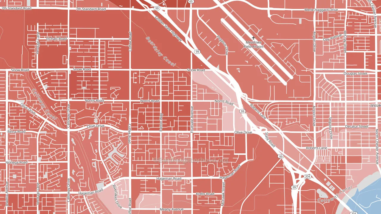 [bestneighborhood_map_controls]
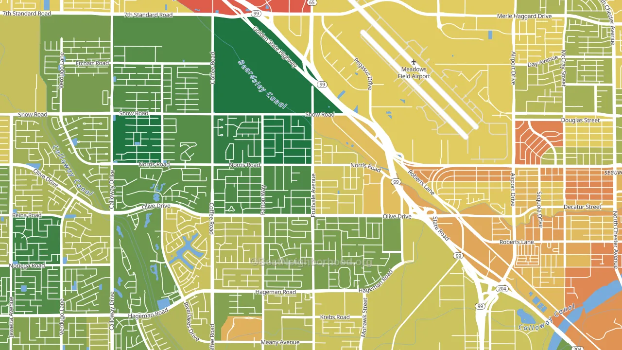
About 69% of adults in Olive Drive Area typically vote, above the U.S. average of about 62%. Among adults in Olive Drive Area, ~20% vote Democratic, ~49% Republican, and ~31% don't vote. The map below shows estimated turnout by block group.
 [bestneighborhood_map_controls]
How Olive Drive Area compares
Among neighborhoods within 5 miles, Olive Drive Area leans more Republican than 8 of 9 neighbors.
Olive Drive Area runs about 62 points more Republican than California as a whole. California leans Democratic overall, while Olive Drive Area is one of the few Republican-leaning pockets.
Politics vary noticeably by block within Olive Drive Area. The west side is the most Republican-leaning (R+54) and the east side is the least Republican-leaning (R+23), a spread of about 31 points.
Why Olive Drive Area leans the way it does
This analysis examined 14,881 data points per neighborhood to find what predicts political lean and turnout. The items below are a few correlations that stood out for Olive Drive Area, not a ranked or complete list of what matters most.
Car-dependent areas vote Republican. About 84% of residents in Olive Drive Area drive to work alone, about 10 points above the U.S. average of 74%. Olive Drive Area runs against the grain of California, a Republican-leaning pocket in a Democratic-leaning state.
Walkability and Republican lean
Places with a low walkability score tend to lean Republican; Olive Drive Area, Bakersfield, CA sits near the national average on this measure. A walkable street grid does not change how people vote; it mostly reflects how urban a place is.
Why turnout in Olive Drive Area looks the way it does
Turnout in Olive Drive Area sits close to the national pattern. Routine healthcare access, homeownership, education, and food security all land near their national averages here. Learn more about the findings and methodology on the political spectrum map.
[one_half]Nearby Neighborhoods
- Fruitvale, Bakersfield, CA R+34
- North Country Meadows, Oildale, CA R+42
- Emerald Estates, Bakersfield, CA R+42
- Riviera-Westchester, Bakersfield, CA R+10
- Homaker Park, Bakersfield, CA D+13
- Stockdale Greens, Bakersfield, CA R+15
- Park Stockdale, Bakersfield, CA D+2
- La Cresta-Alta Vista, Bakersfield, CA R+14
- Oleander Sunset, Bakersfield, CA D+17
- College Heights Baker Street, Bakersfield, CA D+15
Neighborhoods with Similar Populations
- Barnum, Denver, CO D+51
- Vancouver Heights, Vancouver, WA D+19
- Capitol Heights, Milwaukee, WI D+81
- The Reserve, Port St. Lucie, FL R+28
- Holly Grove, New Orleans, LA D+81
- Downtown West, St. Louis, MO D+71
- Downtown Berkeley, Berkeley, CA D+76
- Downtown Concord, Concord, CA D+44
- Country Lakes, Miramar, FL D+15
- Countryside Woods, Vancouver, WA D+13
Sources and methodology
Precinct-level voting records used to fit the model come from California Secretary of State, Elections, distributed by the Voting and Election Science Team. Demographic inputs come from the U.S. Census Bureau (ACS 5-year estimates and the 2020 Decennial Census). Health and environmental inputs come from the CDC (PLACES and the Environmental Justice Index). Land cover comes from the USGS and EPA. Election-day and lead-up weather come from PRISM 4km daily grids and the NOAA Global Historical Climatology Network. Mail-voting and election-administration patterns come from the MIT Election Lab's Survey of the Performance of American Elections. Block-group crime detail comes from CrimeGrade. Internet data and modeling support provided by ISPreports.org.
Modeling and analysis by the BestNeighborhood data science team. Full methodology and findings: political spectrum map.
Methodology reviewed by the BestNeighborhood data team. Last updated May 2026.