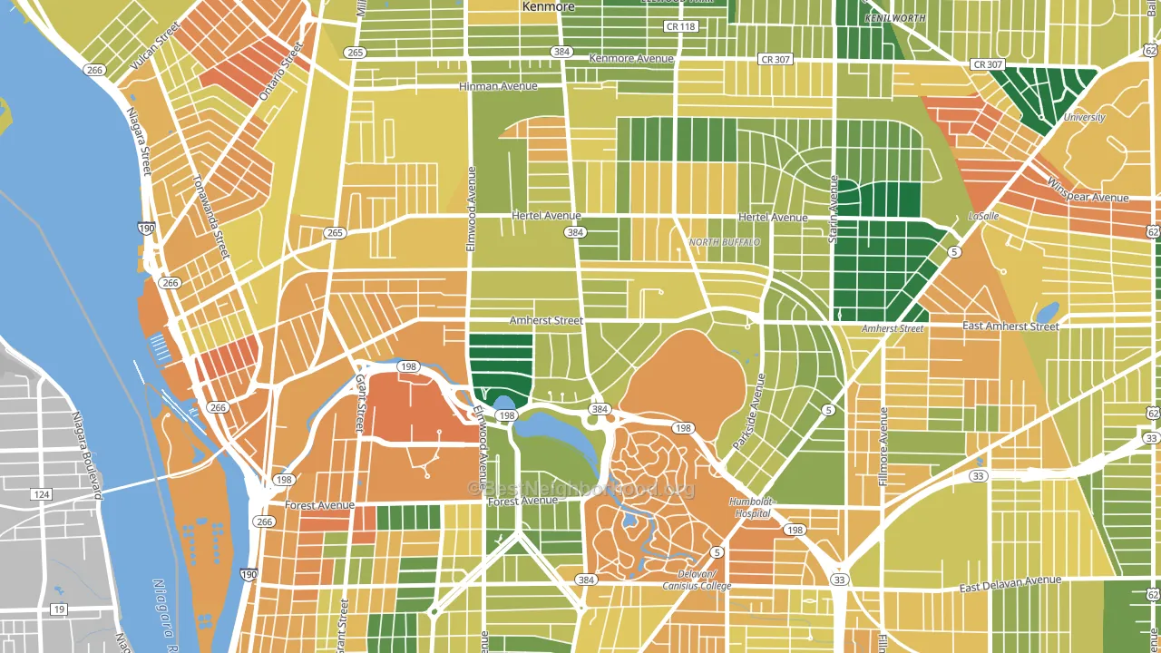
Park Meadow is a Democratic stronghold. About 78% of voters here vote Democratic and 22% Republican.
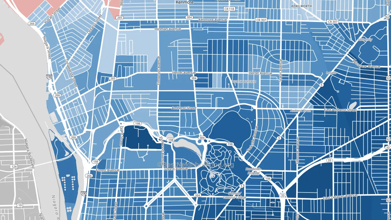
About 69% of adults in Park Meadow typically vote, above the U.S. average of about 62%. Among adults in Park Meadow, ~54% vote Democratic, ~15% Republican, and ~31% don't vote. The map below shows estimated turnout by block group.
How Park Meadow compares
Among neighborhoods within 5 miles, Park Meadow leans more Democratic than 13 of 31 neighbors.
Park Meadow runs about 44 points more Democratic than New York as a whole.
Why Park Meadow leans the way it does
This analysis examined 14,881 data points per neighborhood to find what predicts political lean and turnout. The items below are a few correlations that stood out for Park Meadow, not a ranked or complete list of what matters most.
Areas with high college attainment vote Democratic. About 66% of adults in Park Meadow hold a bachelor's degree, about 38 points above the U.S. average of 28%. A high never-married share predicts Democratic voting, and about 51% of adults in Park Meadow have never been married, above 83% of neighborhoods.
Park access and Democratic lean
Places with heavy park coverage tend to lean Democratic; Park Meadow, Buffalo, NY sits in the top quarter nationally on this measure. Park access does not change how people vote; it tends to track denser, higher-income areas.
Why turnout in Park Meadow looks the way it does
Areas with strong routine healthcare access turn out at higher rates. Park Meadow is in the top quarter nationally for routine-care measures such as insurance coverage, preventive screenings, and dental visits. The dental-visit rate here is about 67%, about 7 points above the U.S. average of 60%. Learn more about the findings and methodology on the political spectrum map.
Nearby Neighborhoods
- North Park, Buffalo, NY D+48
- Albright, Buffalo, NY D+59
- Military, Buffalo, NY D+33
- Black Rock, Buffalo, NY D+29
- Forest, Buffalo, NY D+54
- Starin Central, Buffalo, NY D+58
- Delaware-West Ferry, Buffalo, NY D+67
- Hamlin Park, Buffalo, NY D+79
- Leroy, Buffalo, NY D+73
- Grant Ferry, Buffalo, NY D+54
Neighborhoods with Similar Populations
- Woodbrook, Lakewood, WA Even
- University-San Bernardino, San Bernardino, CA D+29
- Sunset Village, Madison, WI D+84
- Brice Street Area, Greensboro, NC D+61
- Pine Ridge, Coral Springs, FL D+7
- Apple Valley, Birmingham, AL D+71
- Quail Hollow, Charlotte, NC D+15
- Mesa Forest, Austin, TX D+44
- Stony Creek, Ken Caryl, CO D+7
- Second Creek, Mobile, AL R+21
Sources and methodology
Precinct-level voting records used to fit the model come from New York State Board of Elections, distributed by the Voting and Election Science Team. Demographic inputs come from the U.S. Census Bureau (ACS 5-year estimates and the 2020 Decennial Census). Health and environmental inputs come from the CDC (PLACES and the Environmental Justice Index). Land cover comes from the USGS and EPA. Election-day and lead-up weather come from PRISM 4km daily grids and the NOAA Global Historical Climatology Network. Mail-voting and election-administration patterns come from the MIT Election Lab's Survey of the Performance of American Elections. Block-group crime detail comes from CrimeGrade. Internet data and modeling support provided by ISPreports.org.
Modeling and analysis by the BestNeighborhood data science team. Full methodology and findings: political spectrum map.
Methodology reviewed by the BestNeighborhood data team. Last updated May 2026.