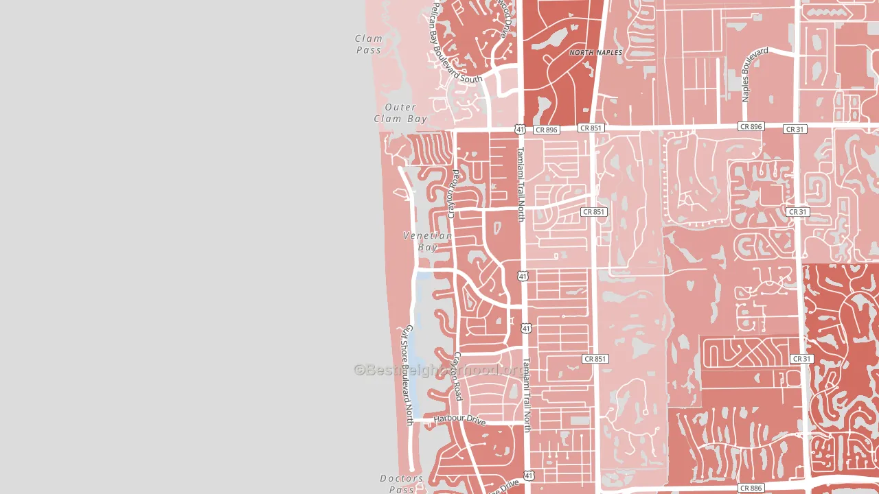
Park Shore leans Republican by roughly 24 points: about 38% of voters vote Democratic and 62% Republican.
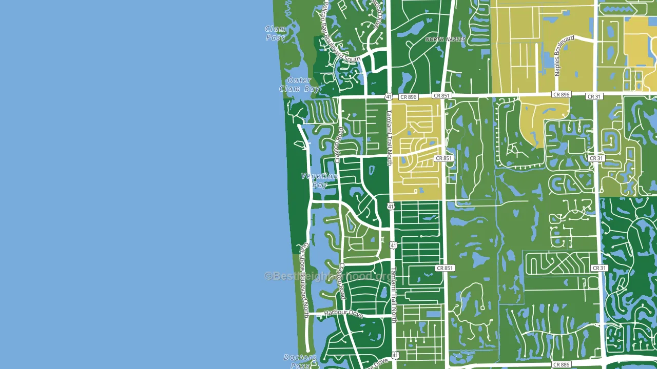
About 95% of adults in Park Shore typically vote, above the U.S. average of about 62%. Among adults in Park Shore, ~36% vote Democratic, ~59% Republican, and ~5% don't vote. The map below shows estimated turnout by block group.
How Park Shore compares
Among neighborhoods within 5 miles, Park Shore leans more Republican than 4 of 5 neighbors.
Park Shore runs about 12 points more Republican than Florida as a whole.
Politics vary noticeably by block within Park Shore. The east side is the most Republican-leaning (R+32) and the southwest side is the least Republican-leaning (R+19), a spread of about 13 points.
Why Park Shore leans the way it does
This analysis examined 14,881 data points per neighborhood to find what predicts political lean and turnout. The items below are a few correlations that stood out for Park Shore, not a ranked or complete list of what matters most.
Rural areas with a high white share vote Republican. Park Shore sits in the bottom quarter on density and about 96% of residents are non-Hispanic white, about 37 points above the Florida average of 60%.
Cancer-screening access and voter turnout
Places with high colon-cancer-screening access tend to turn out at a higher rate; Park Shore, Naples, FL sits in the top tenth nationally on this measure. Cancer screening does not drive turnout; it reflects income, insurance, and healthcare access.
Why turnout in Park Shore looks the way it does
Areas with strong routine healthcare access turn out at higher rates. Park Shore is in the top quarter nationally for routine-care measures such as insurance coverage, preventive screenings, and dental visits. The dental-visit rate here is about 76%, about 16 points above the U.S. average of 60%. Homeowners vote more often than renters, and about 96% of households in Park Shore own their home, compared to around 76% in nearby neighborhoods. High high-school completion lines up with higher turnout, and about 98% of adults in Park Shore have completed high school, above 84% of neighborhoods. Learn more about the findings and methodology on the political spectrum map.
Nearby Neighborhoods
- Moorings-Coquina Sands, Naples, FL R+21
- Pelican Bay, Naples, FL R+23
- Old Naples, Naples, FL R+14
- Pelican Marsh, Naples, FL R+21
- Vineyards, Naples, FL R+26
- Berkshire Lakes, Naples, FL R+15
- Summit Place in Naples, Naples, FL R+17
- Wentworth Estates, Naples, FL R+16
- Lely Resort, Naples, FL R+15
- Orangetree, Naples, FL R+28
Neighborhoods with Similar Populations
- Settlers Landing, Jacksonville, FL R+7
- Brighton Historic District, Zanesville, OH R+17
- Friends of Ridgecrest, Largo, FL D+18
- Beacon Hill, San Antonio, TX D+43
- Sardis Forest, Charlotte, NC Even
- West End, New Orleans, LA D+4
- Downtown South San Francisco, South San Francisco, CA D+46
- Summerville, Augusta, GA D+14
- Kings Manor, Largo, FL R+12
- Goose Creek, Baytown, TX D+7
Sources and methodology
Precinct-level voting records used to fit the model come from Florida Division of Elections, distributed by the Voting and Election Science Team. Demographic inputs come from the U.S. Census Bureau (ACS 5-year estimates and the 2020 Decennial Census). Health and environmental inputs come from the CDC (PLACES and the Environmental Justice Index). Land cover comes from the USGS and EPA. Election-day and lead-up weather come from PRISM 4km daily grids and the NOAA Global Historical Climatology Network. Mail-voting and election-administration patterns come from the MIT Election Lab's Survey of the Performance of American Elections. Block-group crime detail comes from CrimeGrade. Internet data and modeling support provided by ISPreports.org.
Modeling and analysis by the BestNeighborhood data science team. Full methodology and findings: political spectrum map.
Methodology reviewed by the BestNeighborhood data team. Last updated May 2026.