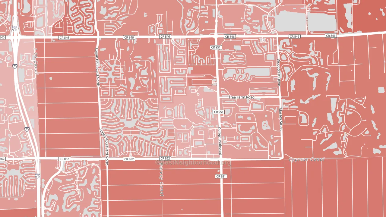
Summit Place in Naples leans Republican by roughly 18 points: about 41% of voters vote Democratic and 59% Republican.
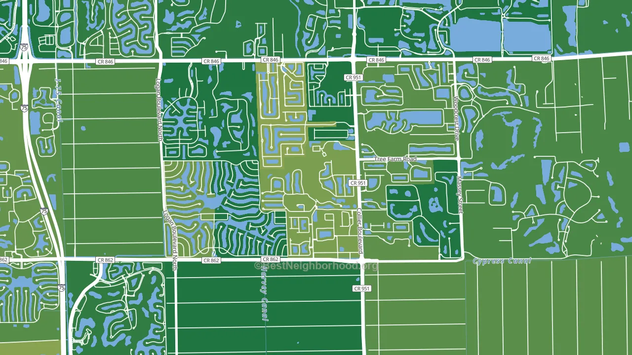
About 75% of adults in Summit Place in Naples typically vote, above the U.S. average of about 62%. Among adults in Summit Place in Naples, ~31% vote Democratic, ~44% Republican, and ~25% don't vote. The map below shows estimated turnout by block group.
How Summit Place in Naples compares
Summit Place in Naples sits in a sparsely populated area with few comparable neighborhoods nearby.
Summit Place in Naples runs about 4 points more Republican than Florida as a whole.
Politics vary noticeably by block within Summit Place in Naples. The northwest side is the most Republican-leaning (R+29) and the east side is the least Republican-leaning (R+16), a spread of about 13 points.
Why Summit Place in Naples leans the way it does
This analysis examined 14,881 data points per neighborhood to find what predicts political lean and turnout. The items below are a few correlations that stood out for Summit Place in Naples, not a ranked or complete list of what matters most.
Areas with many family households vote Republican. About 77% of households in Summit Place in Naples are family households, about 10 points above the U.S. average of 67%.
Park access and Republican lean
Places with low park coverage tend to lean Republican; Summit Place in Naples, Naples, FL sits in the bottom quarter nationally on this measure. Park access does not change how people vote; it tends to track denser, higher-income areas.
Why turnout in Summit Place in Naples looks the way it does
Turnout in Summit Place in Naples sits close to the national pattern. Routine healthcare access, homeownership, education, and food security all land near their national averages here. Learn more about the findings and methodology on the political spectrum map.
Nearby Neighborhoods
- Vineyards, Naples, FL R+26
- Pelican Marsh, Naples, FL R+21
- Berkshire Lakes, Naples, FL R+15
- Orangetree, Naples, FL R+28
- Pelican Bay, Naples, FL R+23
- Park Shore, Naples, FL R+25
- Moorings-Coquina Sands, Naples, FL R+21
- Old Naples, Naples, FL R+14
- Lely Resort, Naples, FL R+15
- Wentworth Estates, Naples, FL R+16
Neighborhoods with Similar Populations
- Millview East, San Marcos, TX D+33
- Old Town Florissant, Florissant, MO D+30
- West Central, Fort Wayne, IN D+31
- Willow Creek, Kansas City, MO D+55
- Park, Redford, MI D+79
- Jefferson, Culver City, CA D+59
- Fire Mountain, Oceanside, CA D+19
- Holly Hills, St. Louis, MO D+40
- Braun Station West, San Antonio, TX R+4
- Fairwood and Robandee, Kansas City, MO D+55
Sources and methodology
Precinct-level voting records used to fit the model come from Florida Division of Elections, distributed by the Voting and Election Science Team. Demographic inputs come from the U.S. Census Bureau (ACS 5-year estimates and the 2020 Decennial Census). Health and environmental inputs come from the CDC (PLACES and the Environmental Justice Index). Land cover comes from the USGS and EPA. Election-day and lead-up weather come from PRISM 4km daily grids and the NOAA Global Historical Climatology Network. Mail-voting and election-administration patterns come from the MIT Election Lab's Survey of the Performance of American Elections. Block-group crime detail comes from CrimeGrade. Internet data and modeling support provided by ISPreports.org.
Modeling and analysis by the BestNeighborhood data science team. Full methodology and findings: political spectrum map.
Methodology reviewed by the BestNeighborhood data team. Last updated May 2026.