Pilsen is a Democratic stronghold. About 81% of voters here vote Democratic and 19% Republican.
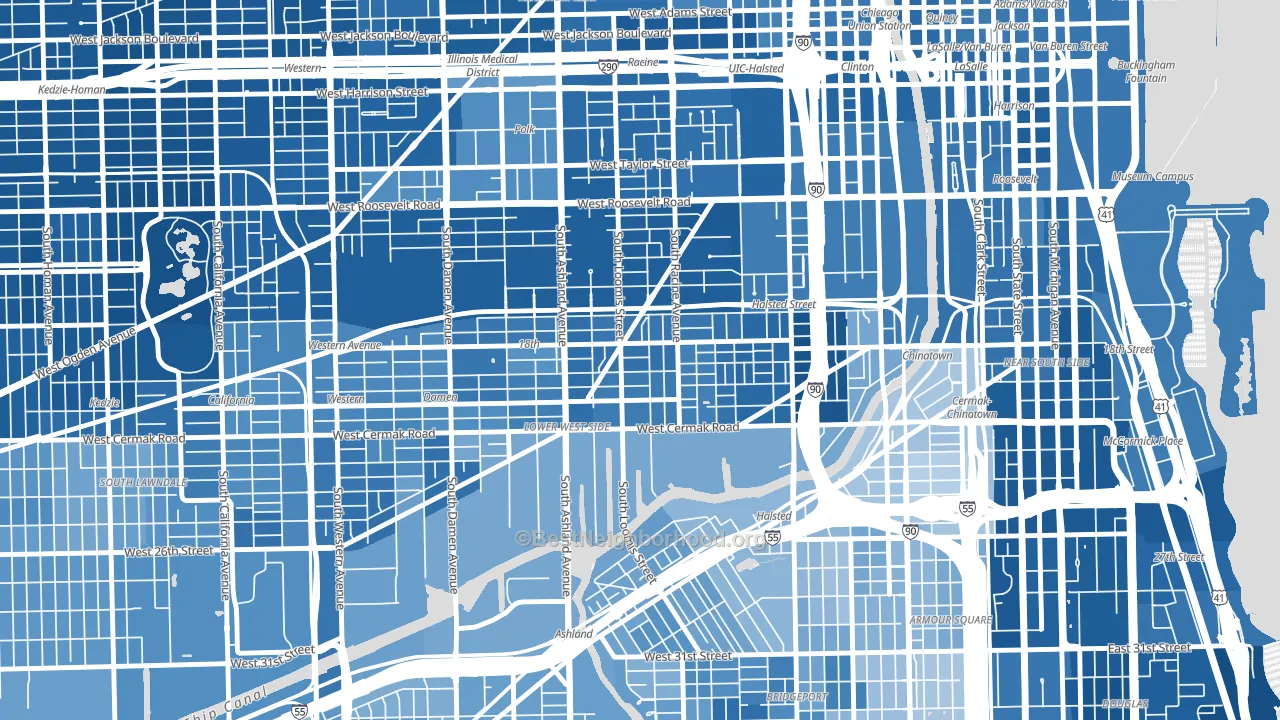
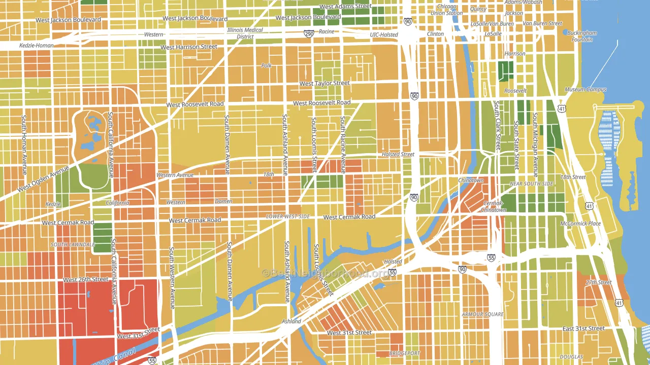
About 41% of adults in Pilsen typically vote, below the U.S. average of about 62%. Among adults in Pilsen, ~33% vote Democratic, ~8% Republican, and ~59% don't vote. The map below shows estimated turnout by block group.
How Pilsen compares
Among neighborhoods within 5 miles, Pilsen leans more Democratic than 24 of 43 neighbors.
Pilsen runs about 51 points more Democratic than Illinois as a whole.
Why Pilsen leans the way it does
This analysis examined 14,881 data points per neighborhood to find what predicts political lean and turnout. The items below are a few correlations that stood out for Pilsen, not a ranked or complete list of what matters most.
Dense areas vote Democratic. More than 99% of residents in Pilsen live in densely developed areas, about 64 points above the U.S. average of 36%. A high never-married share predicts Democratic voting, and about 59% of adults in Pilsen have never been married, above 92% of neighborhoods.
Population density and Democratic lean
Places with high population density tend to lean Democratic; Pilsen, Chicago, IL sits in the top tenth nationally on this measure.
Why turnout in Pilsen looks the way it does
Areas with limited routine healthcare access turn out at lower rates. Pilsen is in the bottom quarter nationally for routine-care measures such as insurance coverage, preventive screenings, and dental visits. Renters vote less often than owners, and about 77% of households in Pilsen rent, compared to around 55% in nearby neighborhoods. High-crime urban areas turn out at lower rates, and Pilsen sits in the top 15% on a violent-crime measure. Learn more about the findings and methodology on the political spectrum map.
Nearby Neighborhoods
- Lower West Side, Chicago, IL D+58
- University Village, Chicago, IL D+67
- Locks, Chicago, IL D+30
- Near West Side, Chicago, IL D+68
- Armour Square, Chicago, IL D+16
- Bridgeport, Chicago, IL D+27
- Greektown, Chicago, IL D+59
- Claremont Cottages, Chicago, IL D+71
- Near South Side, Chicago, IL D+70
- Mount Pleasant, Chicago, IL D+28
Neighborhoods with Similar Populations
- Cherry Avenue, Tucson, AZ D+33
- Vistancia, Peoria, AZ R+21
- Barton-McFarland, Detroit, MI D+87
- Windsor Spring, Hephzibah, GA D+69
- Evanston, Cincinnati, OH D+63
- Burbank, Detroit, MI D+79
- Central Terry, Billings, MT D+3
- Sun City, Georgetown, TX R+20
- Broadway-Fillmore, Buffalo, NY D+47
- Patterson Park, Baltimore, MD D+74
Sources and methodology
Precinct-level voting records used to fit the model come from Illinois State Board of Elections, distributed by the Voting and Election Science Team. Demographic inputs come from the U.S. Census Bureau (ACS 5-year estimates and the 2020 Decennial Census). Health and environmental inputs come from the CDC (PLACES and the Environmental Justice Index). Land cover comes from the USGS and EPA. Election-day and lead-up weather come from PRISM 4km daily grids and the NOAA Global Historical Climatology Network. Mail-voting and election-administration patterns come from the MIT Election Lab's Survey of the Performance of American Elections. Block-group crime detail comes from CrimeGrade. Internet data and modeling support provided by ISPreports.org.
Modeling and analysis by the BestNeighborhood data science team. Full methodology and findings: political spectrum map.
Methodology reviewed by the BestNeighborhood data team. Last updated May 2026.