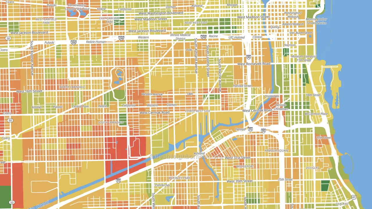
Lower West Side is a Democratic stronghold. About 79% of voters here vote Democratic and 21% Republican.
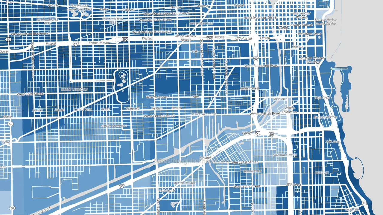
About 39% of adults in Lower West Side typically vote, below the U.S. average of about 62%. Among adults in Lower West Side, ~31% vote Democratic, ~8% Republican, and ~61% don't vote. The map below shows estimated turnout by block group.
How Lower West Side compares
Among neighborhoods within 5 miles, Lower West Side leans more Democratic than 21 of 45 neighbors.
Lower West Side runs about 47 points more Democratic than Illinois as a whole.
Politics vary noticeably by block within Lower West Side. The northeast side is the most Democratic-leaning (D+67) and the southeast side is the least Democratic-leaning (D+50), a spread of about 17 points.
Why Lower West Side leans the way it does
This analysis examined 14,881 data points per neighborhood to find what predicts political lean and turnout. The items below are a few correlations that stood out for Lower West Side, not a ranked or complete list of what matters most.
Areas with many never-married adults vote Democratic. About 50% of adults in Lower West Side have never been married, modestly above similar-sized neighborhoods (around 41%).
Walkability and Democratic lean
Places with a highly walkable street grid tend to lean Democratic; Lower West Side, Chicago, IL sits in the top tenth nationally on this measure. A walkable street grid does not change how people vote; it mostly reflects how urban a place is.
Why turnout in Lower West Side looks the way it does
Areas with limited routine healthcare access turn out at lower rates. Lower West Side is in the bottom quarter nationally for routine-care measures such as insurance coverage, preventive screenings, and dental visits. The uninsured rate here is about 22%, about 13 points above the Illinois average of 8%. Renters vote less often than owners, and about 66% of households in Lower West Side rent, about 41 points above the U.S. average of 25%. High-crime urban areas turn out at lower rates, and Lower West Side sits in the top 15% on a violent-crime measure. Learn more about the findings and methodology on the political spectrum map.
Nearby Neighborhoods
- Pilsen, Chicago, IL D+62
- University Village, Chicago, IL D+67
- Locks, Chicago, IL D+30
- Claremont Cottages, Chicago, IL D+71
- Bohemian California, Chicago, IL D+46
- Near West Side, Chicago, IL D+68
- Mount Pleasant, Chicago, IL D+28
- Ducktown, Chicago, IL D+35
- Bridgeport, Chicago, IL D+27
- Armour Square, Chicago, IL D+16
Neighborhoods with Similar Populations
- Diamond Head-Kapahulu-St Louis, Honolulu, HI D+36
- South Natomas, Sacramento, CA D+37
- North Central Omaha, Omaha, NE D+24
- North Gateway, Phoenix, AZ R+14
- Central, Tacoma, WA D+52
- West Baltimore, Baltimore, MD D+82
- Kalihi Valley, Honolulu, HI D+11
- Central Arlington, Arlington, TX D+25
- Mililani Mauka-Launani Valley, Mililani, HI D+16
- San Luis Rey, Oceanside, CA D+11
Sources and methodology
Precinct-level voting records used to fit the model come from Illinois State Board of Elections, distributed by the Voting and Election Science Team. Demographic inputs come from the U.S. Census Bureau (ACS 5-year estimates and the 2020 Decennial Census). Health and environmental inputs come from the CDC (PLACES and the Environmental Justice Index). Land cover comes from the USGS and EPA. Election-day and lead-up weather come from PRISM 4km daily grids and the NOAA Global Historical Climatology Network. Mail-voting and election-administration patterns come from the MIT Election Lab's Survey of the Performance of American Elections. Block-group crime detail comes from CrimeGrade. Internet data and modeling support provided by ISPreports.org.
Modeling and analysis by the BestNeighborhood data science team. Full methodology and findings: political spectrum map.
Methodology reviewed by the BestNeighborhood data team. Last updated May 2026.