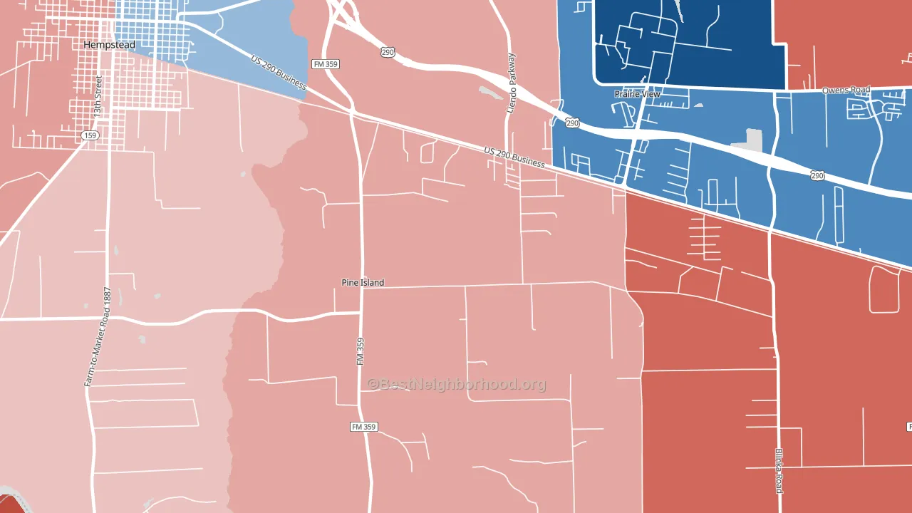
Pine Island leans Republican by roughly 22 points: about 39% of voters vote Democratic and 61% Republican.
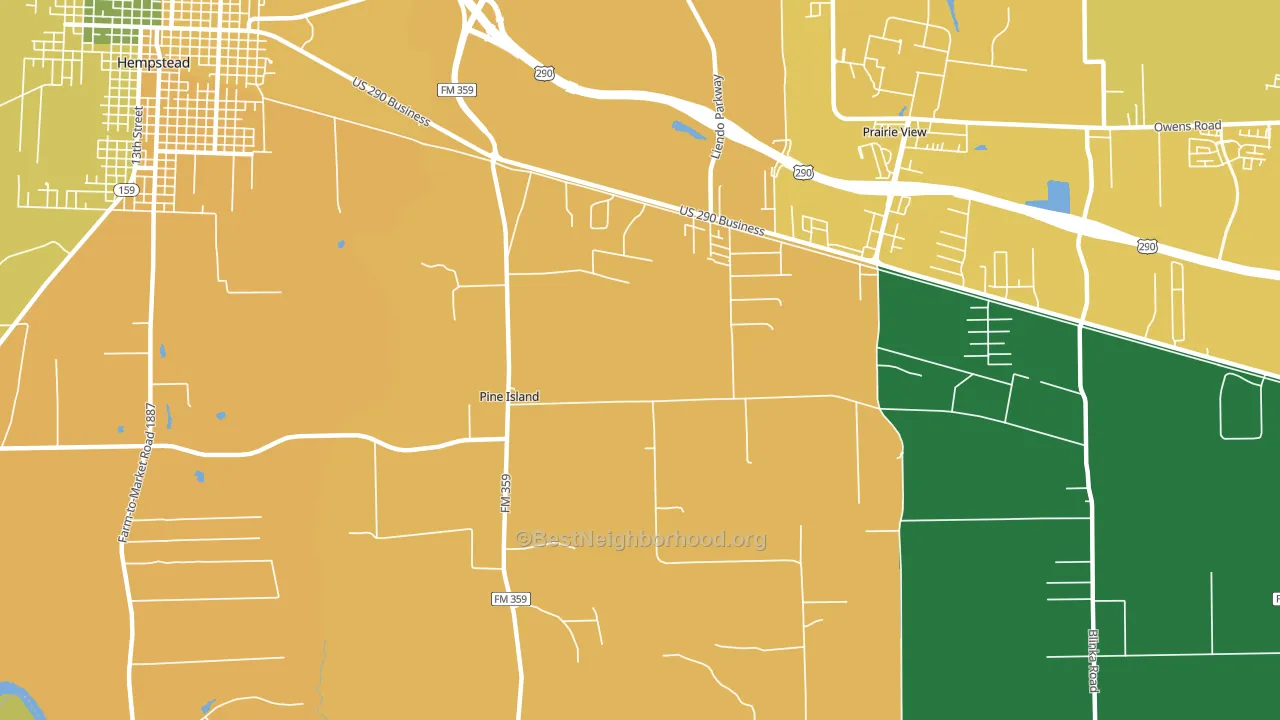
About 34% of adults in Pine Island typically vote, below the U.S. average of about 62%. Among adults in Pine Island, ~13% vote Democratic, ~21% Republican, and ~66% don't vote. The map below shows estimated turnout by block group.
How Pine Island compares
Among cities within 25 miles, Pine Island leans more Republican than 7 of 40 neighbors.
Pine Island runs about 8 points more Republican than Texas as a whole.
Why Pine Island leans the way it does
This analysis examined 14,881 data points per city to find what predicts political lean and turnout. The items below are a few correlations that stood out for Pine Island, not a ranked or complete list of what matters most.
Areas with low college attainment vote Republican. About 14% of adults in Pine Island hold a bachelor's degree, about 12 points below the Texas average of 26%.
Park access and Republican lean
Places with low park coverage tend to lean Republican; Pine Island, TX sits in the bottom tenth nationally on this measure. Park access does not change how people vote; it tends to track denser, higher-income areas.
Why turnout in Pine Island looks the way it does
Areas with limited routine healthcare access turn out at lower rates. Pine Island is in the bottom quarter nationally for routine-care measures such as insurance coverage, preventive screenings, and dental visits. Renters vote less often than owners, and about 32% of households in Pine Island rent, above 87% of cities. High-crime urban areas turn out at lower rates, and Pine Island sits in the top 15% on a violent-crime measure. Learn more about the findings and methodology on the political spectrum map.
Nearby Cities
- Prairie View, TX D+47
- Hempstead, TX R+17
- Cochran, TX R+40
- Waller, TX R+35
- Monaville, TX R+38
- Raccoon Bend, TX R+46
- Sauney Stand, TX R+51
- Hockley, TX R+35
- Burleigh, TX R+56
- Whitehall, TX R+51
Cities with Similar Populations
- Pretty Prairie, KS R+61
- Millington, IL R+38
- Kite, GA R+73
- Sugar Rapids, MI R+41
- Westtown, PA D+8
- Poff, VA R+44
- Reidsboro, GA R+72
- Coal Hill, AR R+63
- Smithfield, ME R+20
- Arenas Valley, NM Even
Sources and methodology
Precinct-level voting records used to fit the model come from Texas Secretary of State, Elections Division, distributed by the Voting and Election Science Team. Demographic inputs come from the U.S. Census Bureau (ACS 5-year estimates and the 2020 Decennial Census). Health and environmental inputs come from the CDC (PLACES and the Environmental Justice Index). Land cover comes from the USGS and EPA. Election-day and lead-up weather come from PRISM 4km daily grids and the NOAA Global Historical Climatology Network. Mail-voting and election-administration patterns come from the MIT Election Lab's Survey of the Performance of American Elections. Block-group crime detail comes from CrimeGrade. Internet data and modeling support provided by ISPreports.org.
Modeling and analysis by the BestNeighborhood data science team. Full methodology and findings: political spectrum map.
Methodology reviewed by the BestNeighborhood data team. Last updated May 2026.