Pulaski is a Democratic stronghold. About 91% of voters here vote Democratic and 9% Republican.
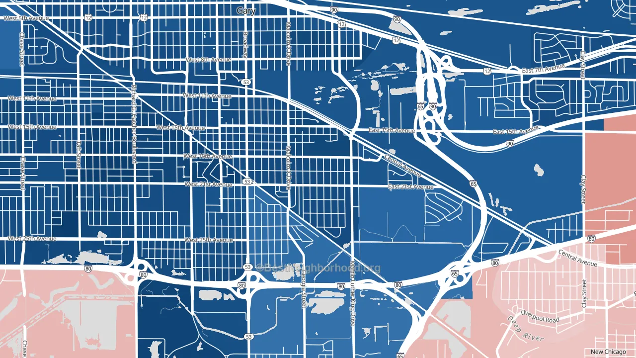
About 52% of adults in Pulaski typically vote, below the U.S. average of about 62%. Among adults in Pulaski, ~47% vote Democratic, ~5% Republican, and ~48% don't vote. The map below shows estimated turnout by block group.
How Pulaski compares
Among neighborhoods within 5 miles, Pulaski leans more Democratic than 5 of 7 neighbors.
Pulaski runs about 102 points more Democratic than Indiana as a whole. Indiana leans Republican overall, while Pulaski is one of the few Democratic-leaning pockets.
Why Pulaski leans the way it does
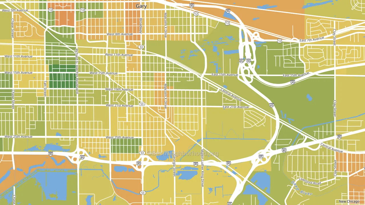
This analysis examined 14,881 data points per neighborhood to find what predicts political lean and turnout. The items below are a few correlations that stood out for Pulaski, not a ranked or complete list of what matters most.
Pulaski votes against the grain of Indiana. Indiana leans Republican overall, while Pulaski runs about 102 points more Democratic. A high never-married share predicts Democratic voting, and about 59% of adults in Pulaski have never been married, above 92% of neighborhoods.
Preventive-care access and voter turnout
Places with limited routine preventive-care access tend to turn out at a lower rate; Pulaski, Gary, IN sits in the bottom tenth nationally on this measure. Dental visits do not drive turnout; the rate reflects income, insurance, and healthcare access, which line up with who votes.
Why turnout in Pulaski looks the way it does
Areas with high food insecurity turn out at lower rates. About 55% of adults in Pulaski report food insecurity, about 39 points above the U.S. average of 16%. Limited routine healthcare access lines up with lower turnout, and Pulaski sits in the bottom quarter on routine-care measures. Renters vote less often than owners, and about 74% of households in Pulaski rent, compared to around 48% in nearby neighborhoods. Learn more about the findings and methodology on the political spectrum map.
Nearby Neighborhoods
- Midtown, Gary, IN D+84
- Downtown West, Gary, IN D+84
- Aetna, Gary, IN D+76
- Glen Park, Gary, IN D+79
- Tolleston, Gary, IN D+82
- Tarrytown, Gary, IN D+82
- Brunswick, Gary, IN D+80
- Turner-Meyn Park, Hammond, IN D+19
- Forestdale, Hammond, IN D+29
- Columbia Center, Hammond, IN D+38
Neighborhoods with Similar Populations
- Oakwood, Knoxville, TN D+32
- Park Village, San Antonio, TX D+33
- Breen Hills, Kansas City, MO D+7
- Gilcrease Hills, Tulsa, OK D+76
- Harrison West, Columbus, OH D+54
- Globeville, Denver, CO D+51
- Villa Cresta, Parkville, MD D+14
- Robbins Blass, Erie, PA D+9
- Green Ridge, Scranton, PA D+17
- Sunnyslope, Riverside, CA Even
Sources and methodology
Precinct-level voting records used to fit the model come from Indiana Secretary of State, Elections, distributed by the Voting and Election Science Team. Demographic inputs come from the U.S. Census Bureau (ACS 5-year estimates and the 2020 Decennial Census). Health and environmental inputs come from the CDC (PLACES and the Environmental Justice Index). Land cover comes from the USGS and EPA. Election-day and lead-up weather come from PRISM 4km daily grids and the NOAA Global Historical Climatology Network. Mail-voting and election-administration patterns come from the MIT Election Lab's Survey of the Performance of American Elections. Block-group crime detail comes from CrimeGrade. Internet data and modeling support provided by ISPreports.org.
Modeling and analysis by the BestNeighborhood data science team. Full methodology and findings: political spectrum map.
Methodology reviewed by the BestNeighborhood data team. Last updated May 2026.