Pumphrey leans slightly Democratic by roughly 10 points: about 55% of voters vote Democratic and 45% Republican.
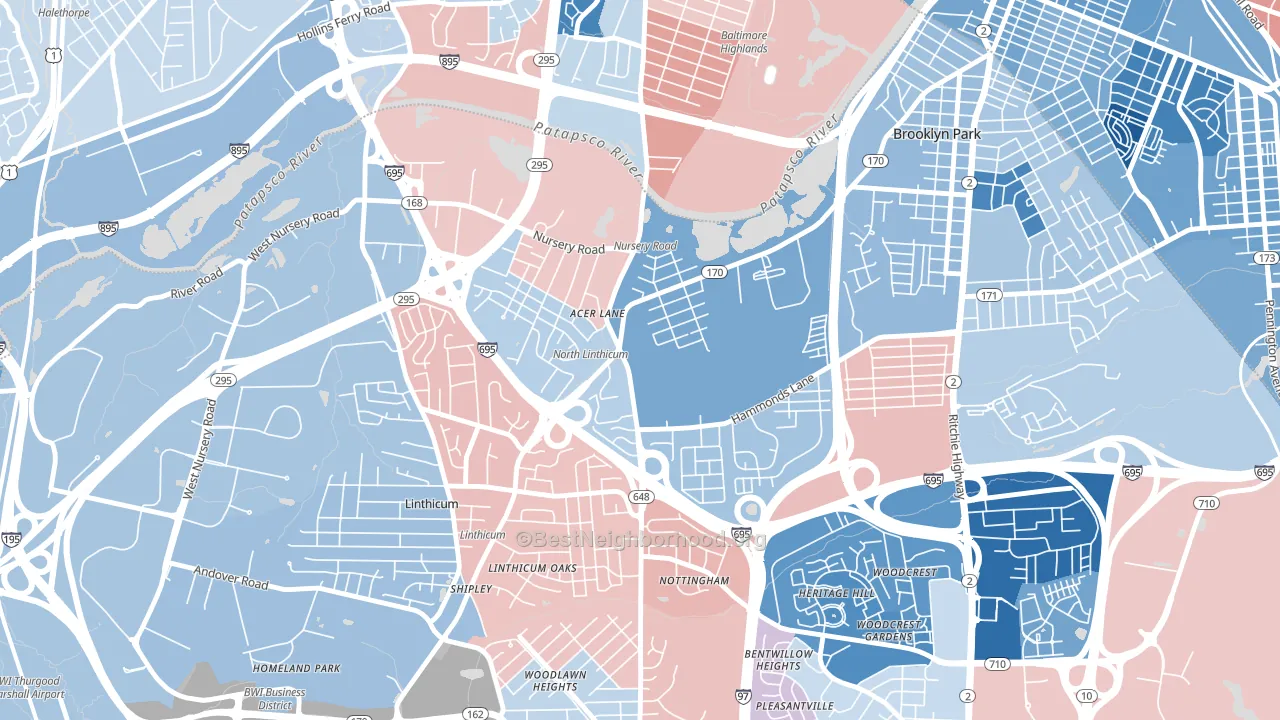
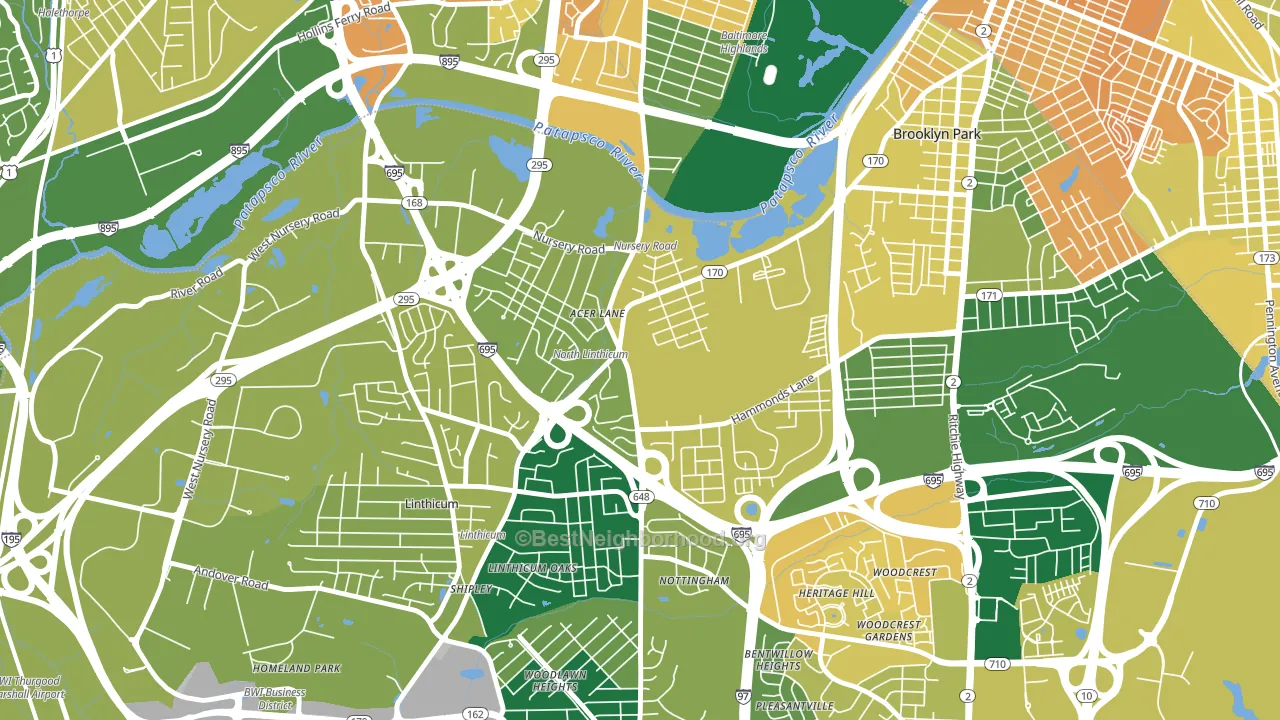
About 67% of adults in Pumphrey typically vote, near the U.S. average of about 62%. Among adults in Pumphrey, ~37% vote Democratic, ~30% Republican, and ~33% don't vote. The map below shows estimated turnout by block group.
How Pumphrey compares
Among neighborhoods within 5 miles, Pumphrey is the least Democratic-leaning.
Pumphrey runs about 20 points more Republican than Maryland as a whole.
Politics vary noticeably by block within Pumphrey. The east side runs the most Democratic (D+35) and the northwest side runs the most Republican (R+7), a spread of about 42 points.
Why Pumphrey leans the way it does
Density, race composition, education, and family structure all sit close to their national averages in Pumphrey. The lean here lands roughly where demographic data alone would predict.
Homeownership and voter turnout
Places with homeowner-heavy households tend to turn out at a higher rate; Pumphrey, Linthicum, MD sits above the national average on this measure.
Why turnout in Pumphrey looks the way it does
Turnout in Pumphrey sits close to the national pattern. Routine healthcare access, homeownership, education, and food security all land near their national averages here. Learn more about the findings and methodology on the political spectrum map.
Nearby Neighborhoods
- Hillcrest, Brooklyn Park, MD D+11
- Brooklyn-Curtis Bay, Brooklyn, MD D+37
- Cherry Hill, Brooklyn, MD D+82
- Lakeland, Baltimore, MD D+56
- Morrell Park, Baltimore, MD D+22
- Riverside, Baltimore, MD D+64
- Locust Point, Baltimore, MD D+46
- Washington Village, Baltimore, MD D+75
- Federal Hill-Montgomery, Baltimore, MD D+67
- St Denis, Catonsville, MD D+18
Neighborhoods with Similar Populations
- Oak Hills, San Antonio, TX D+27
- Sandusky Street Historic District, Delaware, OH D+18
- Mount Vernon-Hollywood-Montclair, Lexington, KY D+54
- Willow Meadows-Willowbend Area, Houston, TX D+36
- Windsor Square, Glendale, AZ Even
- Brookfield Village, Oakland, CA D+58
- Thorpe Westwood, Spokane, WA R+9
- Ashton Heights, Arlington, VA D+62
- Morris Heights, Aurora, CO D+35
- Cardinal Hill-Pine Meadow, Lexington, KY D+40
Sources and methodology
Precinct-level voting records used to fit the model come from Maryland State Board of Elections, distributed by the Voting and Election Science Team. Demographic inputs come from the U.S. Census Bureau (ACS 5-year estimates and the 2020 Decennial Census). Health and environmental inputs come from the CDC (PLACES and the Environmental Justice Index). Land cover comes from the USGS and EPA. Election-day and lead-up weather come from PRISM 4km daily grids and the NOAA Global Historical Climatology Network. Mail-voting and election-administration patterns come from the MIT Election Lab's Survey of the Performance of American Elections. Block-group crime detail comes from CrimeGrade. Internet data and modeling support provided by ISPreports.org.
Modeling and analysis by the BestNeighborhood data science team. Full methodology and findings: political spectrum map.
Methodology reviewed by the BestNeighborhood data team. Last updated May 2026.