Shelby County is a Republican stronghold. About 21% of voters here vote Democratic and 79% Republican.
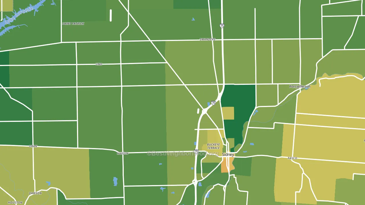
About 80% of adults in Shelby County typically vote, above the U.S. average of about 62%. Among adults in Shelby County, ~17% vote Democratic, ~63% Republican, and ~20% don't vote. The map below shows estimated turnout by block group.
How Shelby County compares
Among counties within 50 miles, Shelby County leans more Republican than 12 of 18 neighbors.
Shelby County runs about 47 points more Republican than Ohio as a whole.
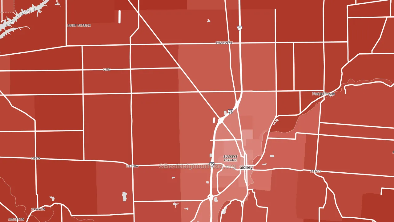
Politics vary noticeably by city within Shelby County. The northwest side is the most Republican-leaning (R+74) and the south side is the least Republican-leaning (R+46), a spread of about 28 points.
Why Shelby County leans the way it does
This analysis examined 14,881 data points per county to find what predicts political lean and turnout. The items below are a few correlations that stood out for Shelby County, not a ranked or complete list of what matters most.
Car-dependent areas vote Republican. About 83% of residents in Shelby County drive to work alone, about 9 points above the U.S. average of 74%.
Population density and Democratic lean
Places with high population density tend to lean Democratic; Shelby County, OH sits above the national average on this measure.
Why turnout in Shelby County looks the way it does
Turnout in Shelby County sits close to the national pattern. Learn more about the findings and methodology on the political spectrum map.
Nearby Counties
- Auglaize County, OH R+59
- Miami County, OH R+42
- Logan County, OH R+51
- Mercer County, OH R+65
- Darke County, OH R+61
- Champaign County, OH R+51
- Allen County, OH R+32
- Clark County, OH R+21
- Hardin County, OH R+50
- Montgomery County, OH D+6
Counties with Similar Populations
- Boyd County, KY R+38
- Crittenden County, AR D+22
- Le Flore County, OK R+63
- Shelby County, KY R+32
- Lincoln Parish, LA R+13
- Curry County, NM R+34
- Tioga County, NY R+27
- Carter County, OK R+46
- Bingham County, ID R+54
- Whitman County, WA D+16
Sources and methodology
Precinct-level voting records used to fit the model come from Ohio Secretary of State, Elections, distributed by the Voting and Election Science Team. Demographic inputs come from the U.S. Census Bureau (ACS 5-year estimates and the 2020 Decennial Census). Health and environmental inputs come from the CDC (PLACES and the Environmental Justice Index). Land cover comes from the USGS and EPA. Election-day and lead-up weather come from PRISM 4km daily grids and the NOAA Global Historical Climatology Network. Mail-voting and election-administration patterns come from the MIT Election Lab's Survey of the Performance of American Elections. Block-group crime detail comes from CrimeGrade. Internet data and modeling support provided by ISPreports.org.
Modeling and analysis by the BestNeighborhood data science team. Full methodology and findings: political spectrum map.
Methodology reviewed by the BestNeighborhood data team. Last updated May 2026.