Hardin County is a Republican stronghold. About 25% of voters here vote Democratic and 75% Republican.
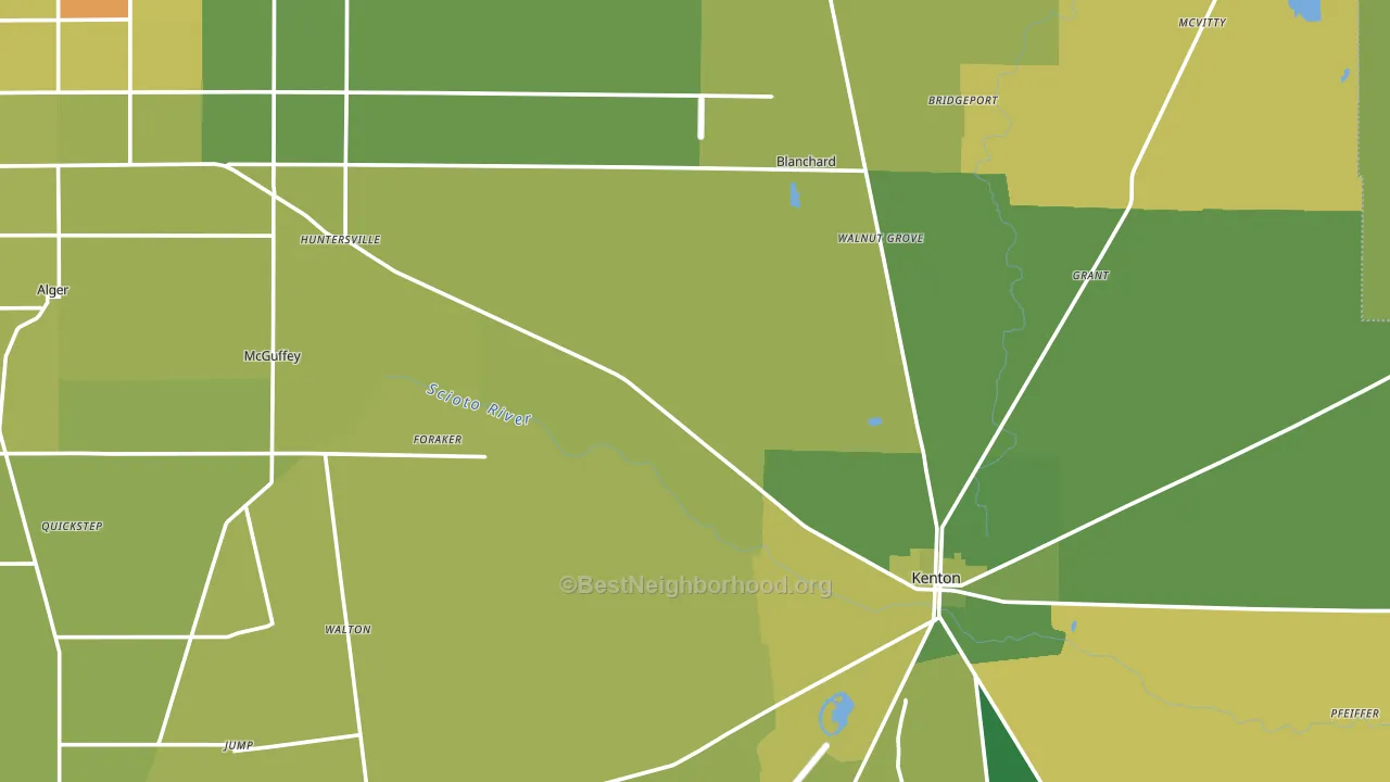
About 72% of adults in Hardin County typically vote, above the U.S. average of about 62%. Among adults in Hardin County, ~18% vote Democratic, ~54% Republican, and ~28% don't vote. The map below shows estimated turnout by block group.
How Hardin County compares
Among counties within 50 miles, Hardin County leans more Republican than 6 of 15 neighbors.
Hardin County runs about 39 points more Republican than Ohio as a whole.
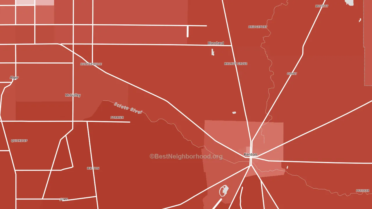
Politics vary noticeably by city within Hardin County. The southwest side is the most Republican-leaning (R+67) and the northwest side is the least Republican-leaning (R+31), a spread of about 37 points.
Why Hardin County leans the way it does
Density, race composition, education, and family structure all sit close to their national averages in Hardin County. The lean here lands roughly where demographic data alone would predict.
Local retail density and voter turnout
Places with dense local retail within a mile tend to turn out at a higher rate; Hardin County, OH sits in the top tenth nationally on this measure. Nearby retail does not change how people vote; it reflects how urban and built-up a place is.
Why turnout in Hardin County looks the way it does
Turnout in Hardin County sits close to the national pattern. Routine healthcare access, homeownership, education, and food security all land near their national averages here. Learn more about the findings and methodology on the political spectrum map.
Nearby Counties
- Logan County, OH R+51
- Wyandot County, OH R+53
- Allen County, OH R+32
- Hancock County, OH R+32
- Marion County, OH R+35
- Putnam County, OH R+66
- Auglaize County, OH R+59
- Union County, OH R+30
- Shelby County, OH R+58
- Seneca County, OH R+35
Counties with Similar Populations
- Vernon County, WI R+19
- Trempealeau County, WI R+26
- Boyle County, KY R+29
- Obion County, TN R+52
- Marshall County, WV R+50
- Greene County, IN R+55
- McCurtain County, OK R+55
- Clare County, MI R+40
- Caroline County, VA R+15
- Jefferson County, ID R+71
Sources and methodology
Precinct-level voting records used to fit the model come from Ohio Secretary of State, Elections, distributed by the Voting and Election Science Team. Demographic inputs come from the U.S. Census Bureau (ACS 5-year estimates and the 2020 Decennial Census). Health and environmental inputs come from the CDC (PLACES and the Environmental Justice Index). Land cover comes from the USGS and EPA. Election-day and lead-up weather come from PRISM 4km daily grids and the NOAA Global Historical Climatology Network. Mail-voting and election-administration patterns come from the MIT Election Lab's Survey of the Performance of American Elections. Block-group crime detail comes from CrimeGrade. Internet data and modeling support provided by ISPreports.org.
Modeling and analysis by the BestNeighborhood data science team. Full methodology and findings: political spectrum map.
Methodology reviewed by the BestNeighborhood data team. Last updated May 2026.