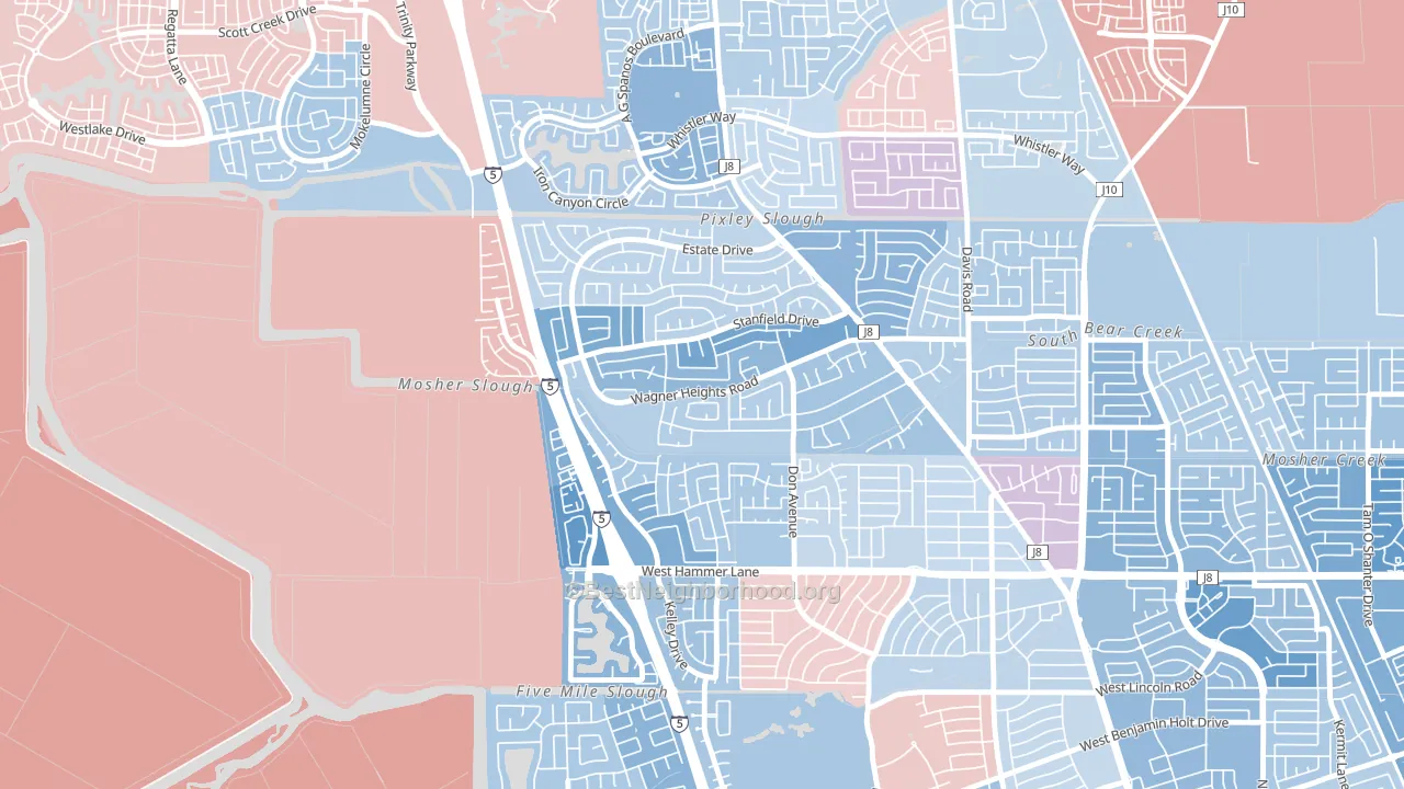
Sherwood Manor leans slightly Democratic by roughly 14 points: about 57% of voters vote Democratic and 43% Republican.
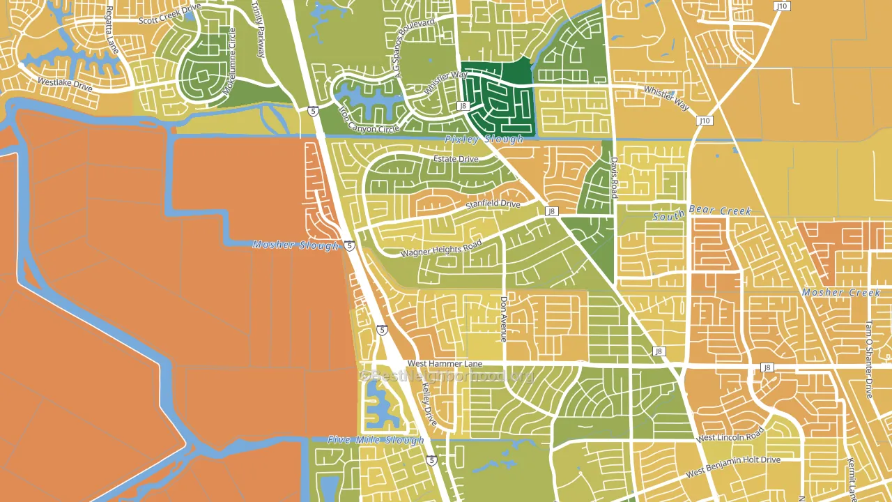
About 50% of adults in Sherwood Manor typically vote, below the U.S. average of about 62%. Among adults in Sherwood Manor, ~29% vote Democratic, ~21% Republican, and ~50% don't vote. The map below shows estimated turnout by block group.
How Sherwood Manor compares
Among neighborhoods within 5 miles, Sherwood Manor leans more Democratic than 7 of 10 neighbors.
Sherwood Manor runs about 6 points more Republican than California as a whole.
Politics vary noticeably by block within Sherwood Manor. The southwest side is the most Democratic-leaning (D+23) and the east side is the least Democratic-leaning (D+5), a spread of about 18 points.
Why Sherwood Manor leans the way it does
This analysis examined 14,881 data points per neighborhood to find what predicts political lean and turnout. The items below are a few correlations that stood out for Sherwood Manor, not a ranked or complete list of what matters most.
Dense areas vote Democratic. More than 99% of residents in Sherwood Manor live in densely developed areas, about 64 points above the U.S. average of 36%.
Cancer-screening access and voter turnout
Places with low colon-cancer-screening access tend to turn out at a lower rate; Sherwood Manor, Stockton, CA sits in the bottom quarter nationally on this measure. Cancer screening does not drive turnout; it reflects income, insurance, and healthcare access.
Why turnout in Sherwood Manor looks the way it does
Crowded housing lines up with lower turnout. About 8% of homes in Sherwood Manor have more than one occupant per room, above 88% of neighborhoods. Learn more about the findings and methodology on the political spectrum map.
Nearby Neighborhoods
- Sherwoods Manor, Stockton, CA D+8
- Bear Creek, Stockton, CA D+15
- Stonewood, Stockton, CA D+12
- Spanos Park, Stockton, CA D+6
- Lincoln Village Proper, Stockton, CA D+2
- Lincoln Village West, Stockton, CA D+11
- Lakeview, Stockton, CA D+20
- Brookside, Stockton, CA D+12
- Valley Oak, Stockton, CA D+12
- Pacific, Stockton, CA D+24
Neighborhoods with Similar Populations
- Lake Hills, Bellevue, WA D+43
- Archer Heights, Chicago, IL D+28
- Education Hill, Redmond, WA D+47
- Aurora Highlands, Arlington, VA D+61
- Stanton Park, Washington, DC D+84
- Eastside Lansing, Lansing, MI D+45
- South End, Nashua, NH D+16
- Sellwood-Moreland, Portland, OR D+77
- Mid-City, New Orleans, LA D+60
- Wilkes, Portland, OR D+28
Sources and methodology
Precinct-level voting records used to fit the model come from California Secretary of State, Elections, distributed by the Voting and Election Science Team. Demographic inputs come from the U.S. Census Bureau (ACS 5-year estimates and the 2020 Decennial Census). Health and environmental inputs come from the CDC (PLACES and the Environmental Justice Index). Land cover comes from the USGS and EPA. Election-day and lead-up weather come from PRISM 4km daily grids and the NOAA Global Historical Climatology Network. Mail-voting and election-administration patterns come from the MIT Election Lab's Survey of the Performance of American Elections. Block-group crime detail comes from CrimeGrade. Internet data and modeling support provided by ISPreports.org.
Modeling and analysis by the BestNeighborhood data science team. Full methodology and findings: political spectrum map.
Methodology reviewed by the BestNeighborhood data team. Last updated May 2026.