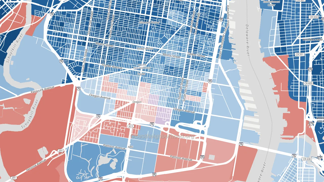
South Philadelphia leans Democratic by roughly 22 points: about 61% of voters vote Democratic and 39% Republican.
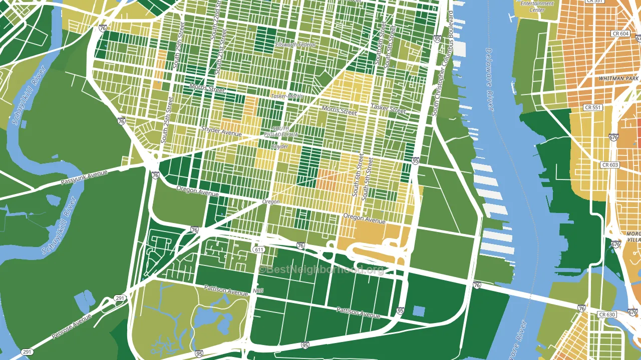
About 66% of adults in South Philadelphia typically vote, near the U.S. average of about 62%. Among adults in South Philadelphia, ~40% vote Democratic, ~26% Republican, and ~34% don't vote. The map below shows estimated turnout by block group.
How South Philadelphia compares
Among neighborhoods within 5 miles, South Philadelphia leans more Democratic than 2 of 39 neighbors.
South Philadelphia runs about 23 points more Democratic than Pennsylvania as a whole. Pennsylvania is roughly evenly split, and South Philadelphia sits clearly on the Democratic side.
Politics vary noticeably by block within South Philadelphia. The northeast side runs the most Democratic (D+60) and the southwest side runs the most Republican (R+18), a spread of about 77 points.
Why South Philadelphia leans the way it does
This analysis examined 14,881 data points per neighborhood to find what predicts political lean and turnout. The items below are a few correlations that stood out for South Philadelphia, not a ranked or complete list of what matters most.
Dense areas vote Democratic. More than 99% of residents in South Philadelphia live in densely developed areas, about 64 points above the U.S. average of 36%. South Philadelphia runs against the grain of Pennsylvania, a Democratic-leaning outlier in a roughly evenly split state.
Paved land cover and Democratic lean
Places with extensive paved surfaces tend to lean Democratic; South Philadelphia, Philadelphia, PA sits in the top tenth nationally on this measure. Paved ground does not change how people vote; it mostly reflects how urban and built-up a place is.
Why turnout in South Philadelphia looks the way it does
Turnout in South Philadelphia sits close to the national pattern. Routine healthcare access, homeownership, education, and food security all land near their national averages here. Learn more about the findings and methodology on the political spectrum map.
Nearby Neighborhoods
- Girard Estates, Philadelphia, PA D+17
- Pennsport-Whitman-Queen, Philadelphia, PA D+42
- Wharton-Hawthorne-Bella Vista, Philadelphia, PA D+60
- Point Breeze-Philadelphia, Philadelphia, PA D+73
- Marconi Plaza-Packer Park, Philadelphia, PA R+23
- Bella Vista, Philadelphia, PA D+76
- Schuylkill Southwest, Philadelphia, PA D+79
- Grays Ferry, Philadelphia, PA D+62
- City Center East, Philadelphia, PA D+71
- Rittenhouse Square, Philadelphia, PA D+67
Neighborhoods with Similar Populations
- Gage Park, Chicago, IL D+39
- North Central Dallas, Carrollton, TX D+8
- Bridgeport, Chicago, IL D+27
- Howard Beach, Queens, NY R+29
- North End, Tacoma, WA D+58
- Roxborough, Philadelphia, PA D+40
- West Englewood, Chicago, IL D+79
- North Austin, Austin, TX D+48
- Greater Landover, Landover, MD D+78
- Academy Gardens, Philadelphia, PA D+7
Sources and methodology
Precinct-level voting records used to fit the model come from Pennsylvania Department of State, Bureau of Elections, distributed by the Voting and Election Science Team. Demographic inputs come from the U.S. Census Bureau (ACS 5-year estimates and the 2020 Decennial Census). Health and environmental inputs come from the CDC (PLACES and the Environmental Justice Index). Land cover comes from the USGS and EPA. Election-day and lead-up weather come from PRISM 4km daily grids and the NOAA Global Historical Climatology Network. Mail-voting and election-administration patterns come from the MIT Election Lab's Survey of the Performance of American Elections. Block-group crime detail comes from CrimeGrade. Internet data and modeling support provided by ISPreports.org.
Modeling and analysis by the BestNeighborhood data science team. Full methodology and findings: political spectrum map.
Methodology reviewed by the BestNeighborhood data team. Last updated May 2026.