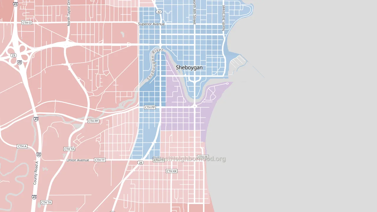
South Pier leans slightly Democratic by roughly 12 points: about 56% of voters vote Democratic and 44% Republican.
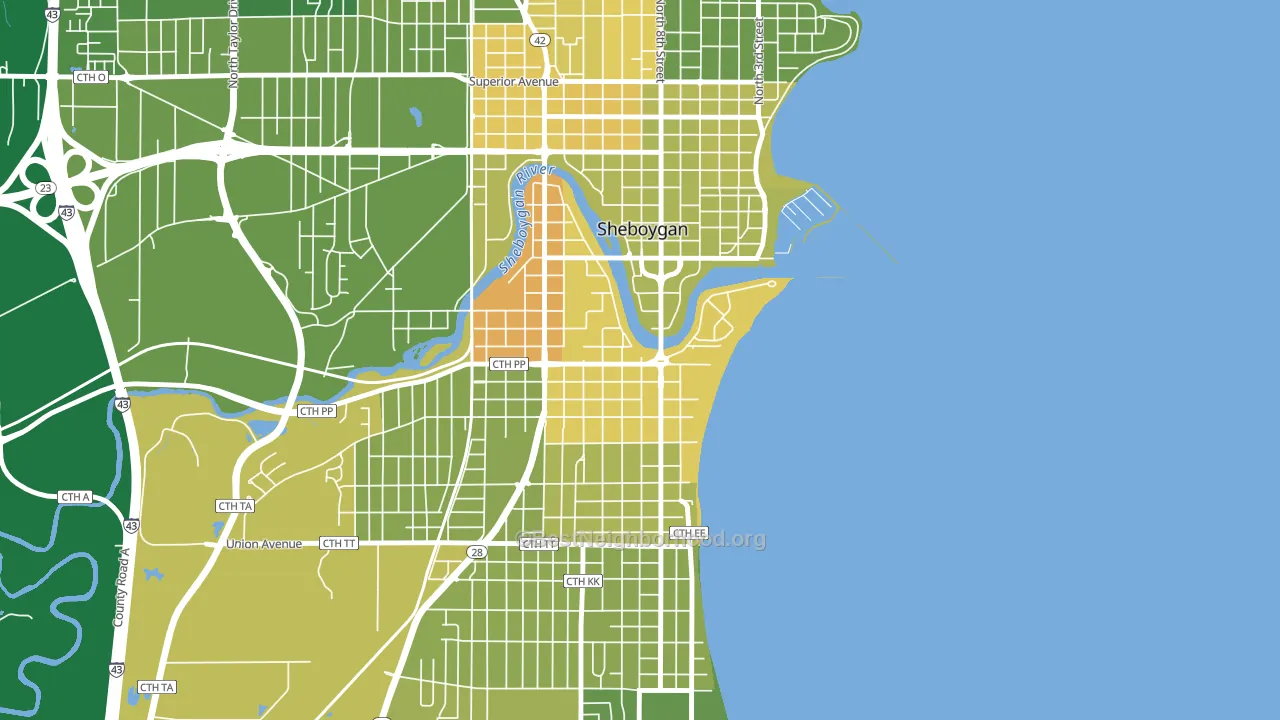
About 62% of adults in South Pier typically vote, near the U.S. average of about 62%. Among adults in South Pier, ~35% vote Democratic, ~27% Republican, and ~38% don't vote. The map below shows estimated turnout by block group.
How South Pier compares
South Pier runs about 13 points more Democratic than Wisconsin as a whole. Wisconsin is roughly evenly split, and South Pier sits clearly on the Democratic side.
Politics vary noticeably by block within South Pier. The northeast side runs the most Democratic (D+23) and the southeast side runs the most Republican (R+3), a spread of about 26 points.
Why South Pier leans the way it does
This analysis examined 14,881 data points per neighborhood to find what predicts political lean and turnout. The items below are a few correlations that stood out for South Pier, not a ranked or complete list of what matters most.
South Pier votes against the grain of Wisconsin. Wisconsin is roughly evenly split, while South Pier runs about 13 points more Democratic.
Local retail density and voter turnout
Places with dense local retail within a mile tend to turn out at a higher rate; South Pier, Sheboygan, WI sits in the top quarter nationally on this measure. Nearby retail does not change how people vote; it reflects how urban and built-up a place is.
Why turnout in South Pier looks the way it does
Turnout in South Pier sits close to the national pattern. Routine healthcare access, homeownership, education, and food security all land near their national averages here. Learn more about the findings and methodology on the political spectrum map.
Nearby Neighborhoods
- Bradley Estates, Milwaukee, WI D+66
- Town and Country Manor, Milwaukee, WI D+74
- Village Centre, Menomonee Falls, WI R+4
- Menomonee River Hills East, Milwaukee, WI D+63
- Thurston Woods, Milwaukee, WI D+79
- Menomonee River Hills, Milwaukee, WI D+63
- Menominee South, Oshkosh, WI D+17
- Silver Spring, Milwaukee, WI D+74
- Lincoln Park, Milwaukee, WI D+83
- McGovern Park, Milwaukee, WI D+82
Neighborhoods with Similar Populations
- North Sifton-Orchards Area, Orchards, WA Even
- Adams Hill, San Antonio, TX D+15
- Moorland-Rimrock, Madison, WI D+54
- North Rosslyn, Arlington, VA D+57
- South East Lake, Birmingham, AL D+71
- Dicken, Ann Arbor, MI D+71
- Knightsville, Cranston, RI D+10
- Knoxville, Pittsburgh, PA D+59
- Live Oaks Square, Tampa, FL D+69
- Ardmore-Gould Estates-Olin Heights, Savannah, GA D+36
Sources and methodology
Precinct-level voting records used to fit the model come from Wisconsin Elections Commission, distributed by the Voting and Election Science Team. Demographic inputs come from the U.S. Census Bureau (ACS 5-year estimates and the 2020 Decennial Census). Health and environmental inputs come from the CDC (PLACES and the Environmental Justice Index). Land cover comes from the USGS and EPA. Election-day and lead-up weather come from PRISM 4km daily grids and the NOAA Global Historical Climatology Network. Mail-voting and election-administration patterns come from the MIT Election Lab's Survey of the Performance of American Elections. Block-group crime detail comes from CrimeGrade. Internet data and modeling support provided by ISPreports.org.
Modeling and analysis by the BestNeighborhood data science team. Full methodology and findings: political spectrum map.
Methodology reviewed by the BestNeighborhood data team. Last updated May 2026.