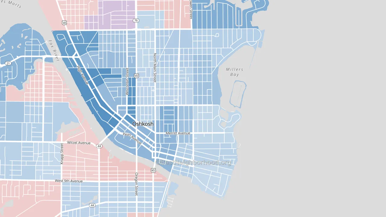
Menominee South leans Democratic by roughly 16 points: about 58% of voters vote Democratic and 42% Republican.
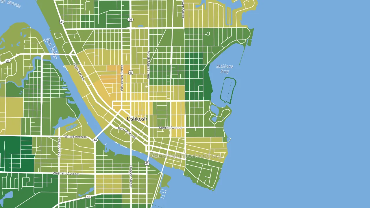
About 72% of adults in Menominee South typically vote, above the U.S. average of about 62%. Among adults in Menominee South, ~42% vote Democratic, ~30% Republican, and ~28% don't vote. The map below shows estimated turnout by block group.
How Menominee South compares
Menominee South runs about 18 points more Democratic than Wisconsin as a whole. Wisconsin is roughly evenly split, and Menominee South sits clearly on the Democratic side.
Politics vary noticeably by block within Menominee South. The northeast side is the most Democratic-leaning (D+22) and the northwest side is the least Democratic-leaning (D+7), a spread of about 15 points.
Why Menominee South leans the way it does
This analysis examined 14,881 data points per neighborhood to find what predicts political lean and turnout. The items below are a few correlations that stood out for Menominee South, not a ranked or complete list of what matters most.
Menominee South votes against the grain of Wisconsin. Wisconsin is roughly evenly split, while Menominee South runs about 18 points more Democratic. A high white share with below-average college attainment predicts Republican voting, and Menominee South fits that profile on both counts.
Walkability and Democratic lean
Places with a highly walkable street grid tend to lean Democratic; Menominee South, Oshkosh, WI sits above the national average on this measure. A walkable street grid does not change how people vote; it mostly reflects how urban a place is.
Why turnout in Menominee South looks the way it does
Turnout in Menominee South sits close to the national pattern. Routine healthcare access, homeownership, education, and food security all land near their national averages here. Learn more about the findings and methodology on the political spectrum map.
Nearby Neighborhoods
- Downtown Appleton, Appleton, WI D+21
- Western Corridor, Green Bay, WI D+15
- Fort Howard, Green Bay, WI D+12
- Haevers Corners, Green Bay, WI D+19
- South Pier, Sheboygan, WI D+12
- Village Centre, Menomonee Falls, WI R+4
- Bradley Estates, Milwaukee, WI D+66
- Menomonee River Hills, Milwaukee, WI D+63
- Menomonee River Hills East, Milwaukee, WI D+63
- Town and Country Manor, Milwaukee, WI D+74
Neighborhoods with Similar Populations
- Konnoak, Winston-Salem, NC D+38
- Meadows, Boynton Beach, FL D+16
- Browntown, Wilmington, DE D+71
- Bay Breeze Cove, St. Petersburg, FL Even
- Shady Lane, Columbus, OH D+66
- Kent Heights, East Providence, RI D+7
- Sunnyslope, Riverside, CA Even
- Gilcrease Hills, Tulsa, OK D+76
- Oakwood, Knoxville, TN D+32
- East Harriet, Minneapolis, MN D+76
Sources and methodology
Precinct-level voting records used to fit the model come from Wisconsin Elections Commission, distributed by the Voting and Election Science Team. Demographic inputs come from the U.S. Census Bureau (ACS 5-year estimates and the 2020 Decennial Census). Health and environmental inputs come from the CDC (PLACES and the Environmental Justice Index). Land cover comes from the USGS and EPA. Election-day and lead-up weather come from PRISM 4km daily grids and the NOAA Global Historical Climatology Network. Mail-voting and election-administration patterns come from the MIT Election Lab's Survey of the Performance of American Elections. Block-group crime detail comes from CrimeGrade. Internet data and modeling support provided by ISPreports.org.
Modeling and analysis by the BestNeighborhood data science team. Full methodology and findings: political spectrum map.
Methodology reviewed by the BestNeighborhood data team. Last updated May 2026.